TYPOGRAPHy
MASTERING MEDITATION
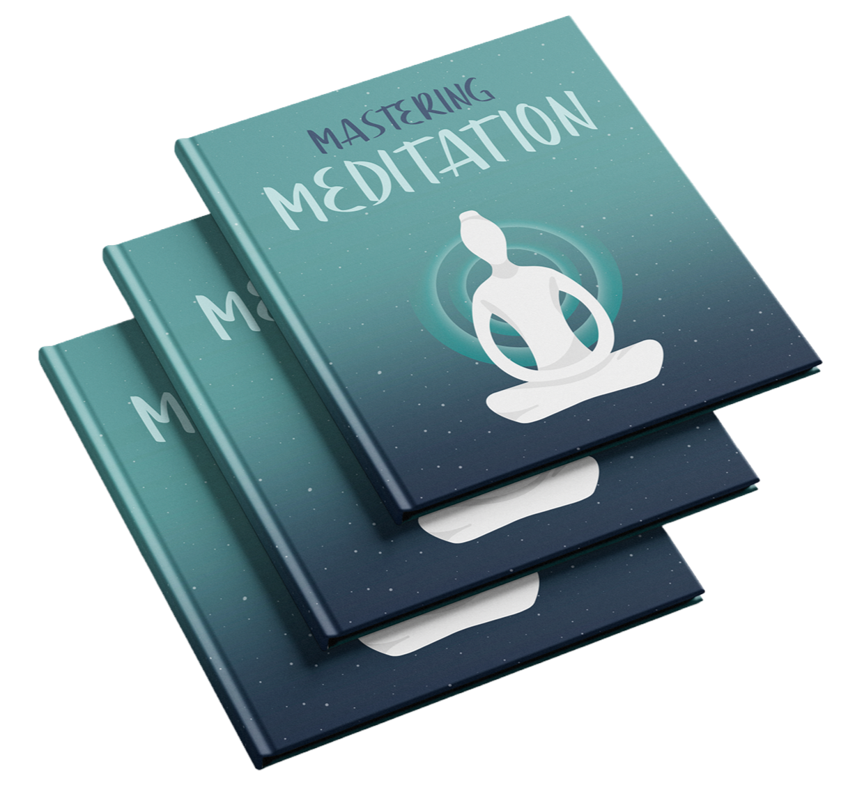
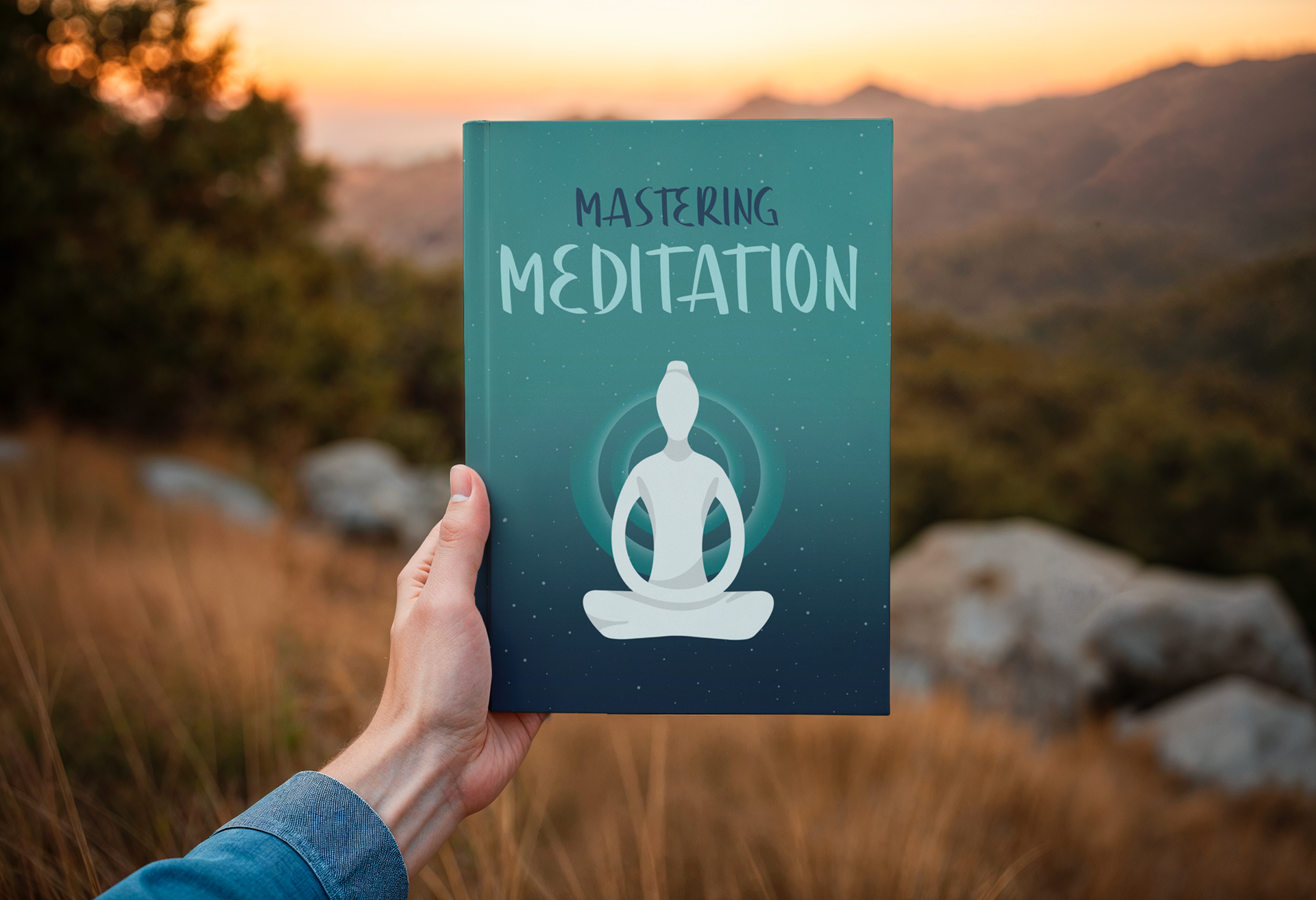
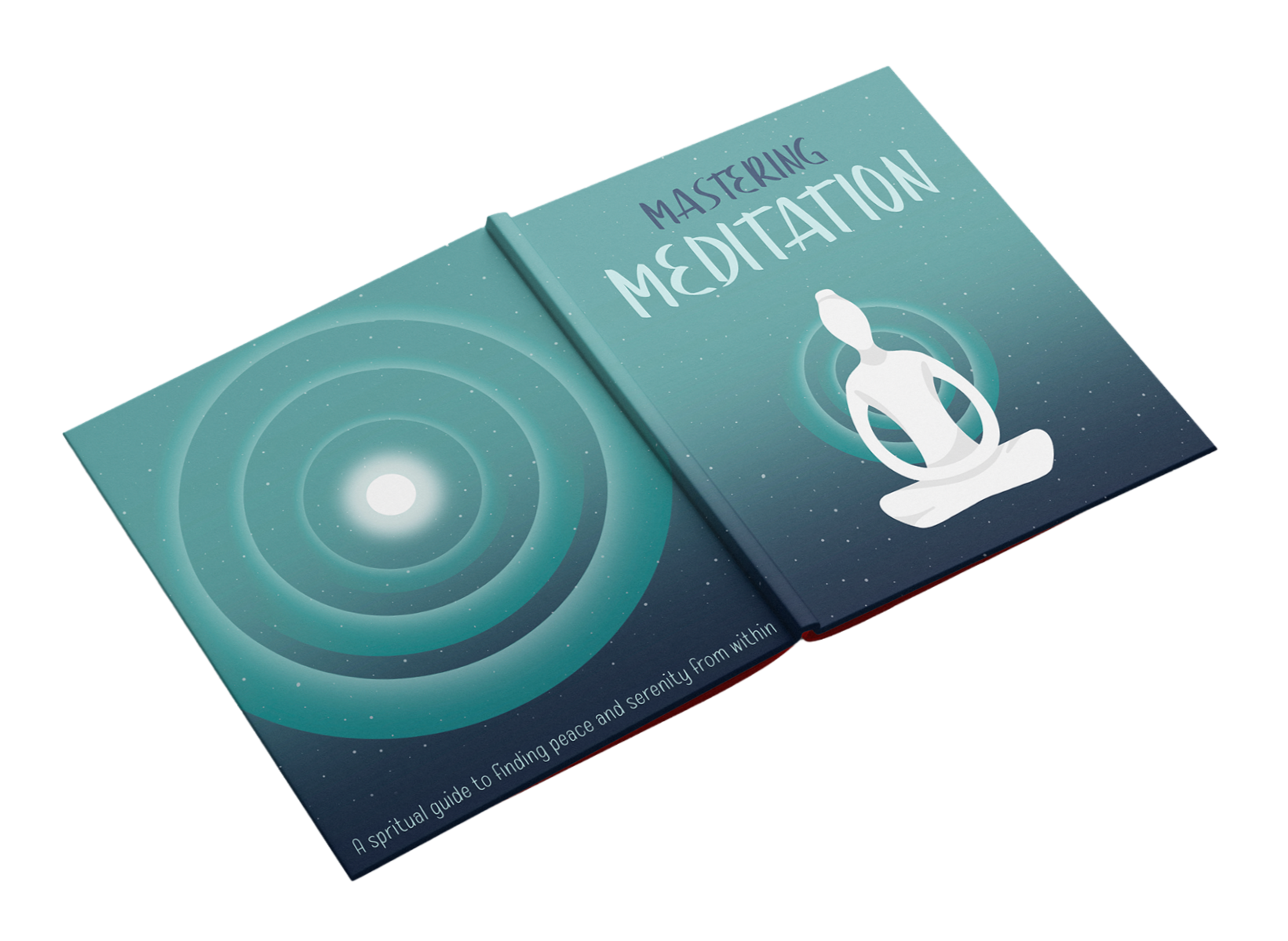
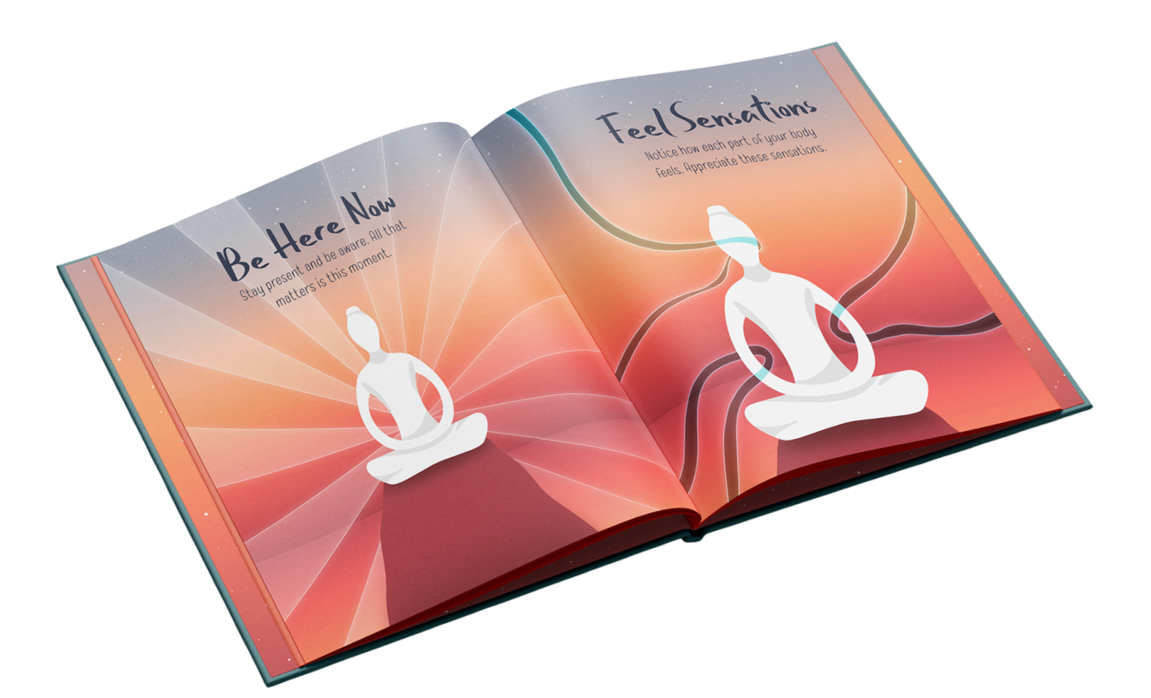
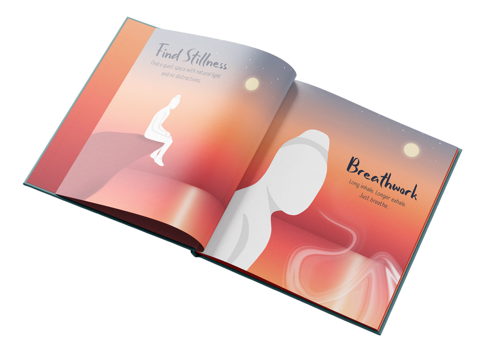
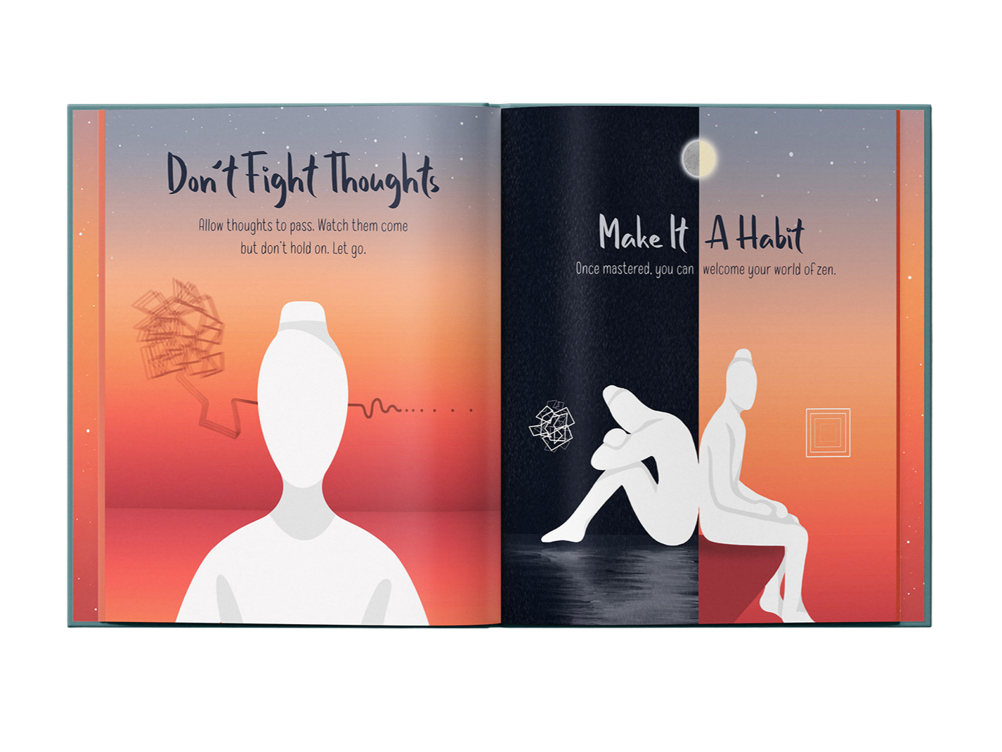
Mastering Meditation is a typographic children’s book designed to introduce meditation and mindfulness in a way that feels simple and easy to understand. I wanted to create a super minimal and calming book that could help children learn how to slow down, regulate their emotions and feel more at peace. Through tranquil imagery and simple words, the book is made to be easy to follow while evoking a strong sense of calm and relaxation. I wanted to show children not only the importance of mindfulness, but also that meditation doesn’t have to feel intimidating. Overall, the book was designed to make meditation feel approachable and to encourage a sense of stillness and comfort when reading.

THE MIND IS A POWERFUL PLACE
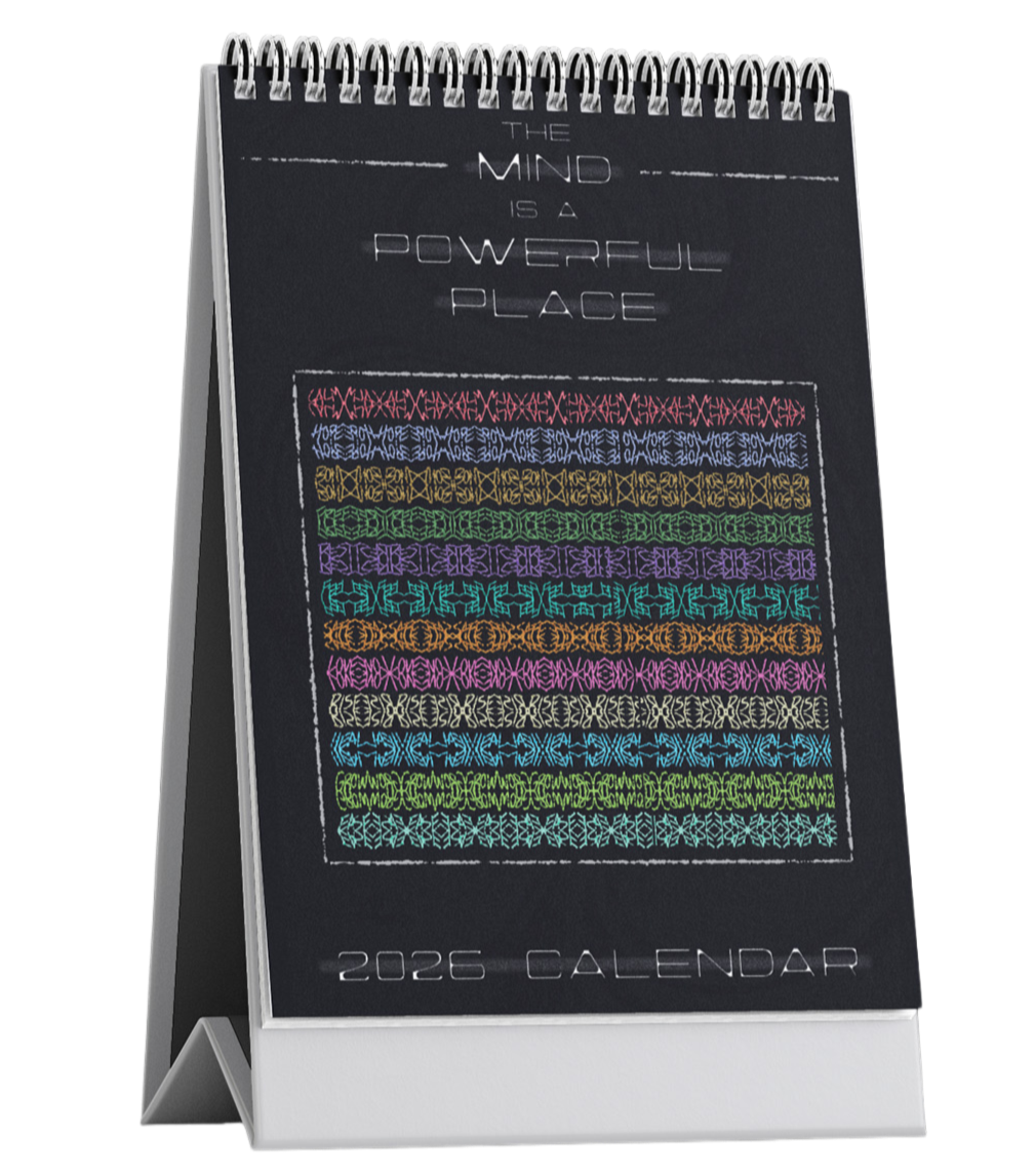
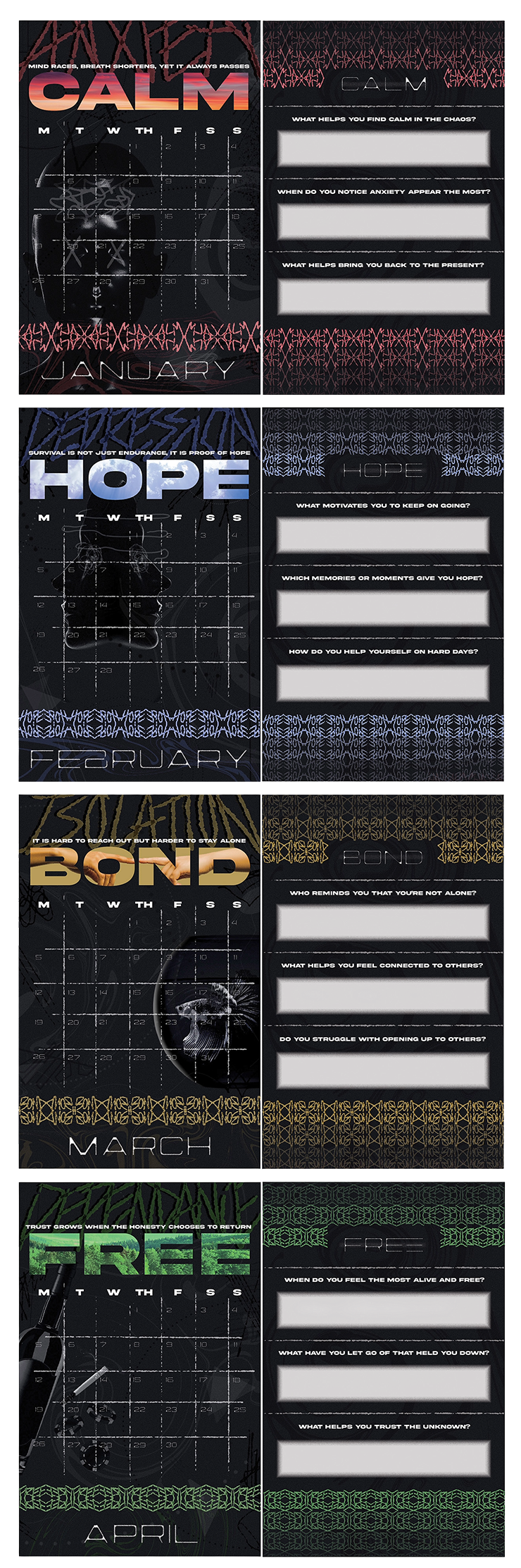
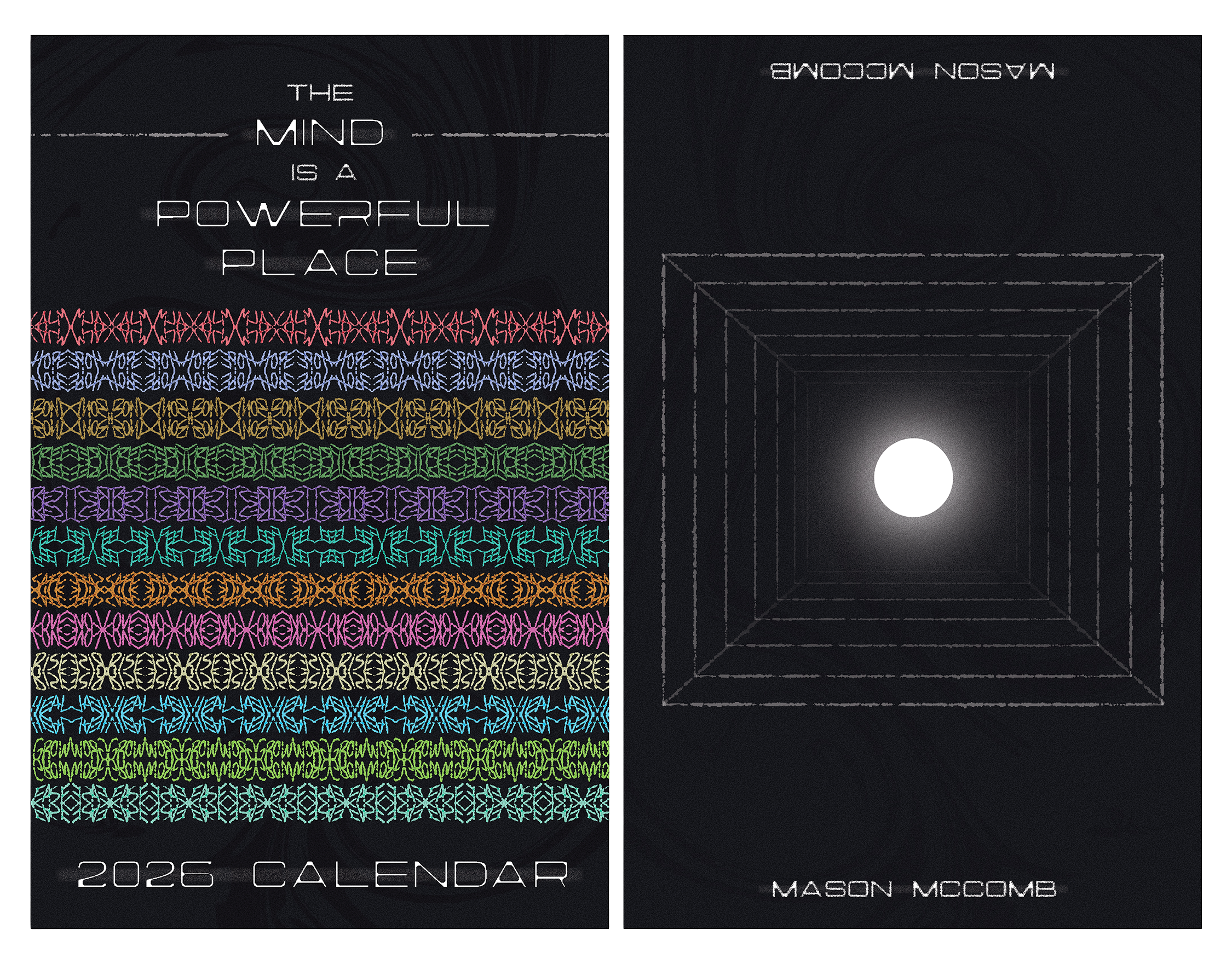
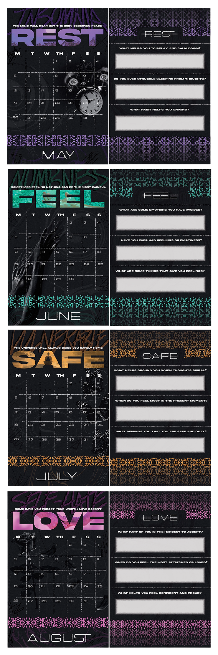
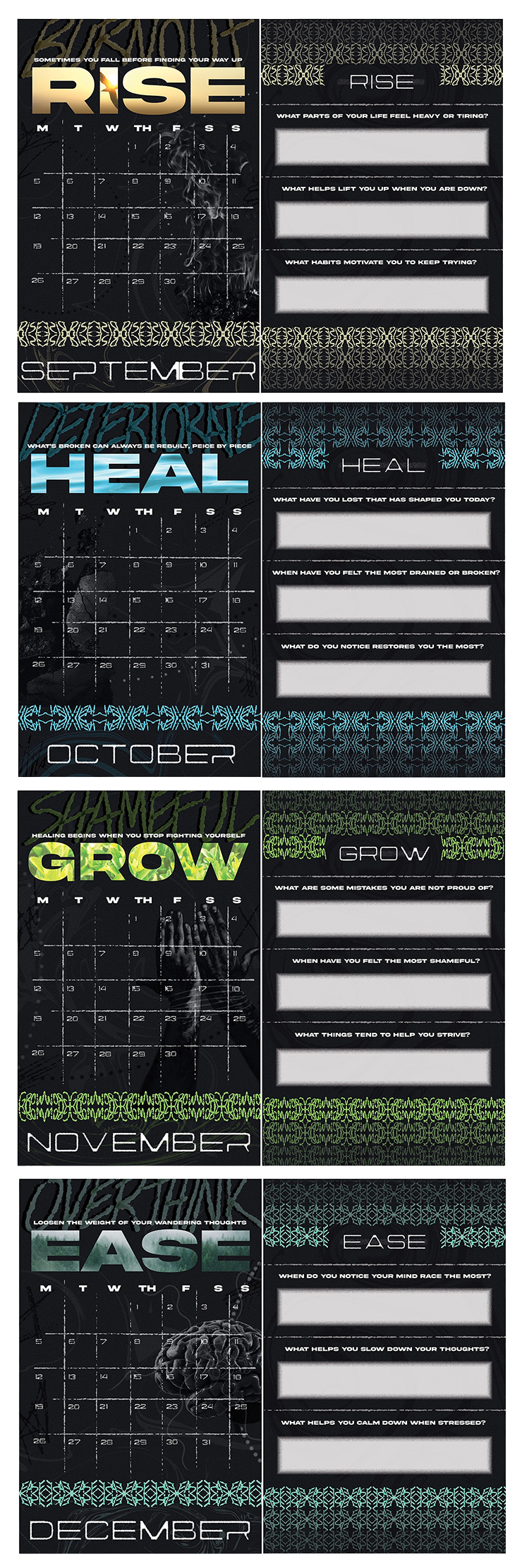
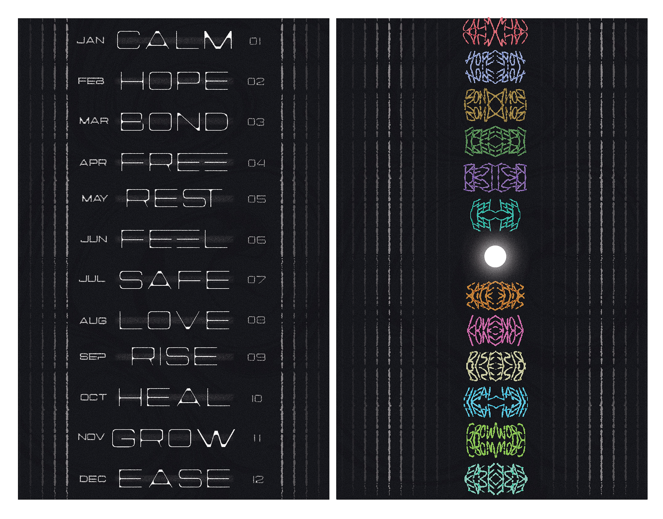
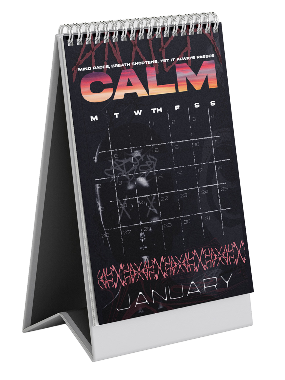
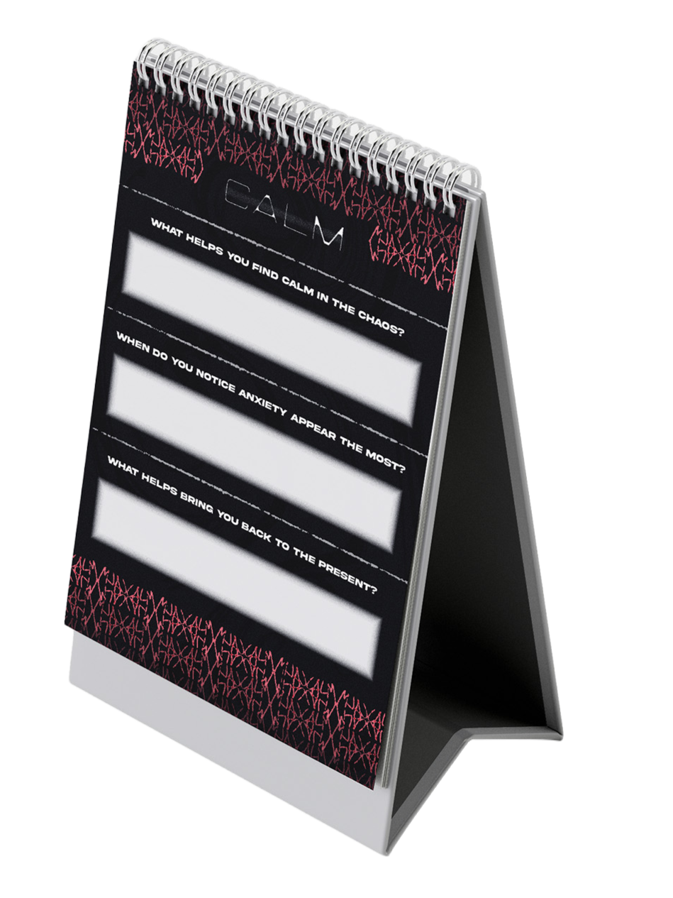
The Mind Is a Powerful Place is a typographic calendar that explores the tension between negative and positive states of mind. Each month features two opposing words represented through layered typography, photography and design. Negative emotions are communicated through analog type and supporting imagery, while positive emotions are expressed through masked imagery and hand-drawn typographic patterns. The back of the calendar serves as a journal, encouraging reflection and providing a space to express thoughts and emotions. Created to visually communicate the power of the mind and the importance of emotional balance, the project aims to be relatable to those navigating mental health challenges. The design process was highly experimental, evolving through numerous explorations of layout, color and style before developing into a cohesive visual system across all twelve months. One of my favorite aspects of the project was creating the hand-drawn analog typography for each positive word, which forms unique patterns throughout the calendar and ultimately became the cover artwork. Overall, the calendar serves as a visual exploration of how the mind can shift from darkness to light.
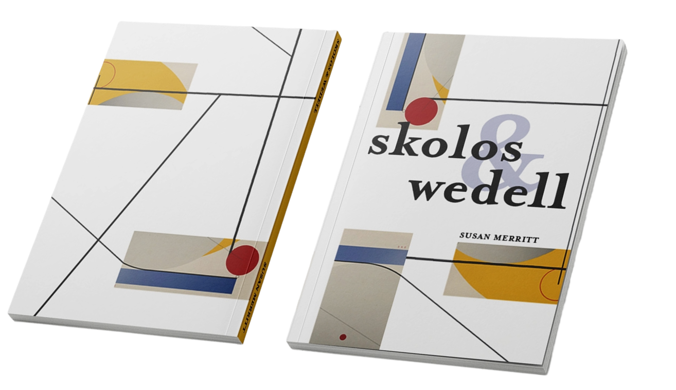
SKOLOS & WEDELL Inspired book
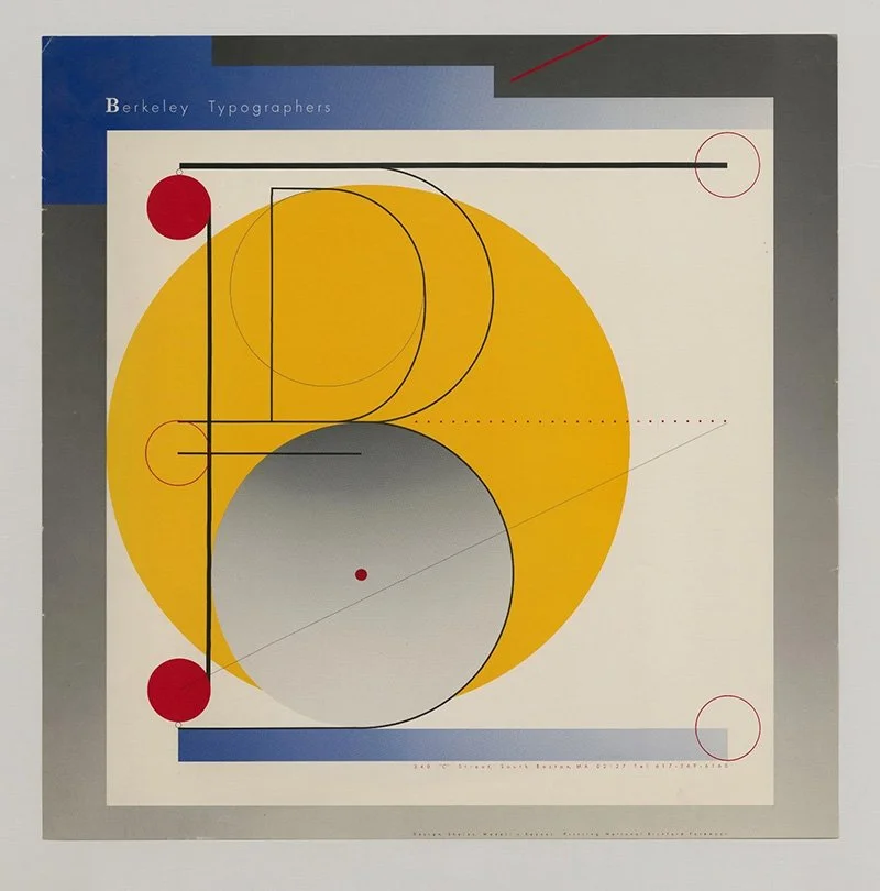
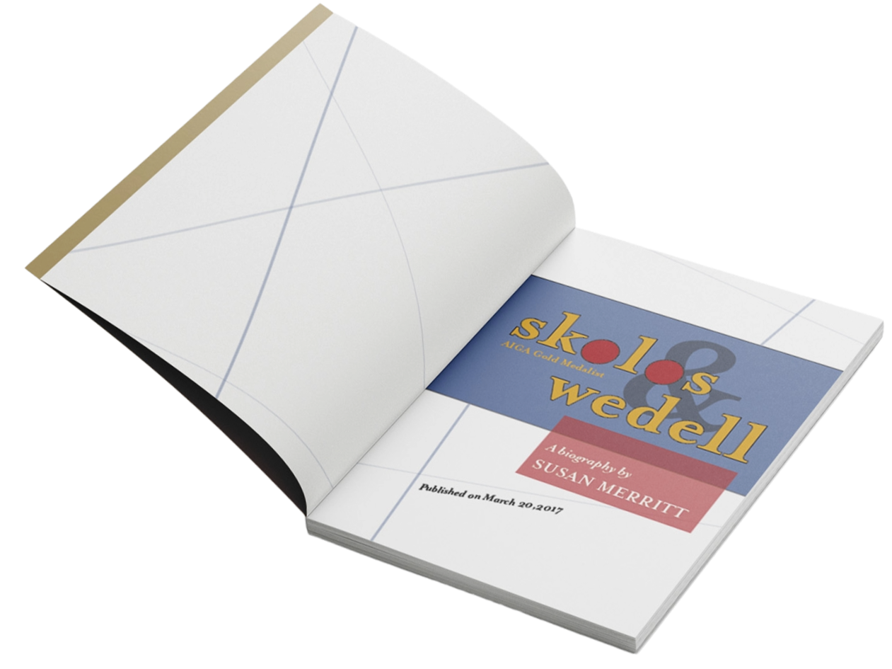
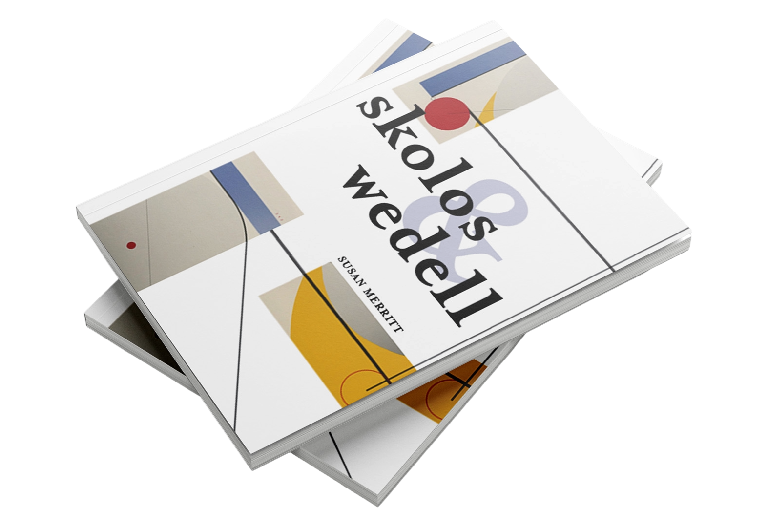
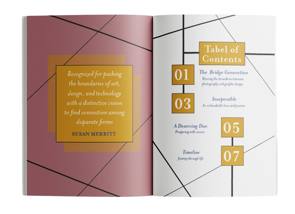
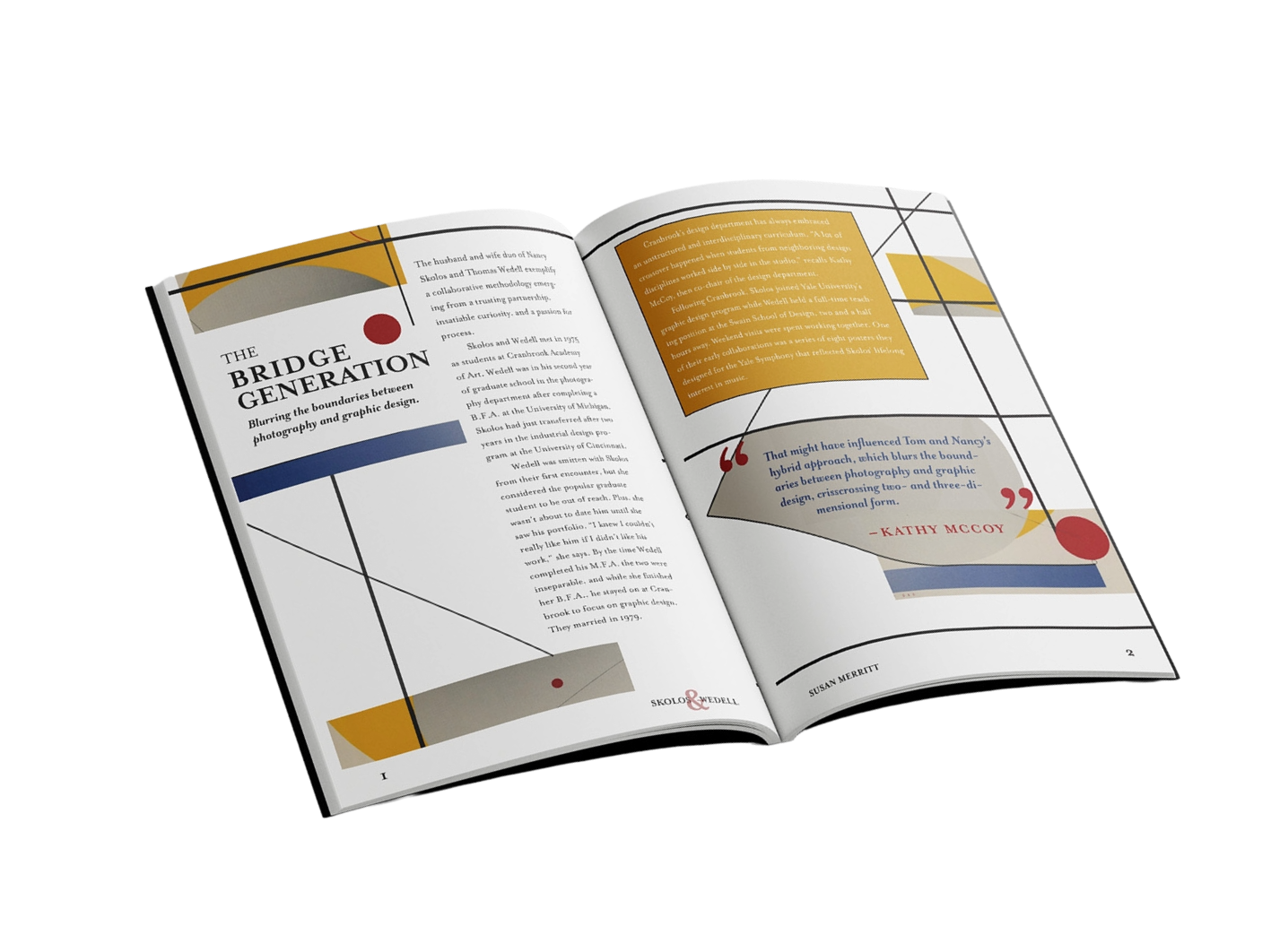
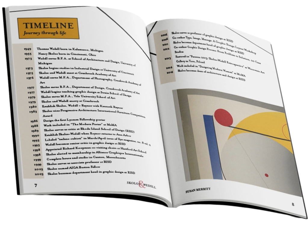
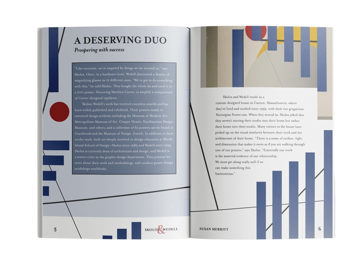
This book was inspired by the work of artist duo Skolos and Wedell. Using one of their collages, pictured above, as the inspiration and foundation for the project, I wanted to carry the same visual aesthetic throughout the entire book while incorporating my own typographic approach. I matched the vibe of their original design across each page through abstract lines, shapes and the same yellow, blue and red color palette. Overall, I wanted to preserve the same style that Skolos and Wedell use in their collage while adding my own creative twist.
COSTA RICA PASSION GUIDE

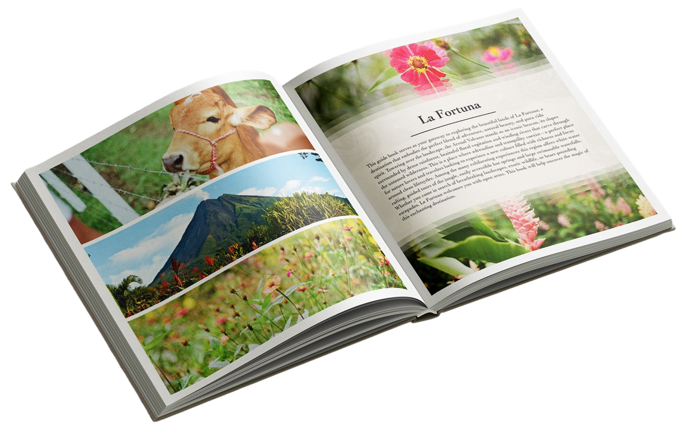
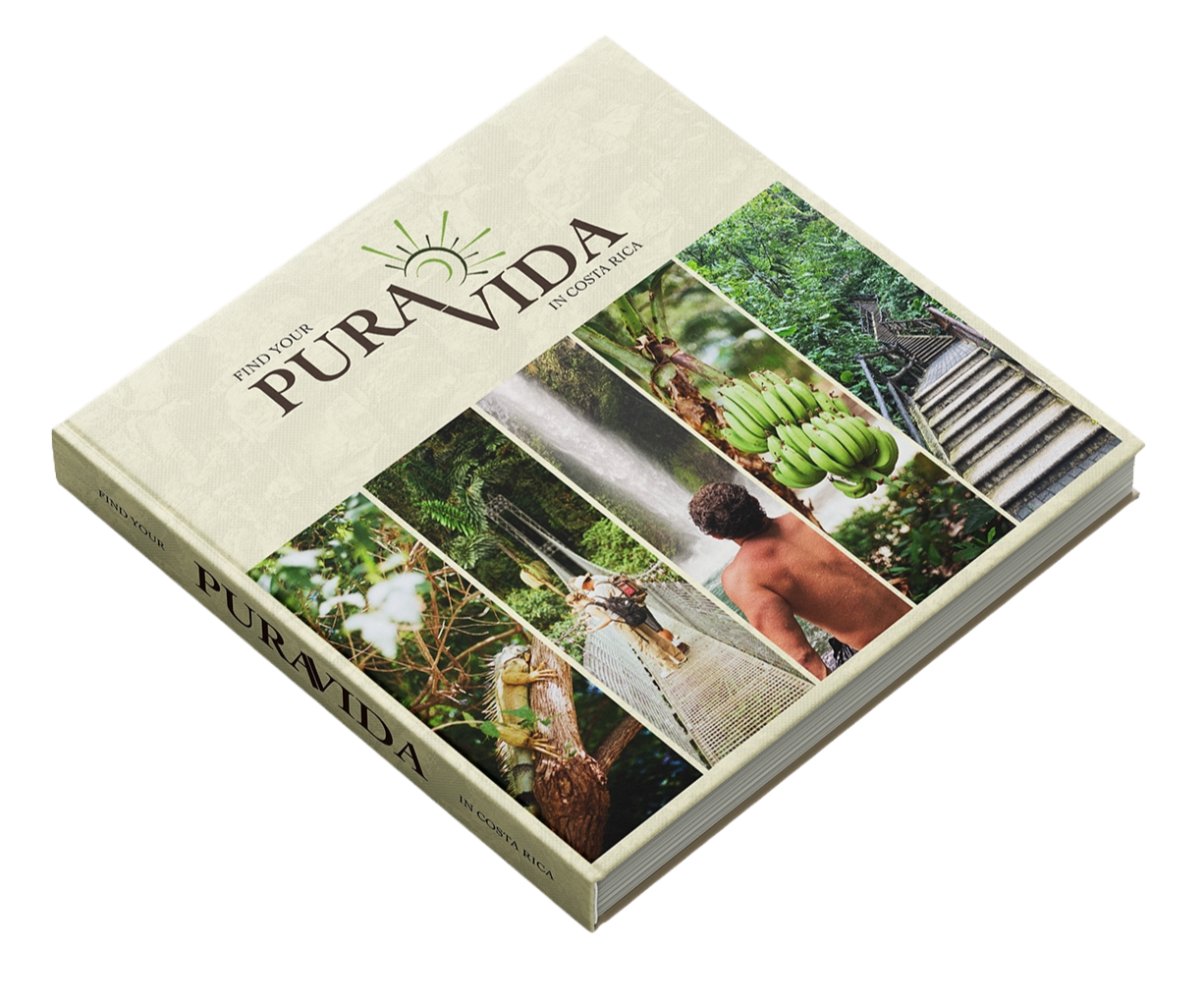
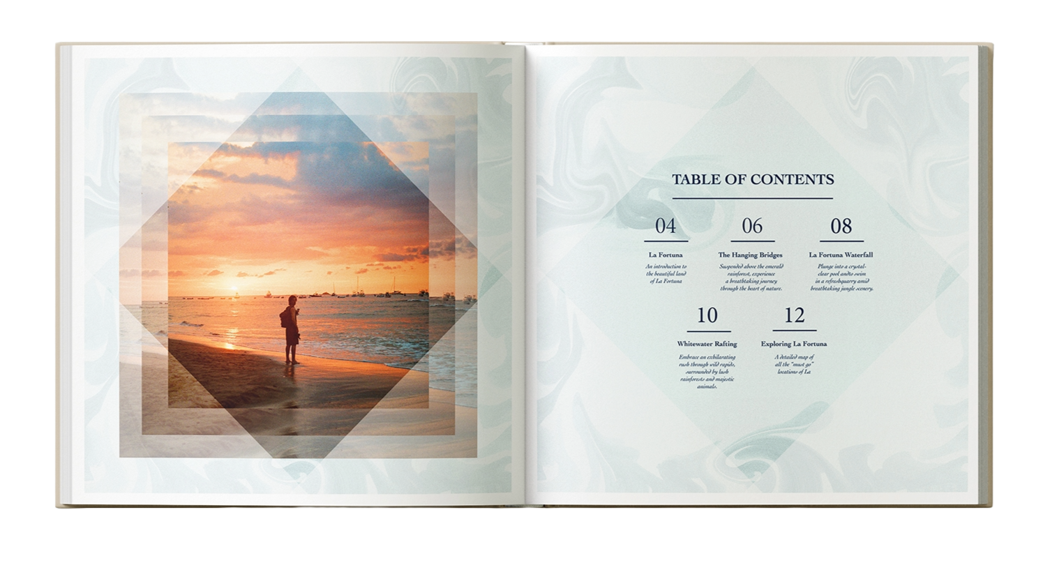
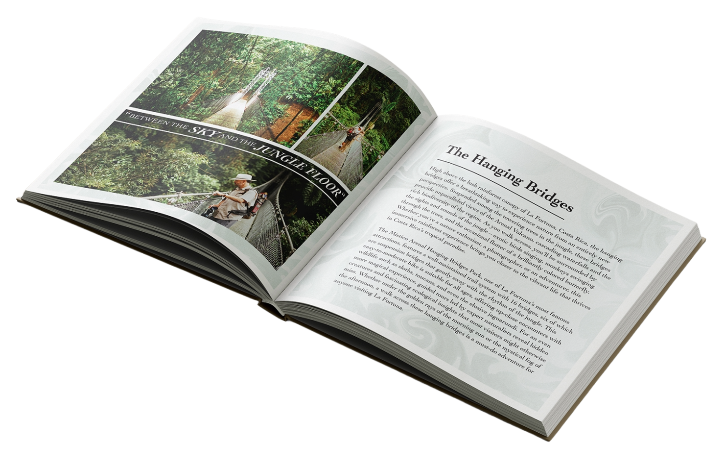
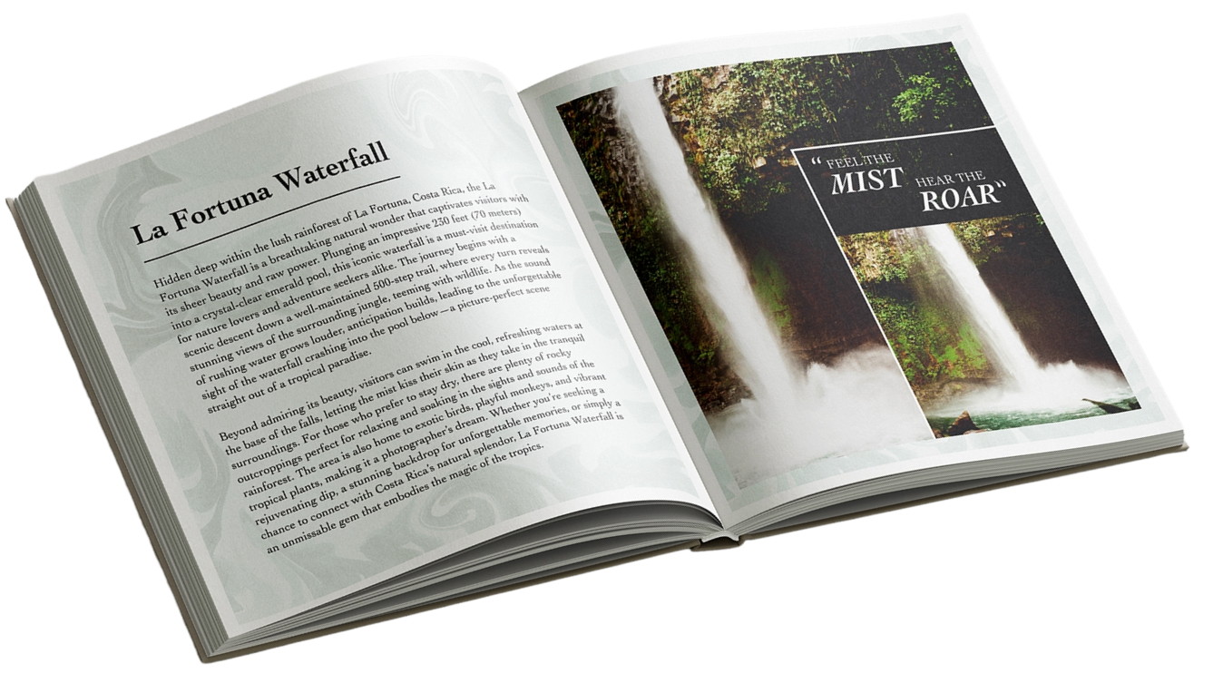
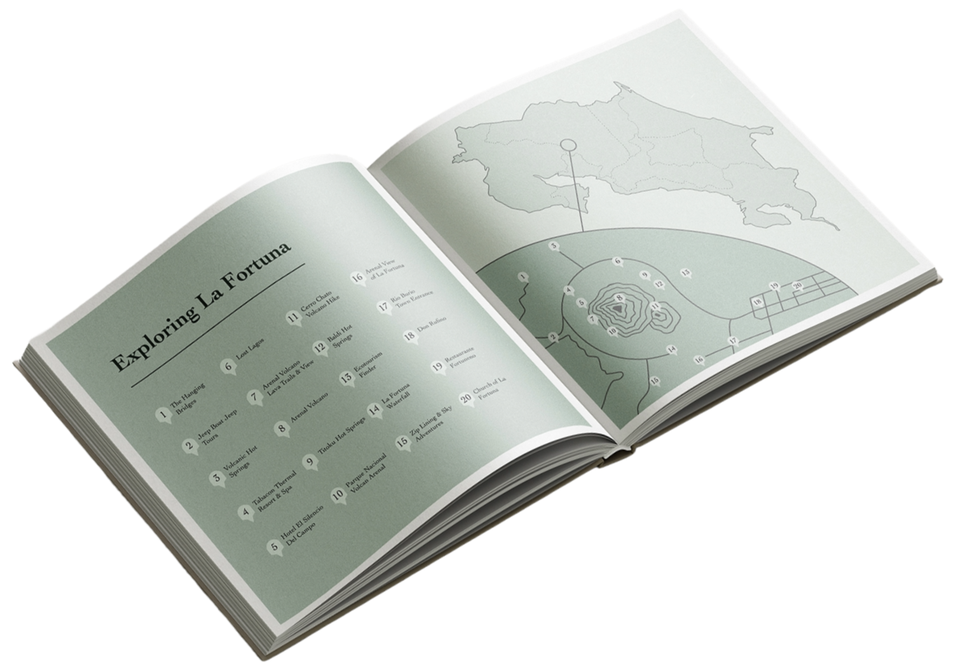
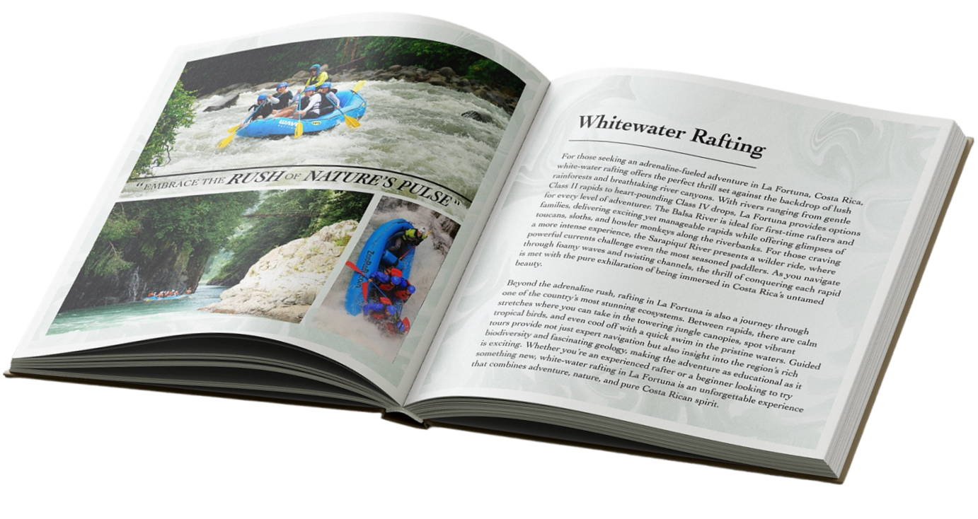
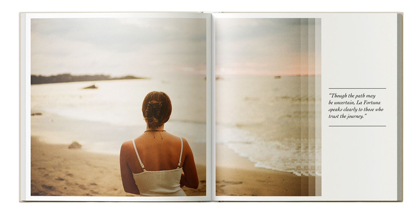
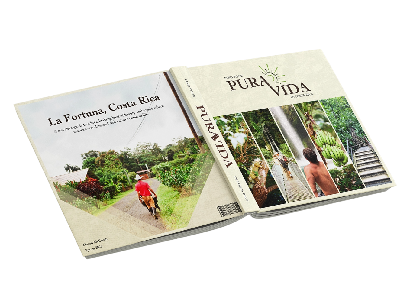
This passion guide was created from my own experience traveling to Costa Rica in 2024. Every photograph featured in the book was taken by me during my trip there, specifically in the La Fortuna rainforest. I was inspired by the beauty of the landscape, the culture and the atmosphere and wanted to create a quick, visually engaging guide that would give readers a sense of what it feels like to be there. Through photography, short descriptions of places to visit and a simple map on the back, the book offers an introduction to some of the best sights and experiences in the region. Overall, I wanted the design to reflect the natural beauty of Costa Rica through an aesthetic that feels lush and rooted in its environment.
Penguin BOOK COVER
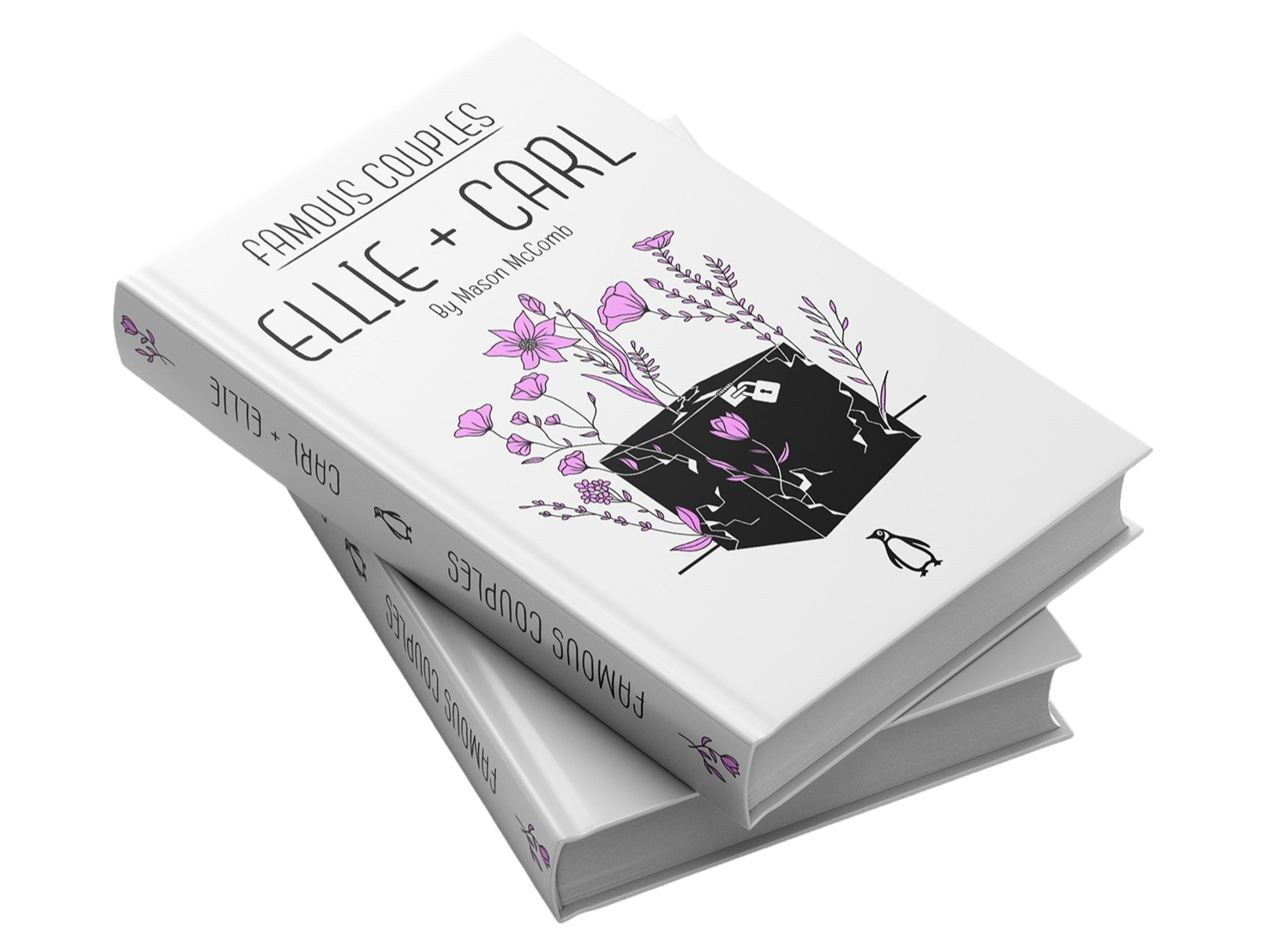
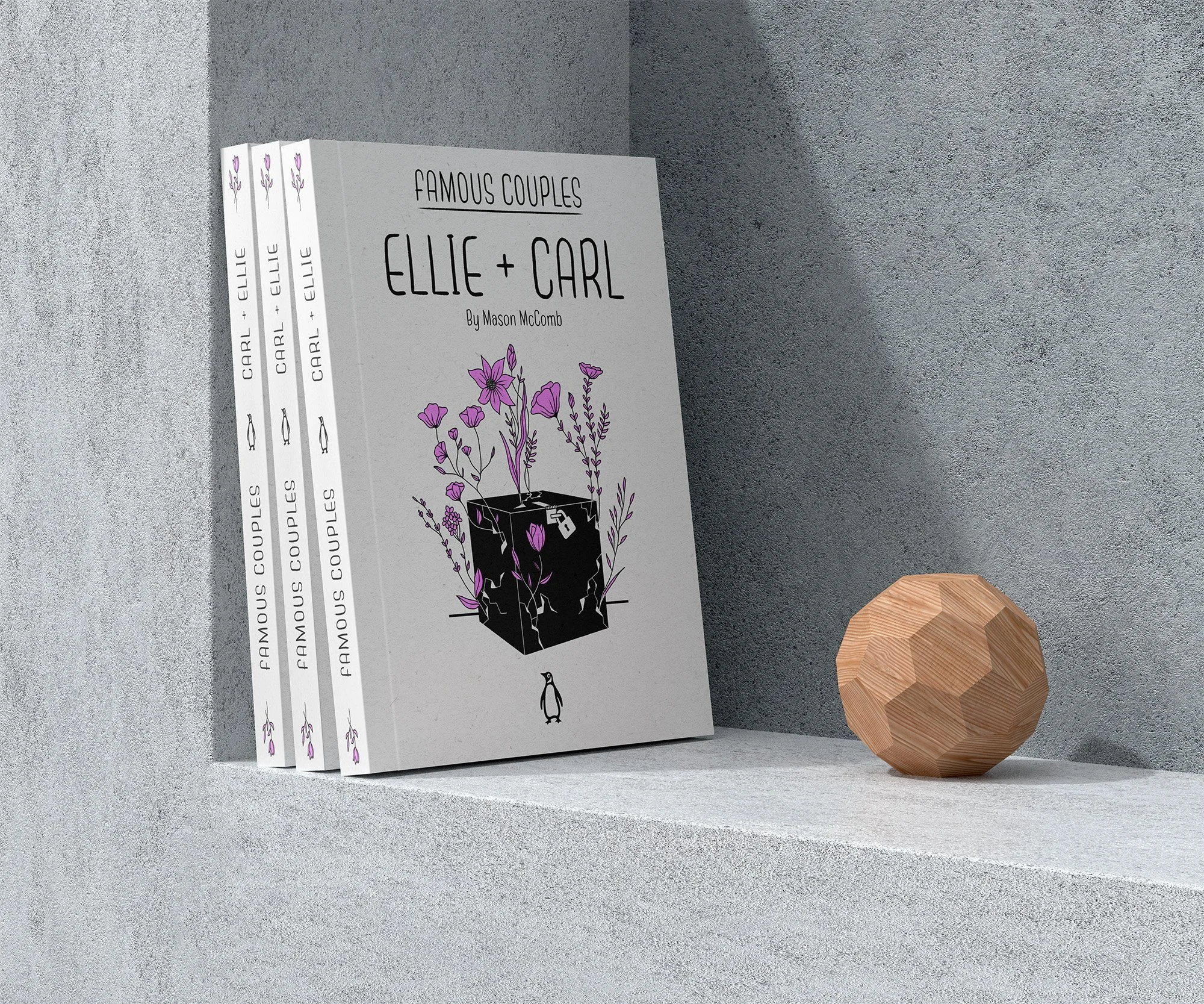
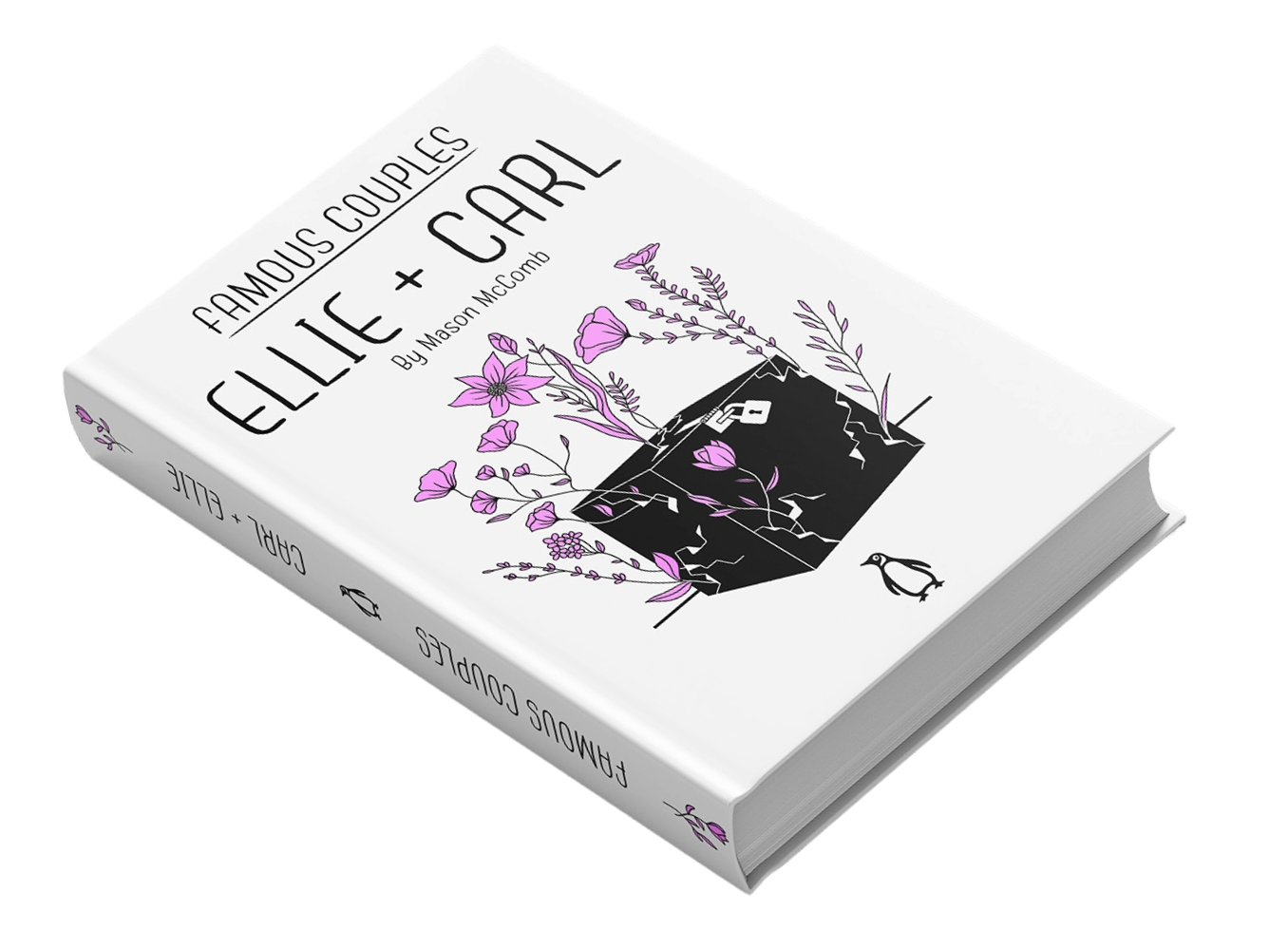
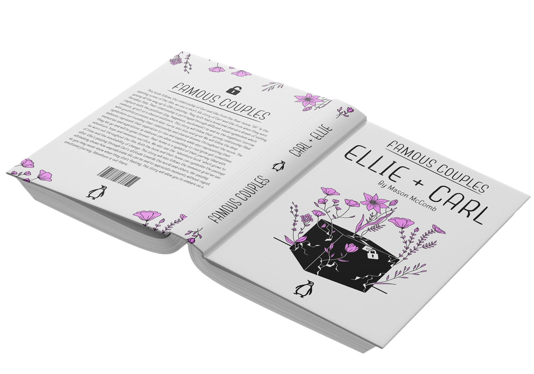
This cover was created for a Famous Couples book series and focuses on the relationship between Ellie and Carl from the Pixar movie Up. Rather than representing their story in a literal way, I wanted to capture their emotional relationship through symbolism and analogy. The black box safe represents Carl’s personality at the beginning of the film: closed off, guarded, grumpy and emotionally flat. The pink flowers blooming from the box symbolize Ellie, whose warmth, joy, kindness and optimism bring out the best in Carl and allow him to open up. After her passing, Carl becomes withdrawn and miserable, but after carrying out their dream of reaching Paradise Falls, he feels that sense of joy and adventure again that she brought into his life. Overall, the concept reflects their emotional relationship and how Ellie truly transformed Carl, helping him break out of his shell.
FRUTIGER TYPE STUDY
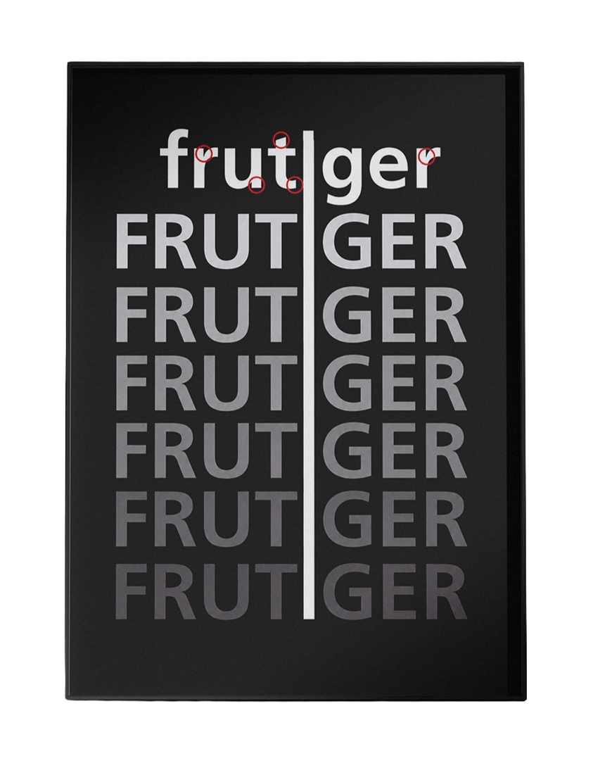
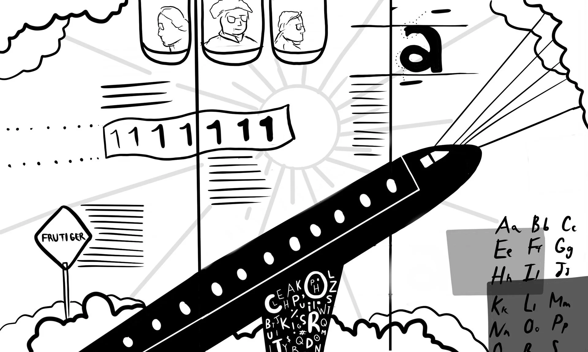
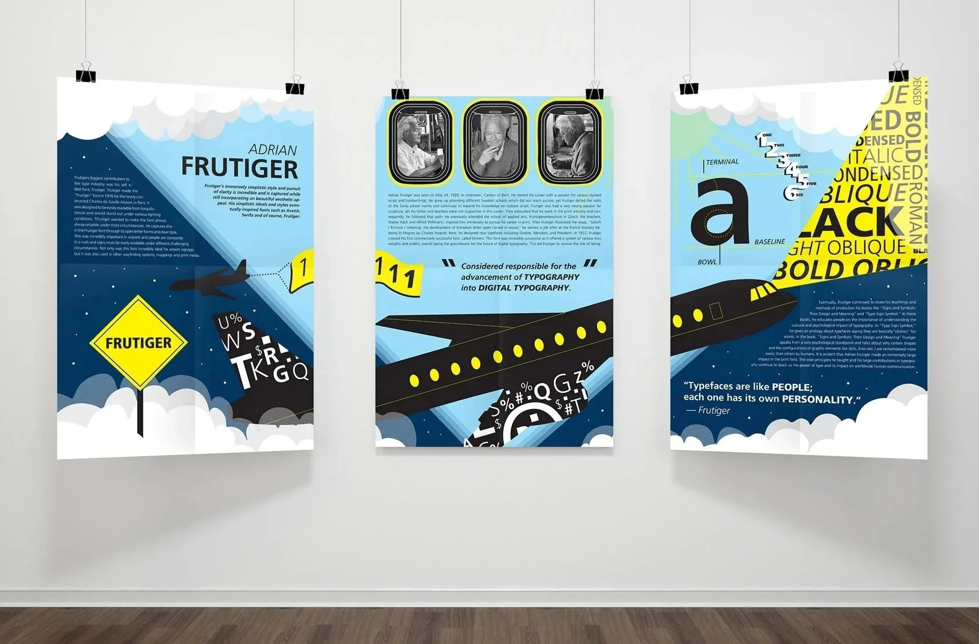
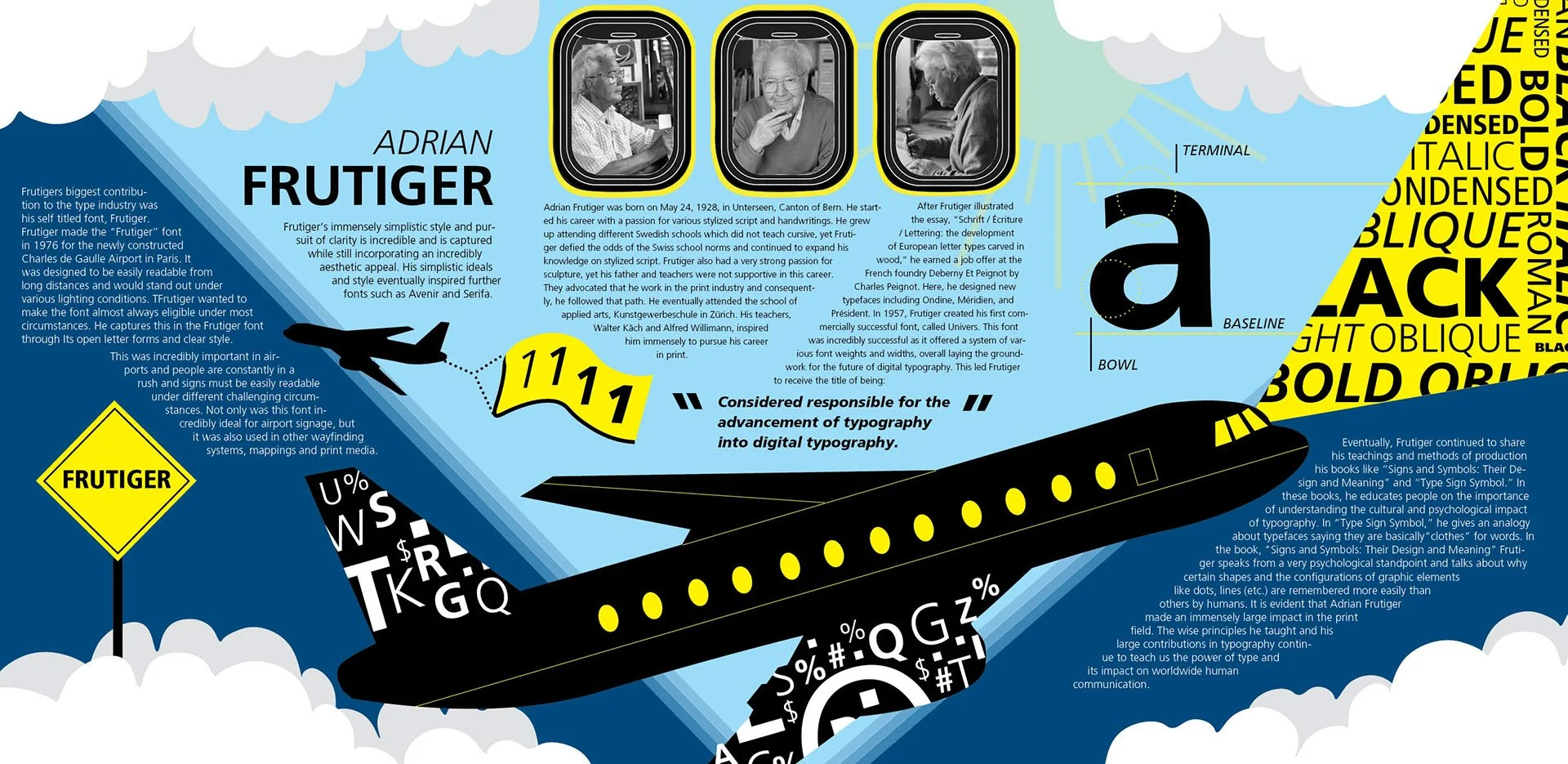
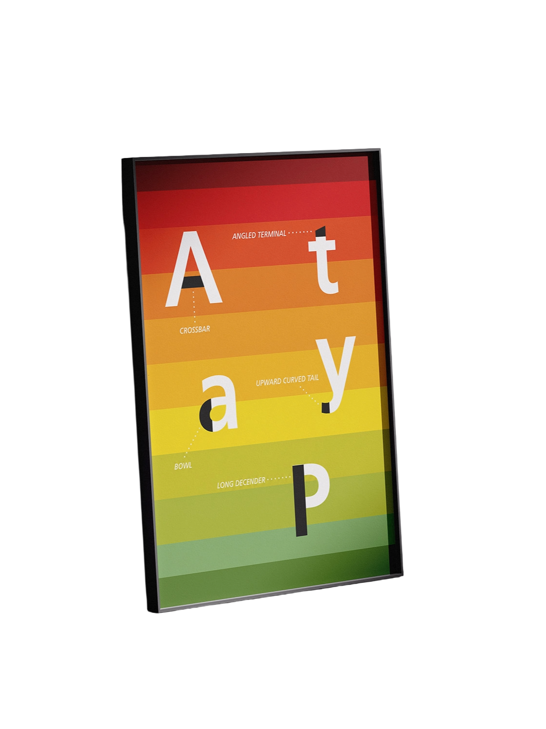
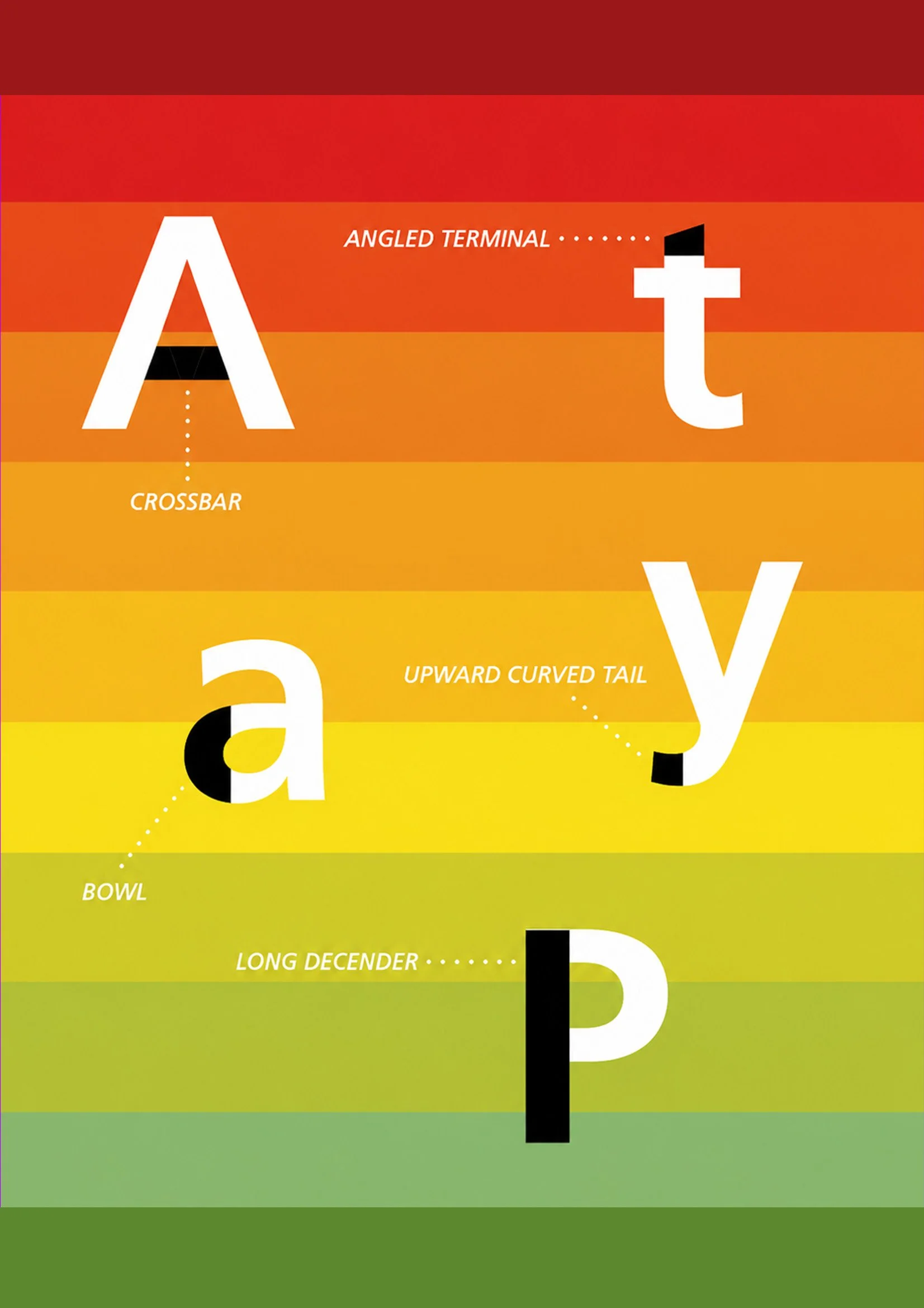
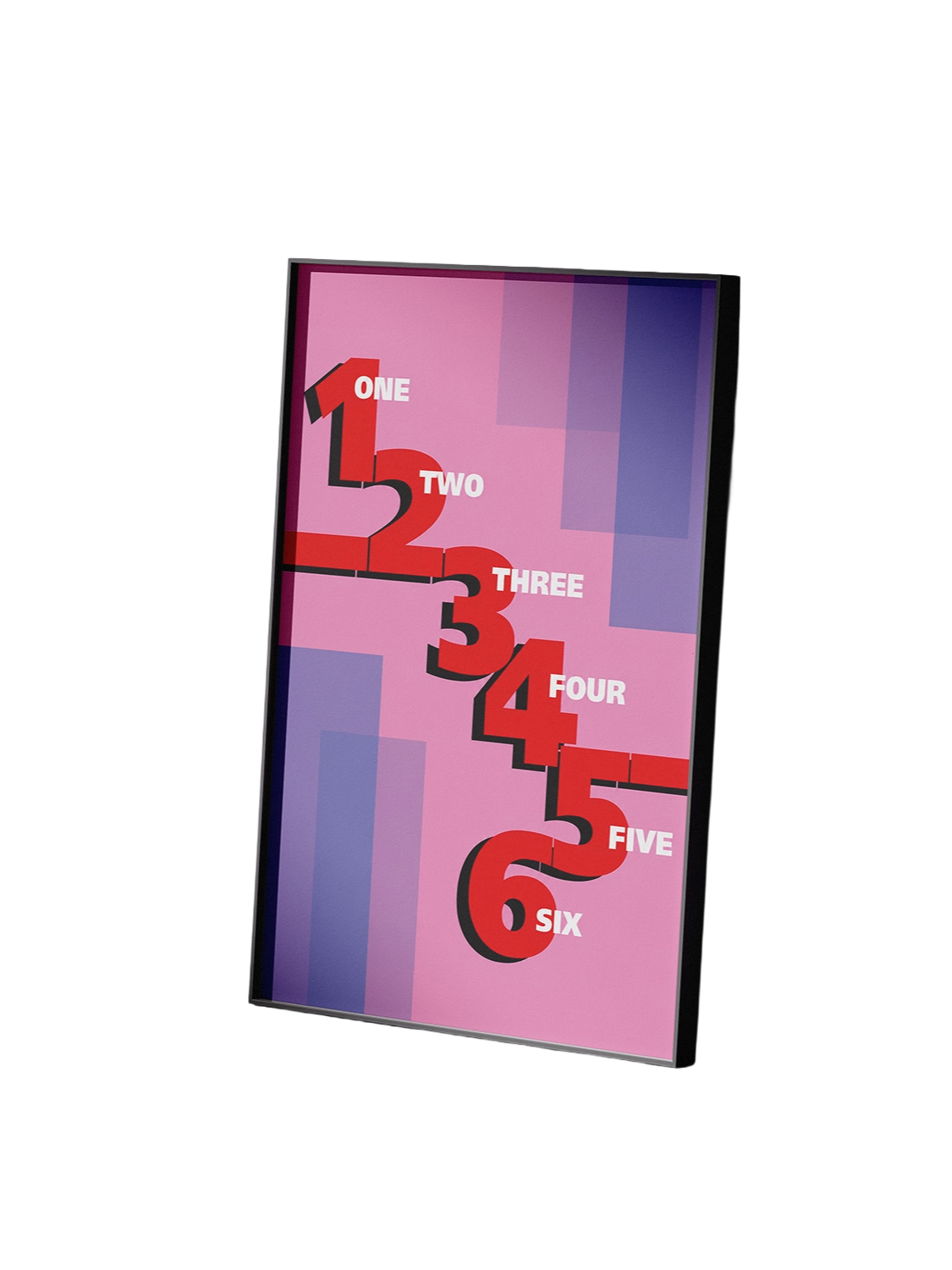
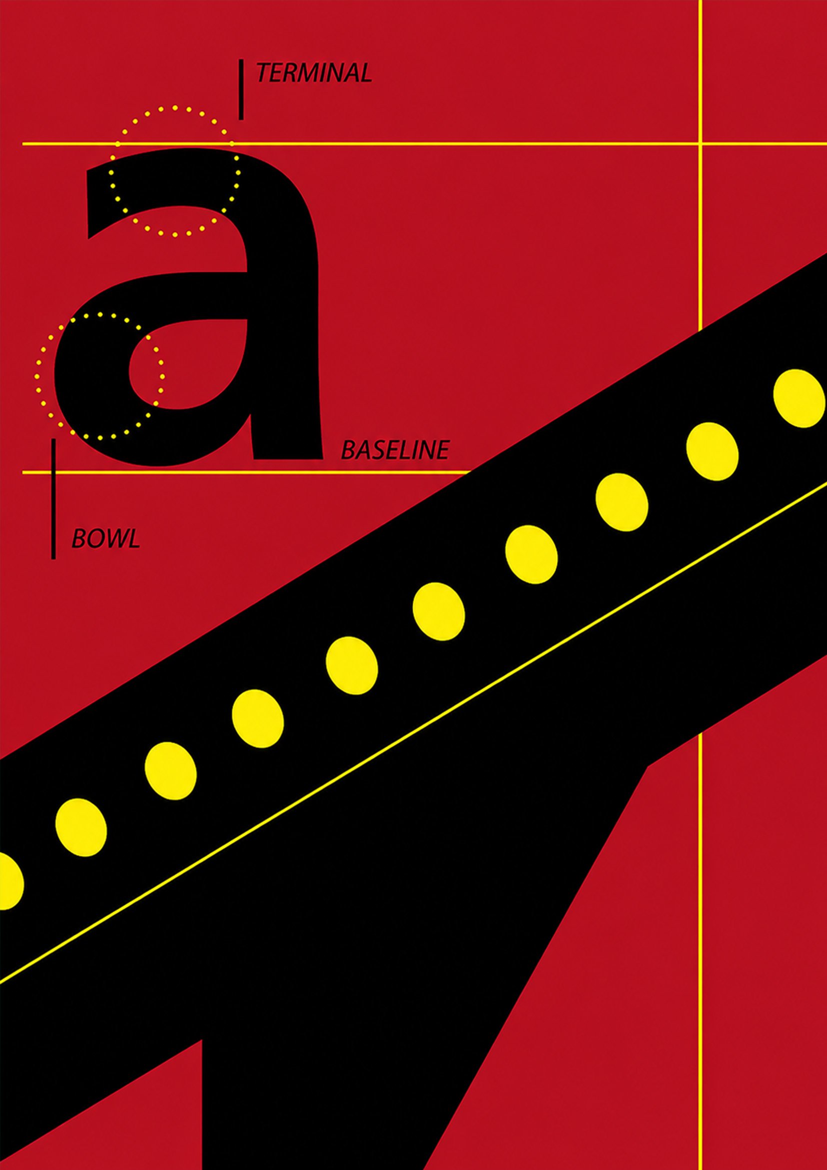
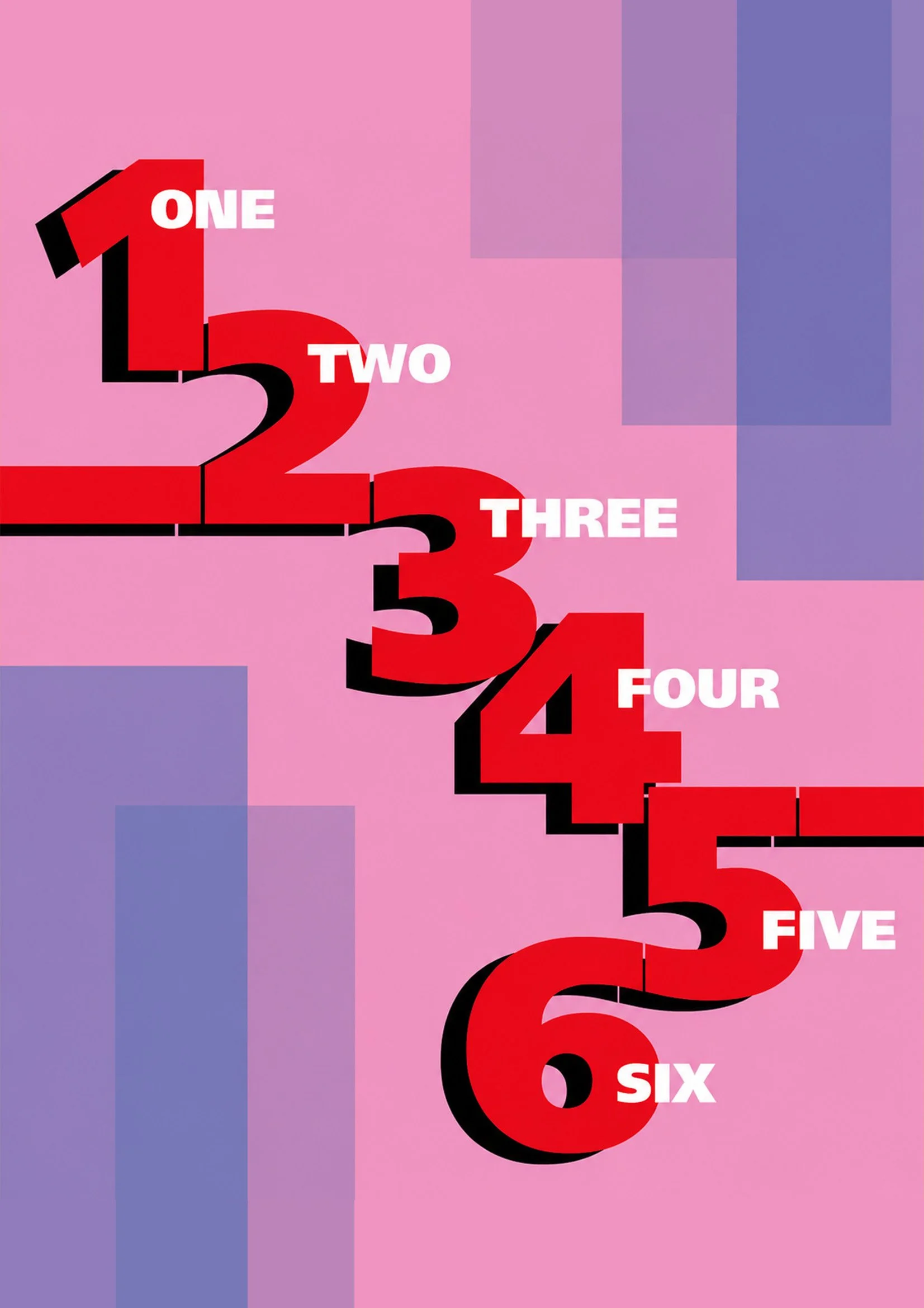
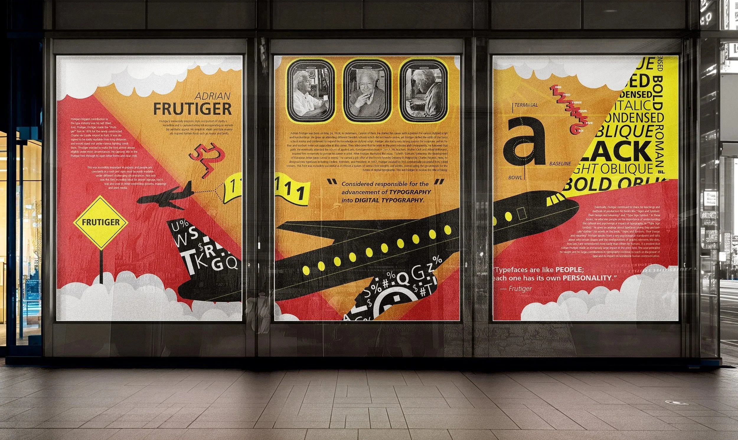
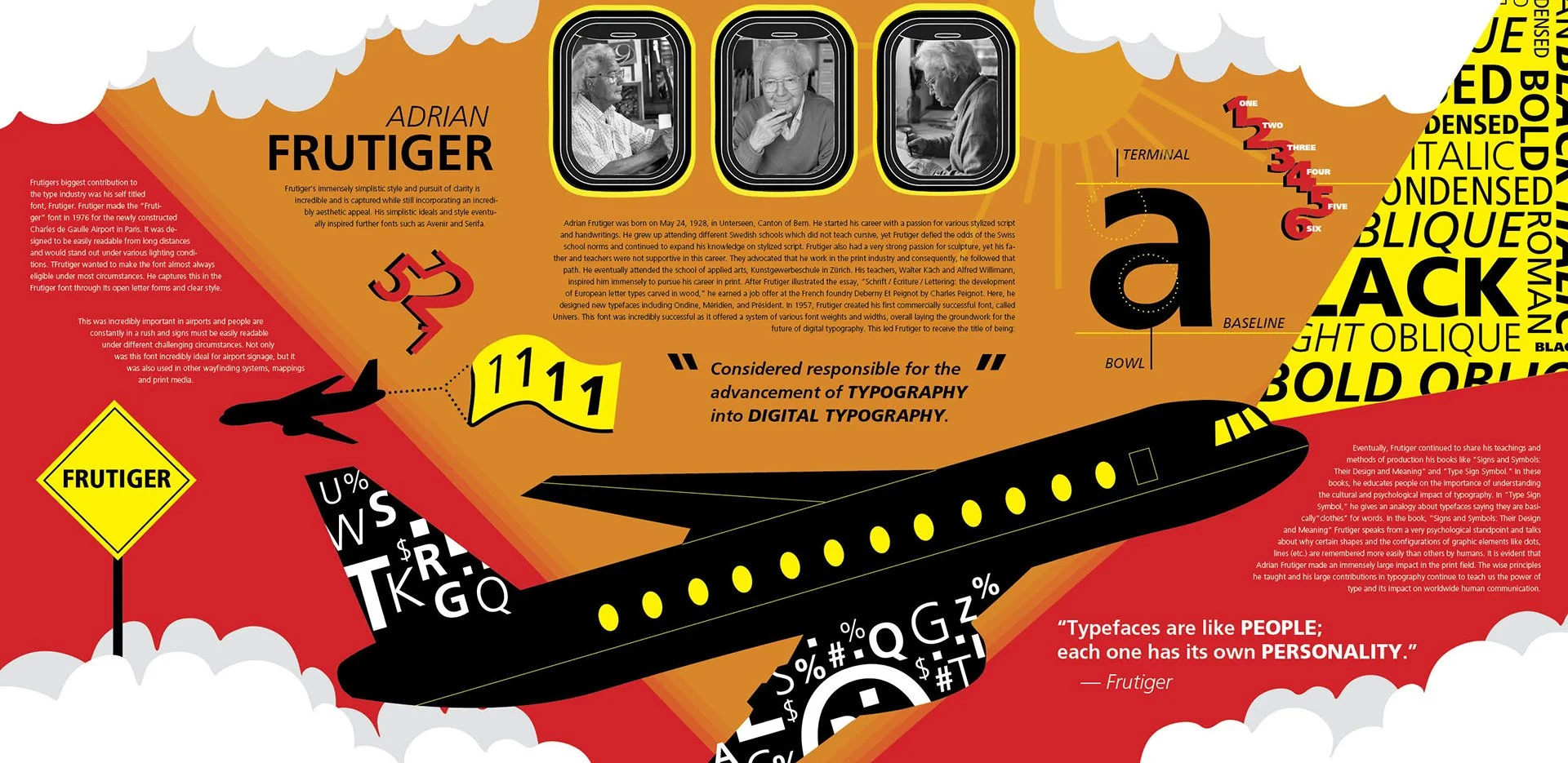
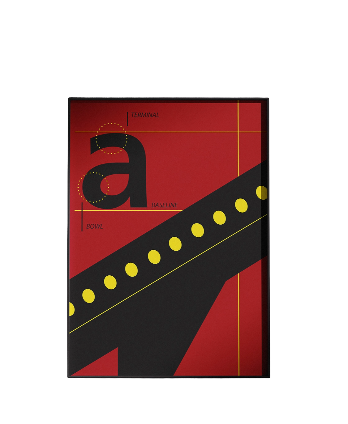
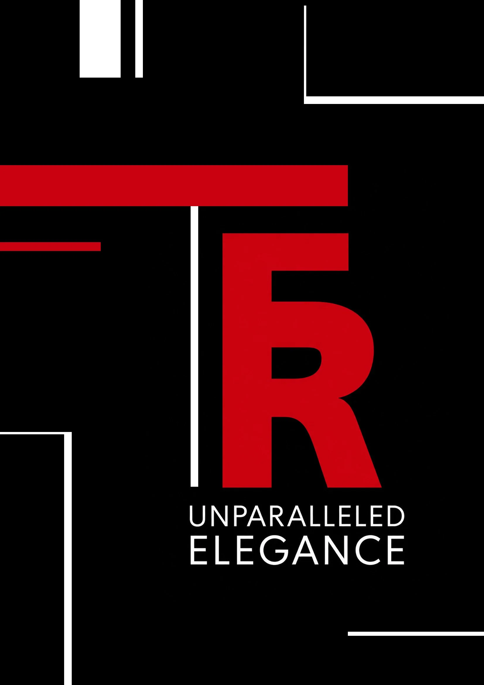
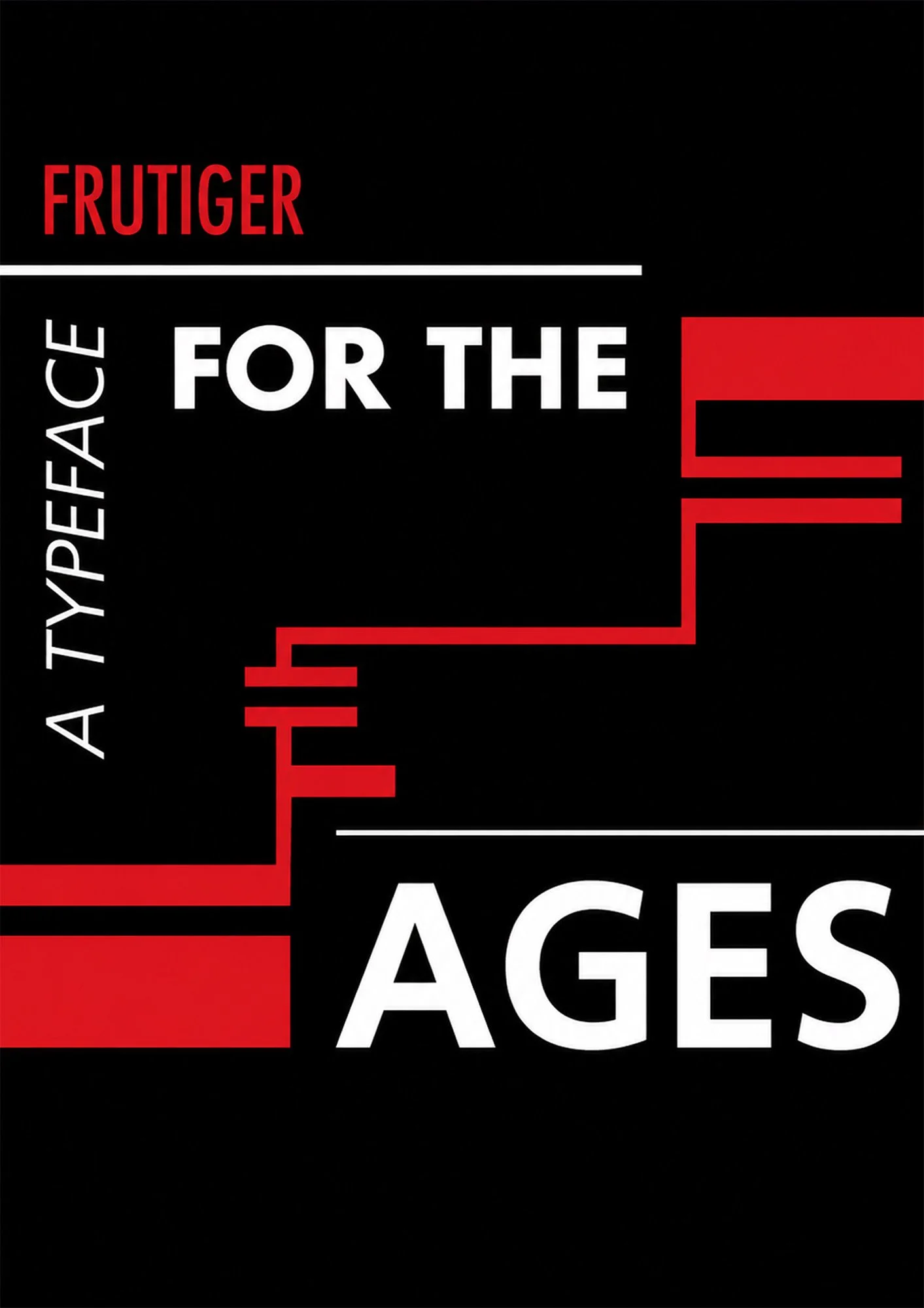
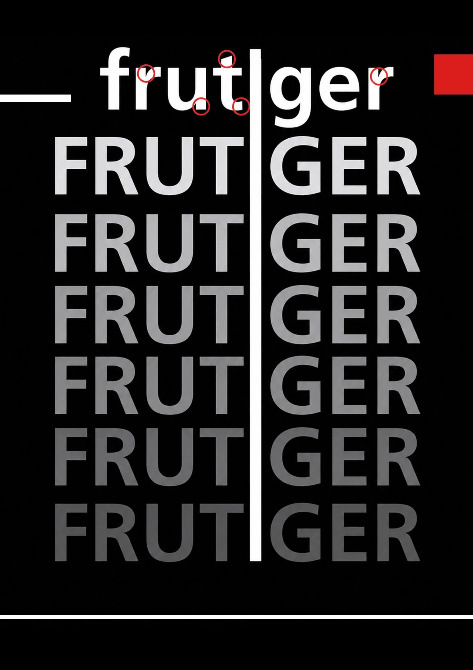
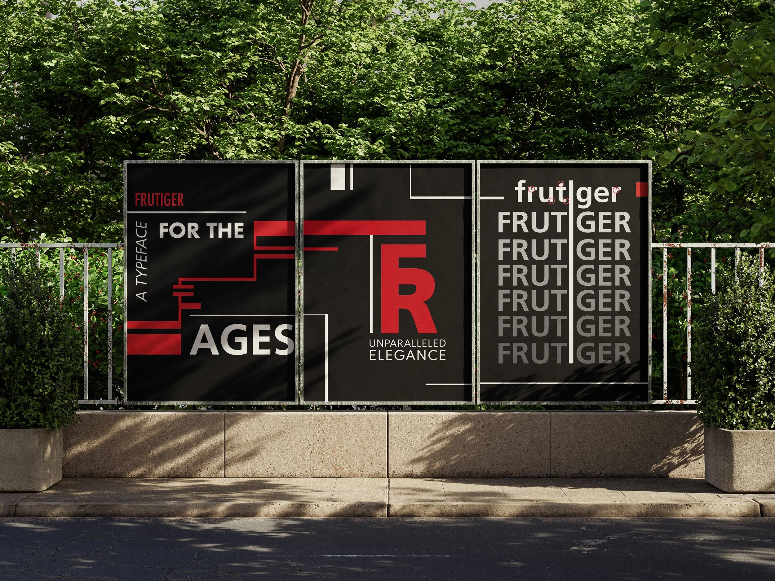
For this type study, I focused on Frutiger, a typeface that has always stood out to me because of how recognizable it is in everyday life. It is very popular as it is widely used for signage in airports, train stations, transit systems, highways and other public spaces due to its bold, highly legible and functional design. I centered this project around aviation specifically. Frutiger's clarity and readability make it especially effective in fast-paced environments where information needs to be understood quickly, at a glance. The project includes a series of triptych and individual posters that explore the different characteristics of the Frutiger typeface and what makes it such a successful choice for signage. One of the triptych series focuses on Adrian Frutiger himself and the history behind his iconic typeface.
SKETCH CONCEPT