branding
Unilyte
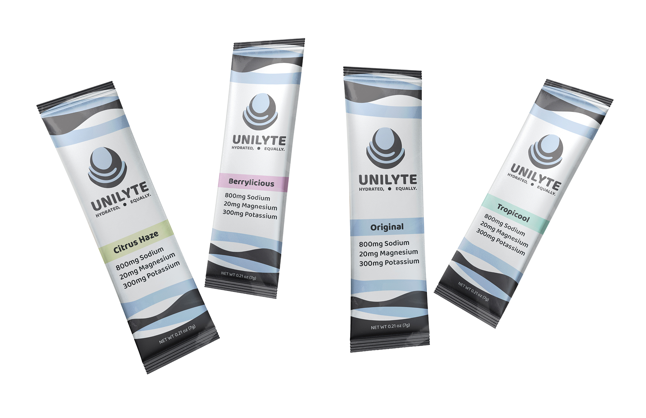
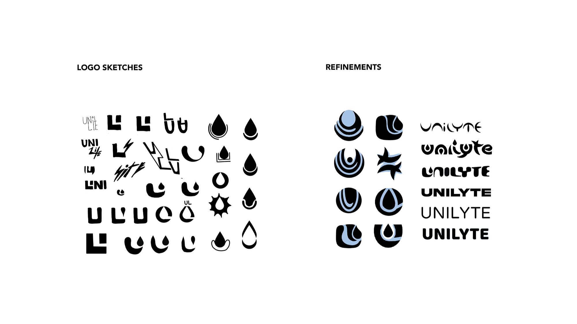
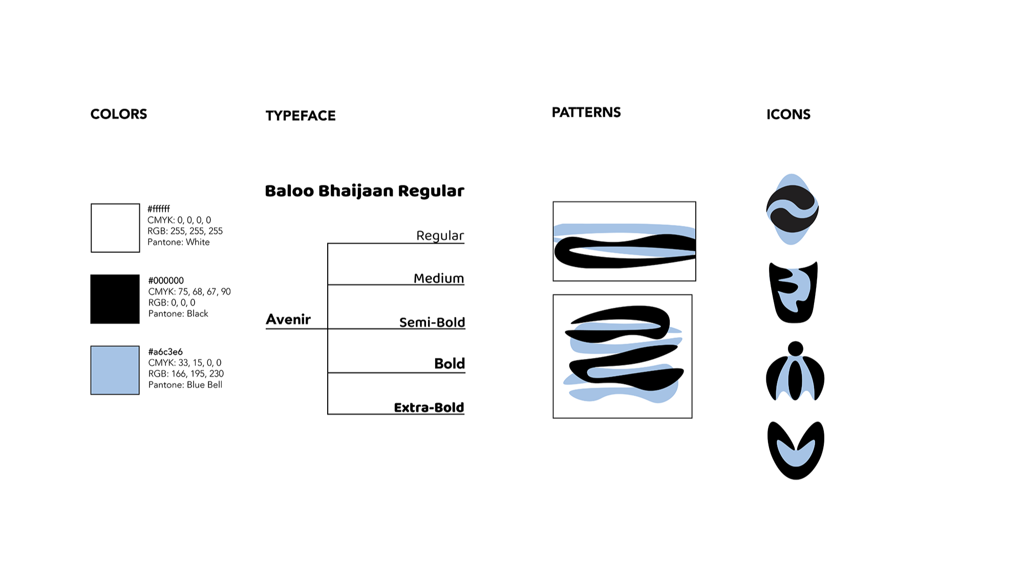
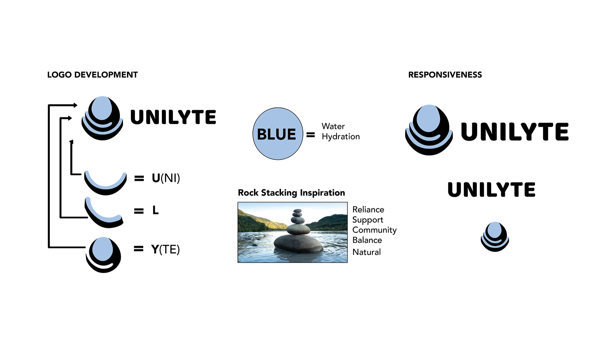
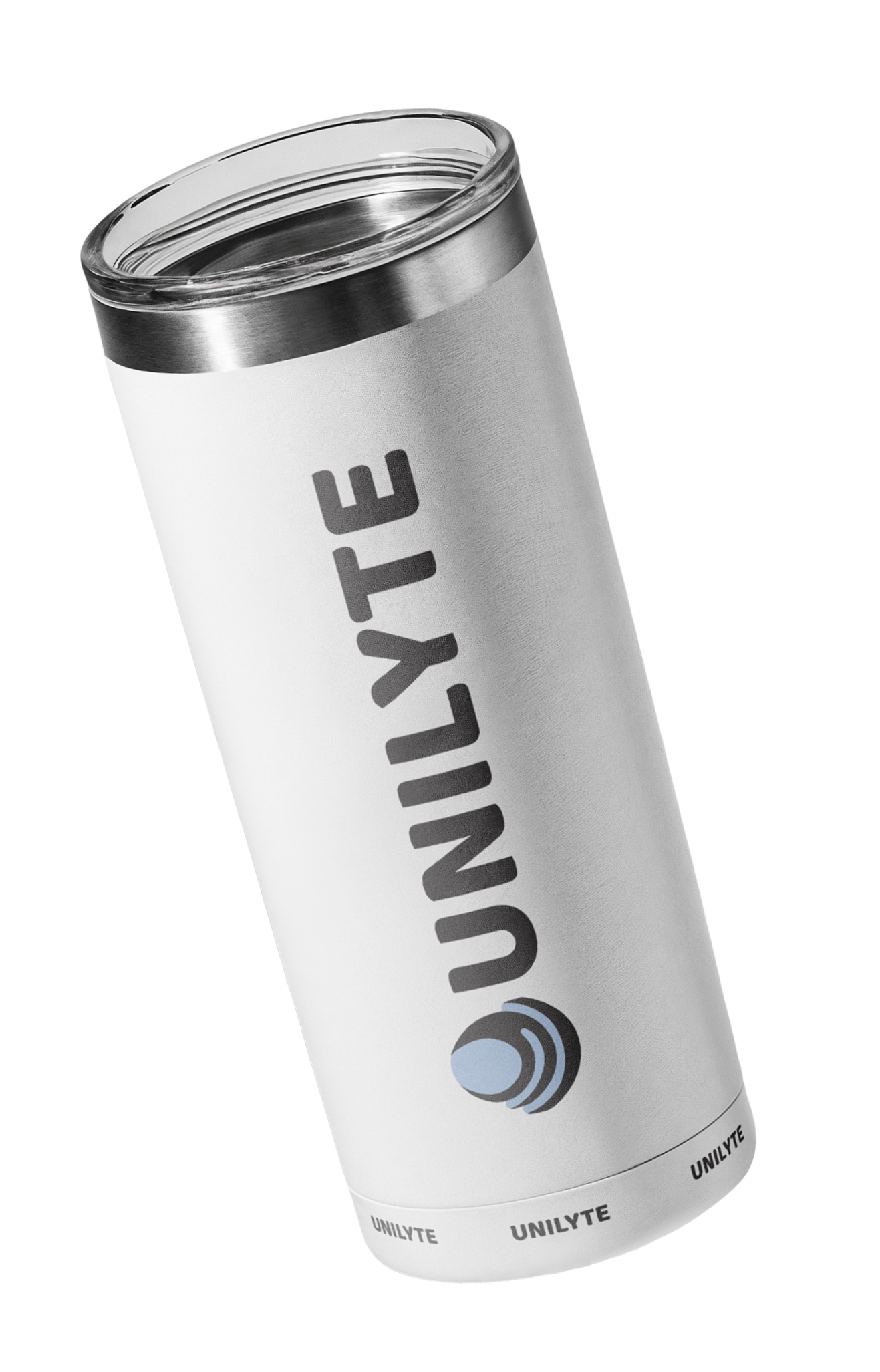
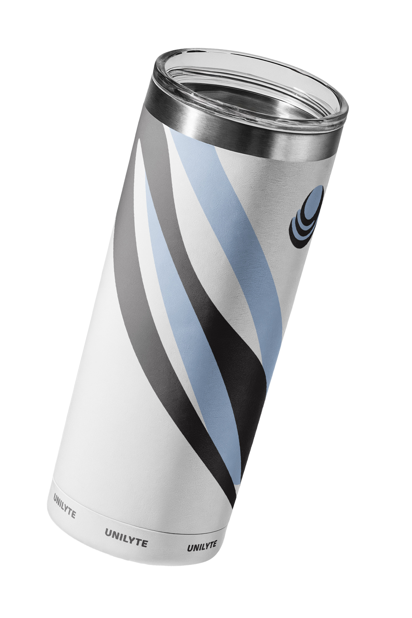
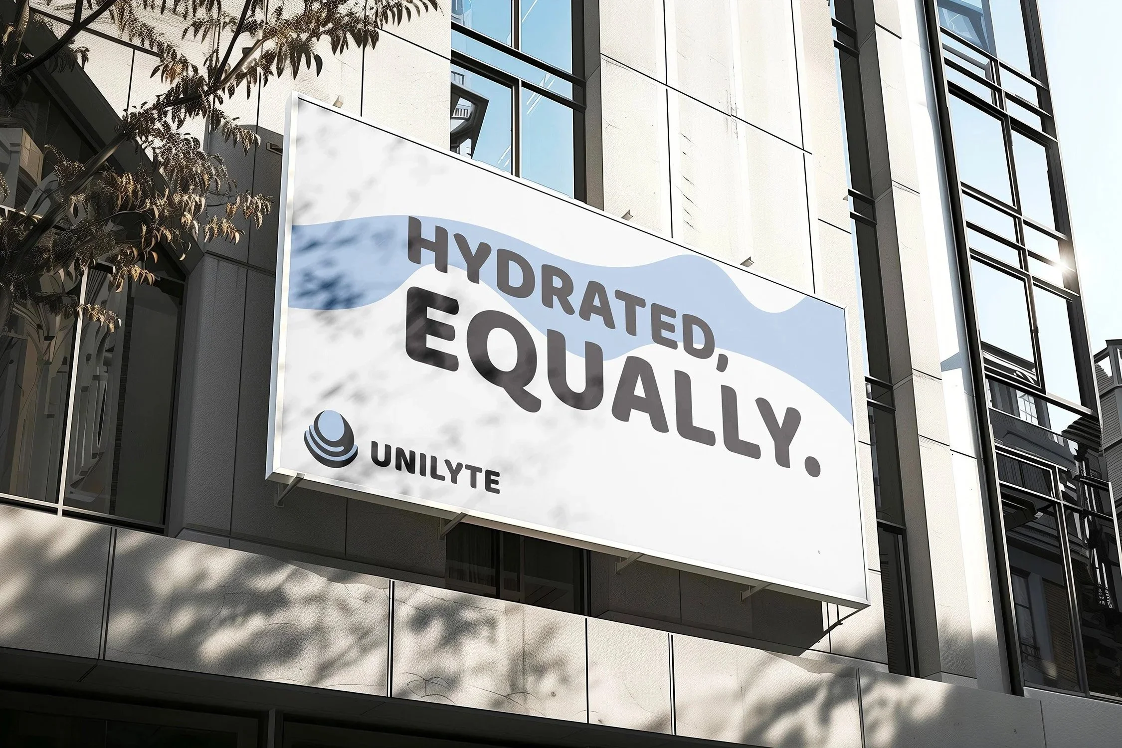
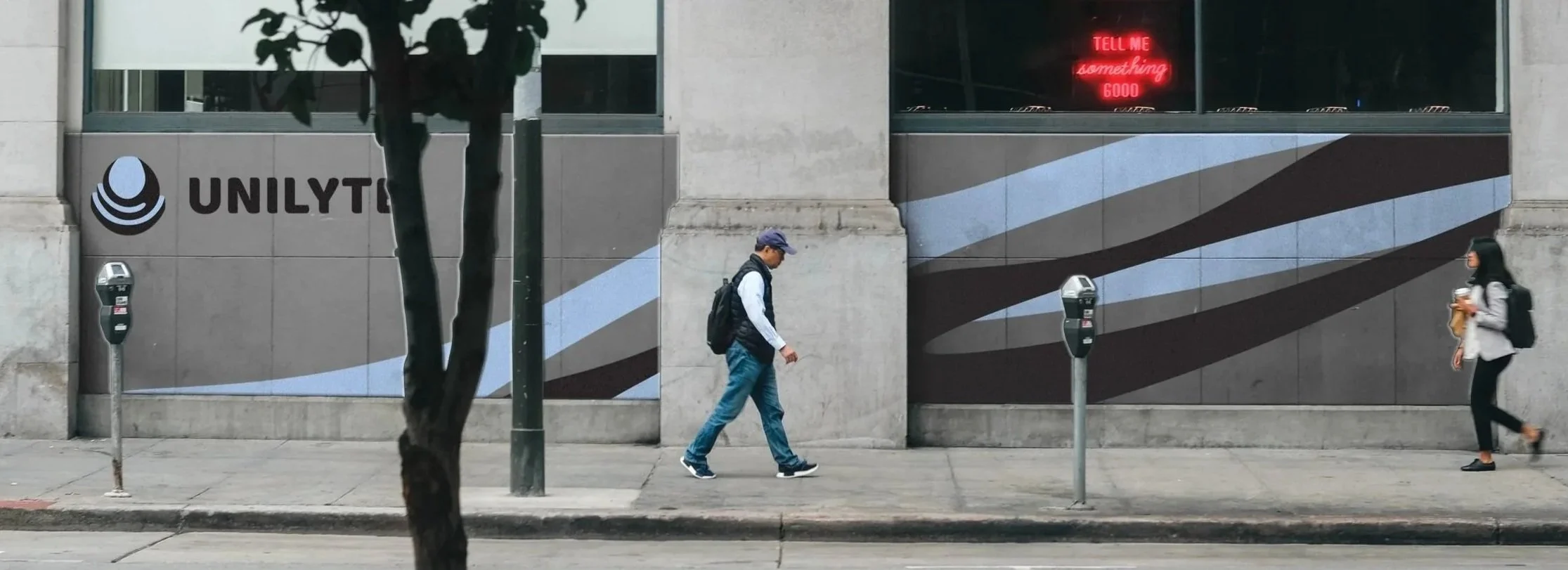
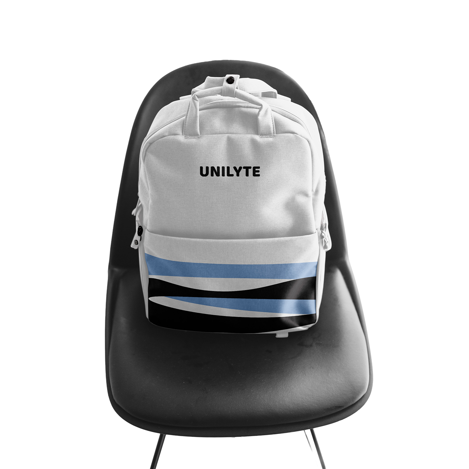
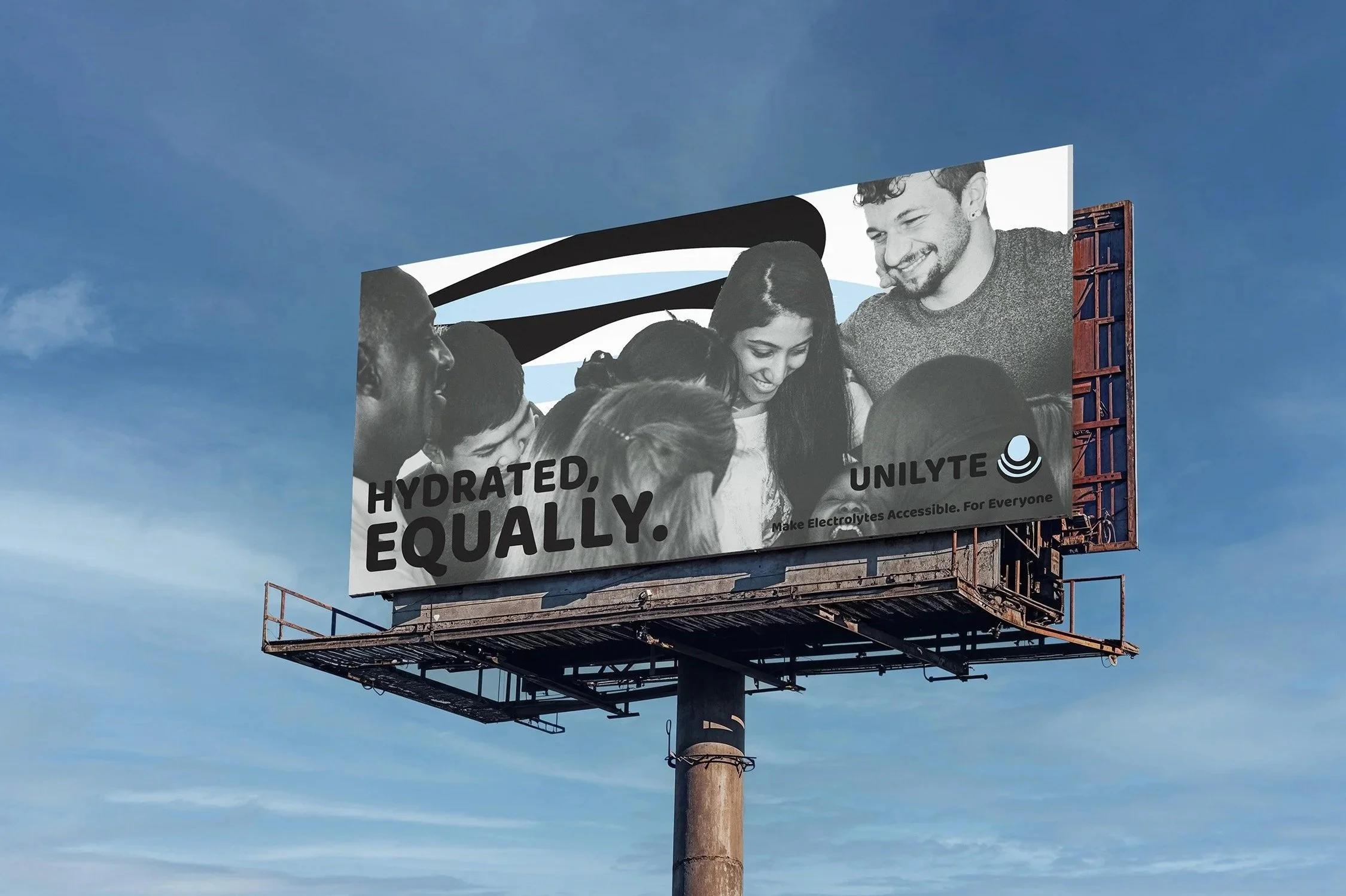
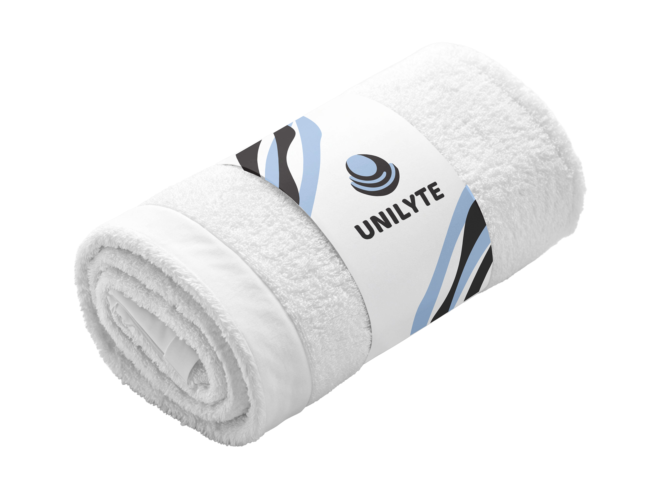
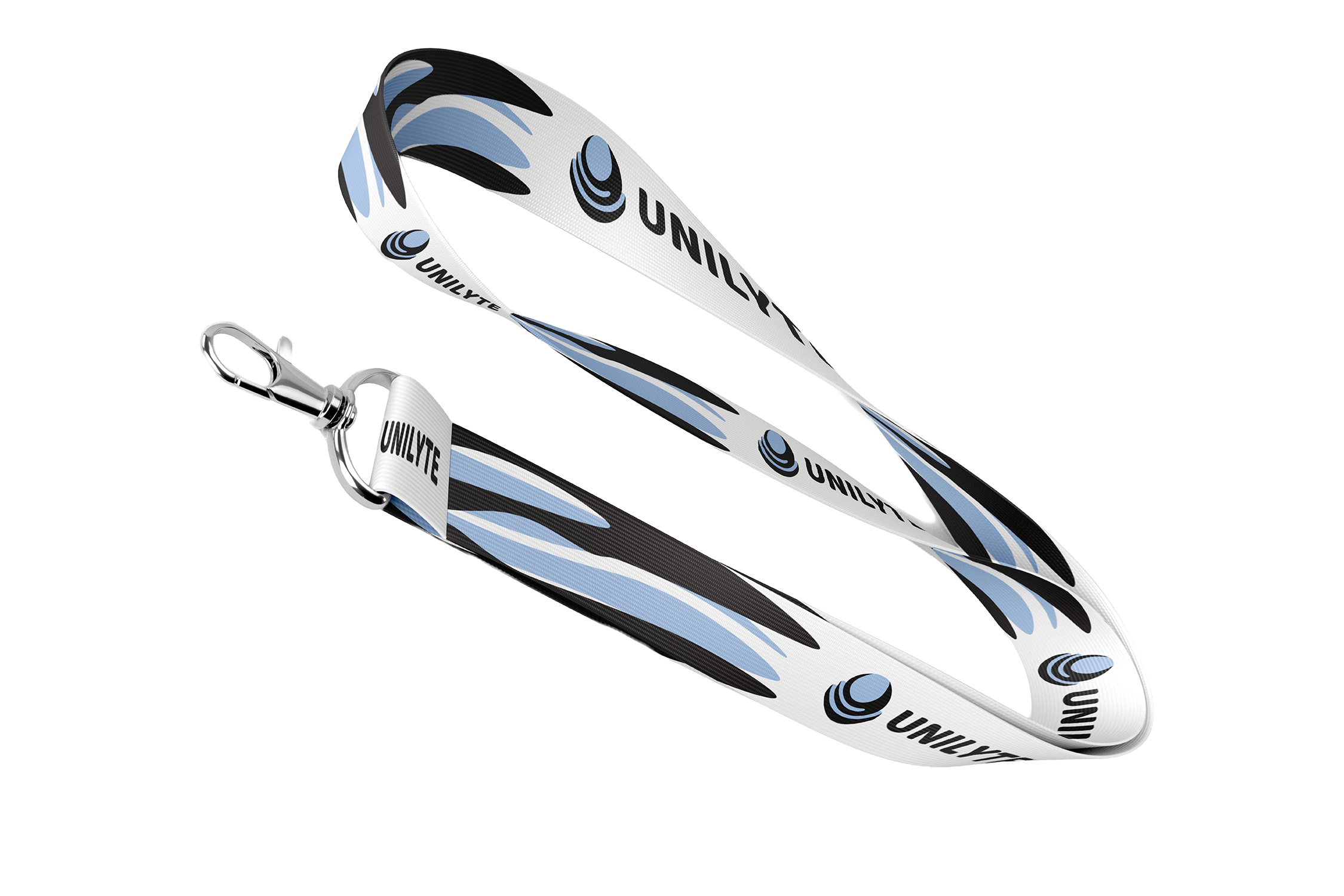
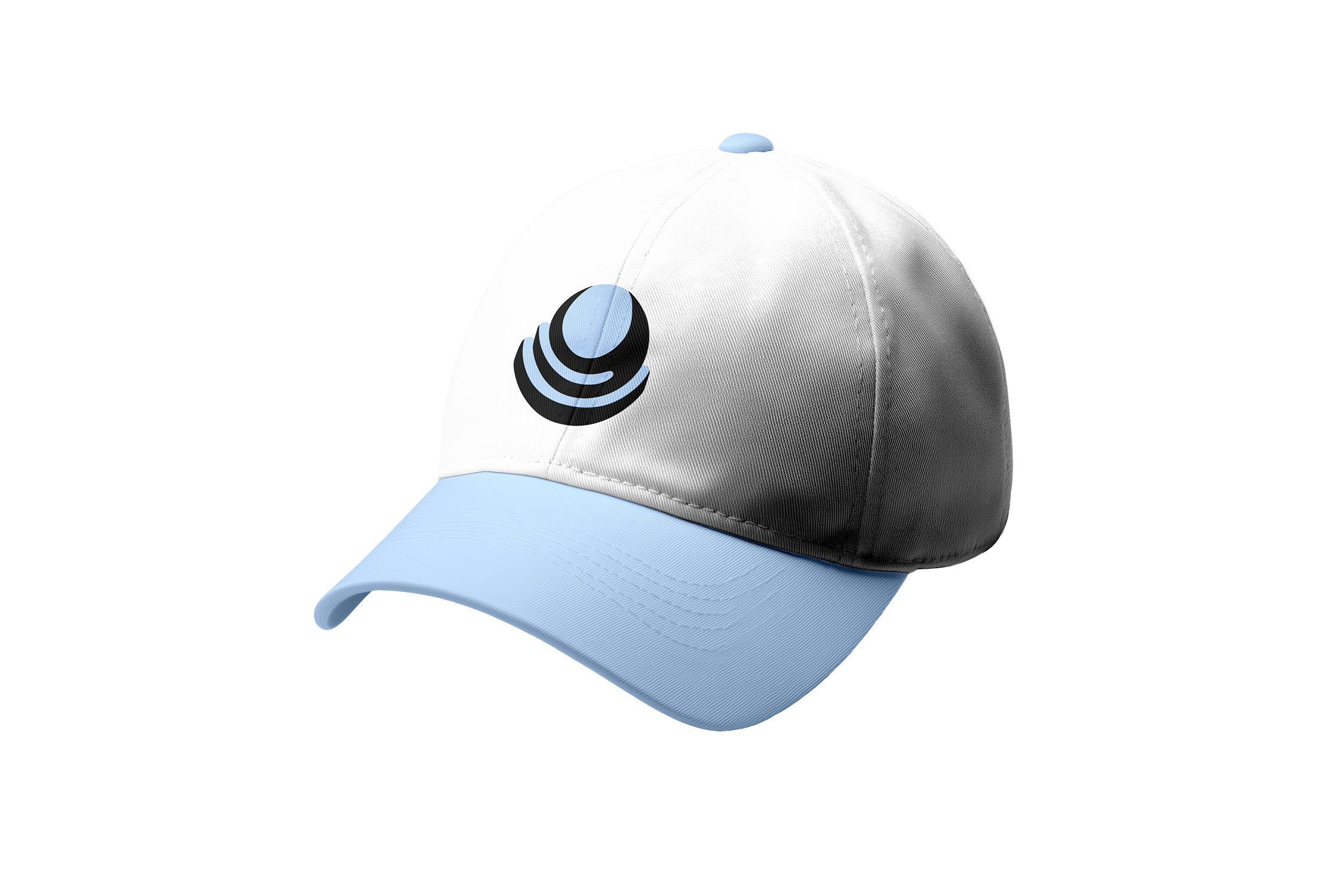
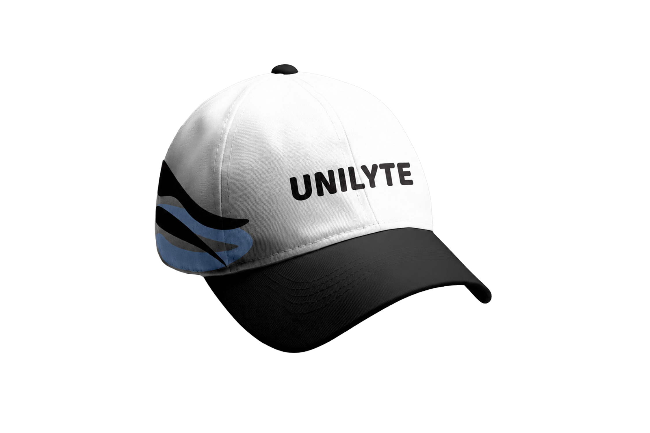
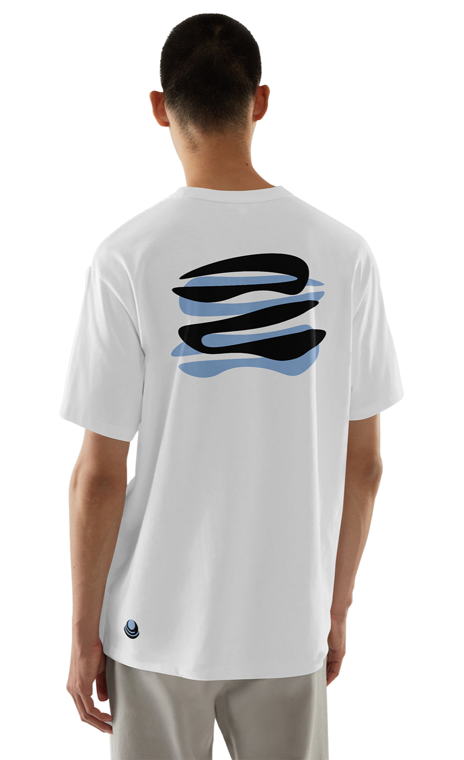
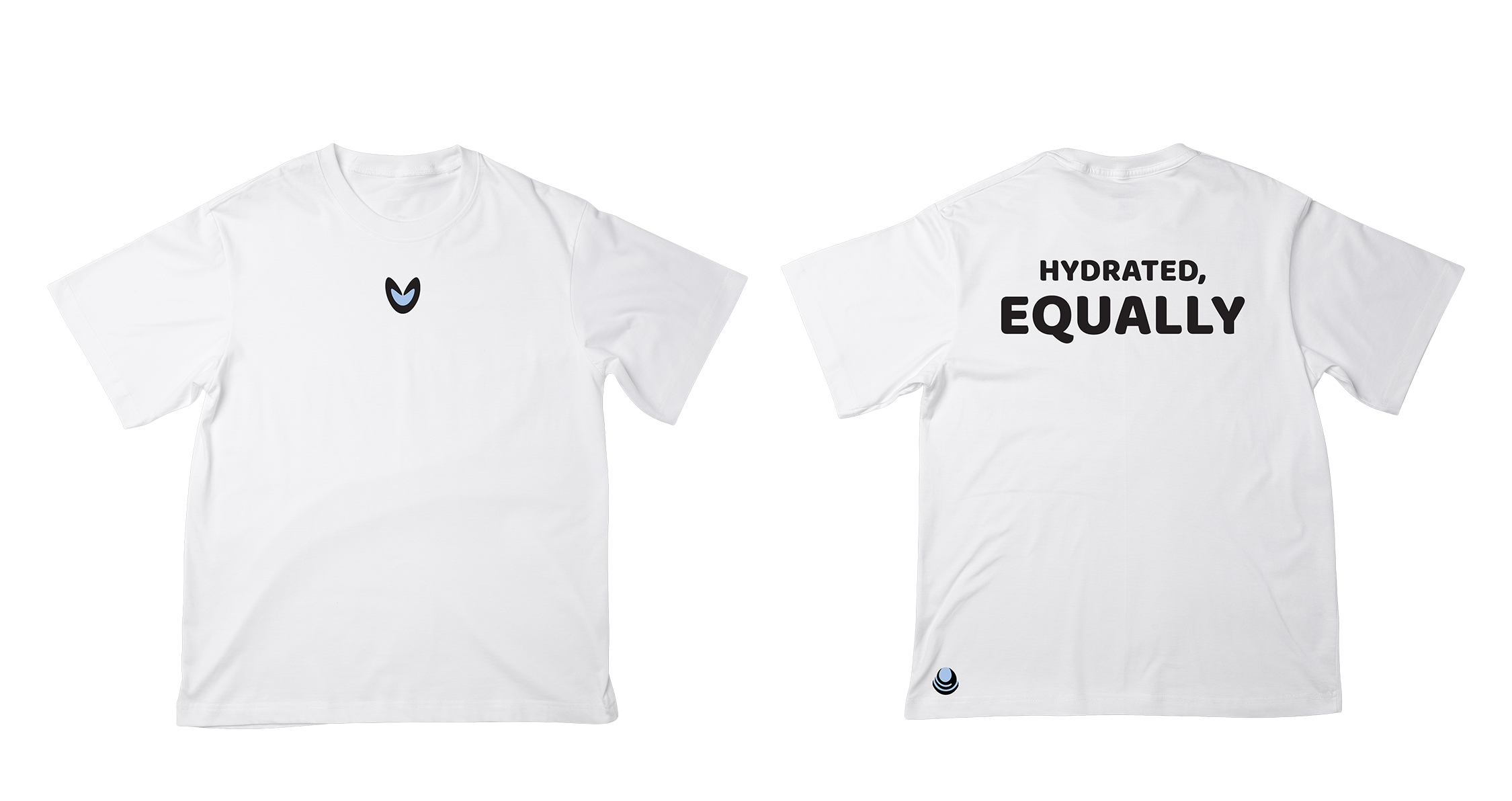
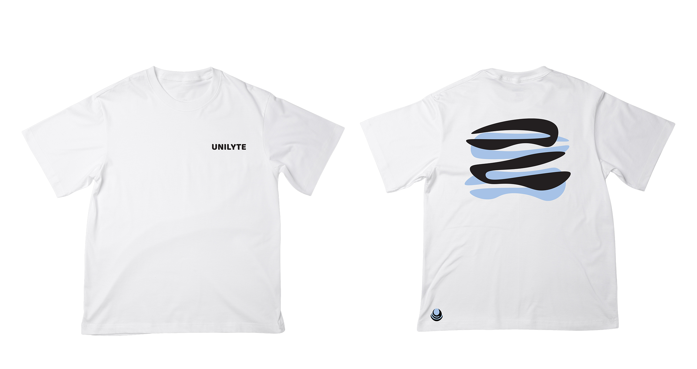
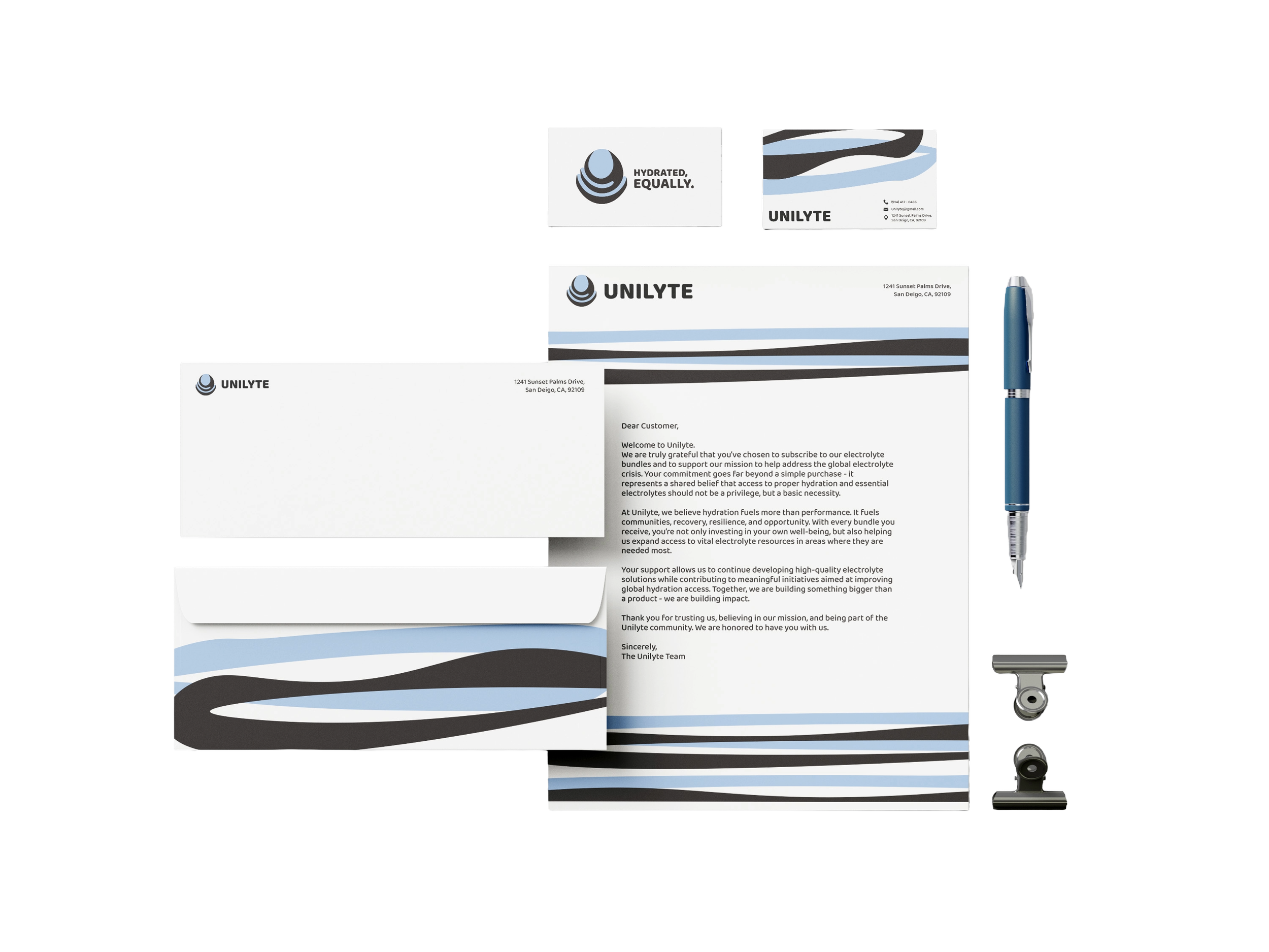
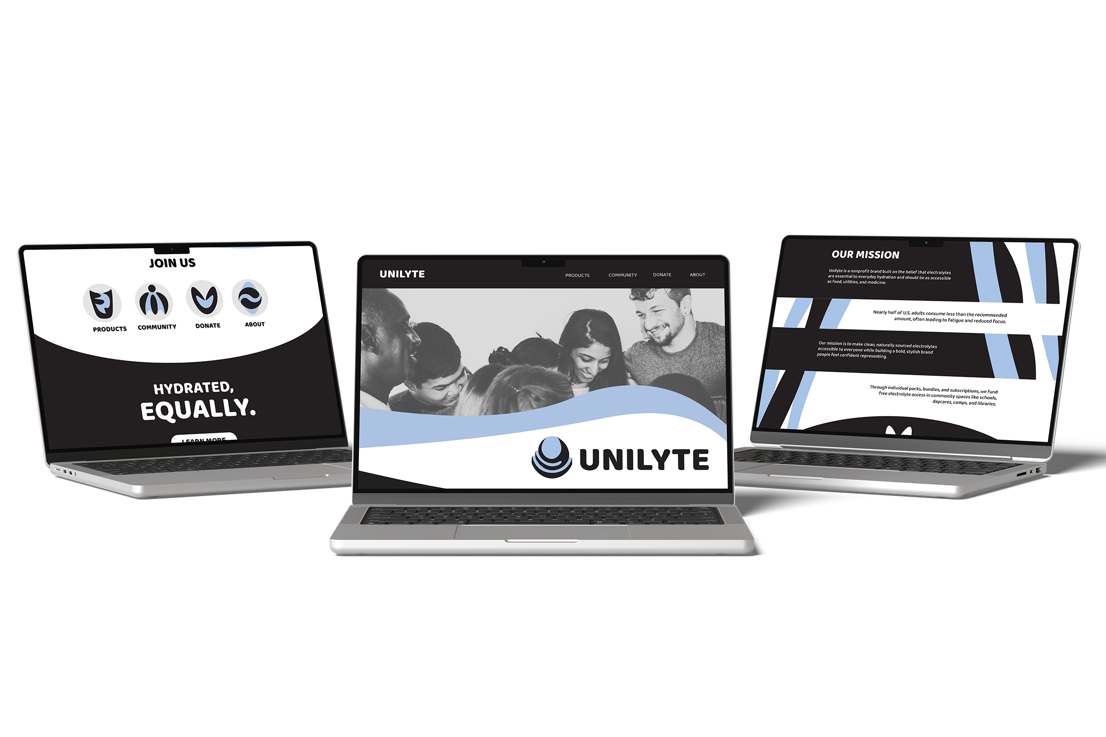
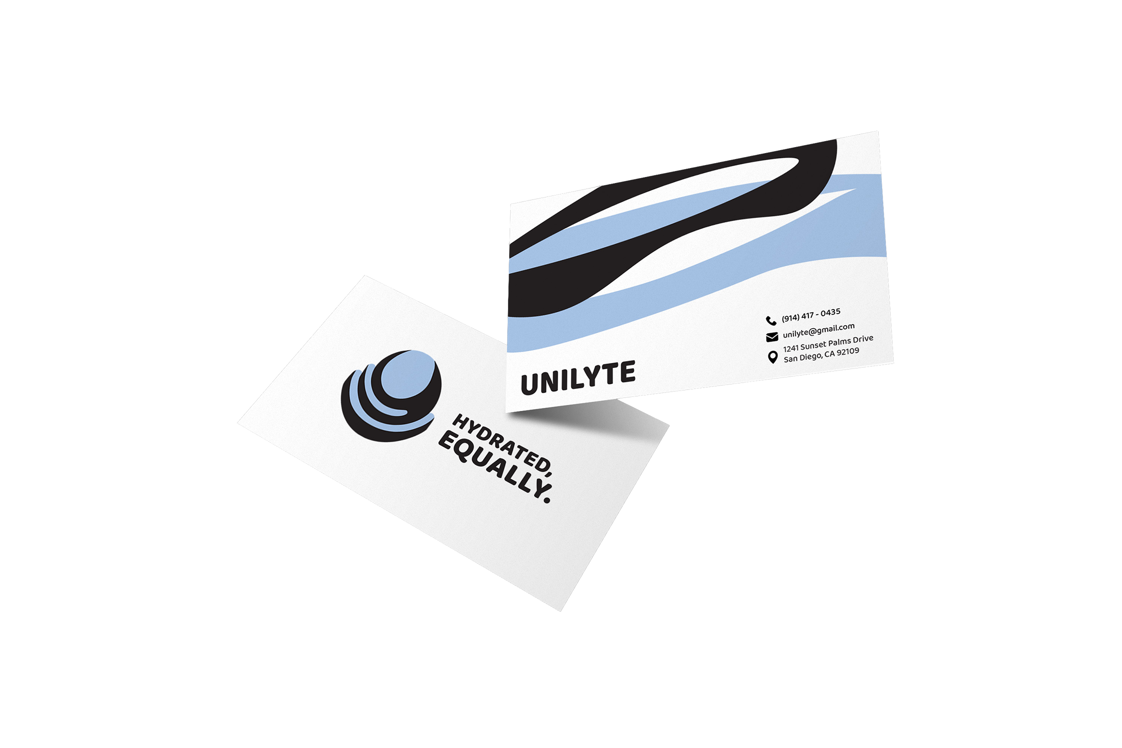
UNILYTE is a nonprofit hydration brand built on the belief that electrolytes are a basic necessity and should be accessible to everyone, just like food, utilities and medicine. Nearly half of U.S. adults consume less than the recommended amount of electrolytes, often leading to fatigue, low motivation and reduced cognitive function. Staying properly hydrated not only improves physical performance, energy and focus, but also supports mental clarity, emotional balance and overall mood. UNILYTE provides clean, naturally sourced electrolyte packets for daily hydration and recovery, available individually, in bundles, or through monthly and yearly subscriptions. Alongside its hydration products, UNILYTE also offers mission-driven merchandise including apparel, water bottles, hats and bags, allowing people to proudly support a meaningful cause. Overall, the brand exists to promote healthier communities through accessible, effective and enjoyable hydration solutions.
BRAND DEVELOPMENT
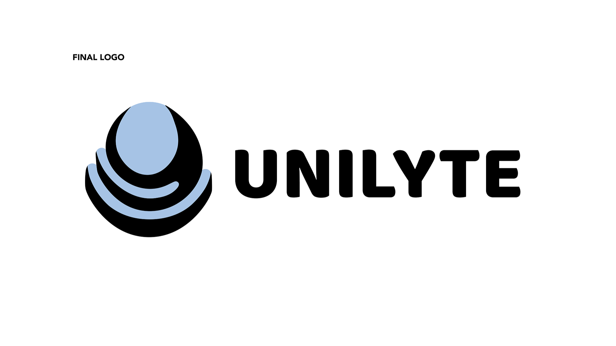
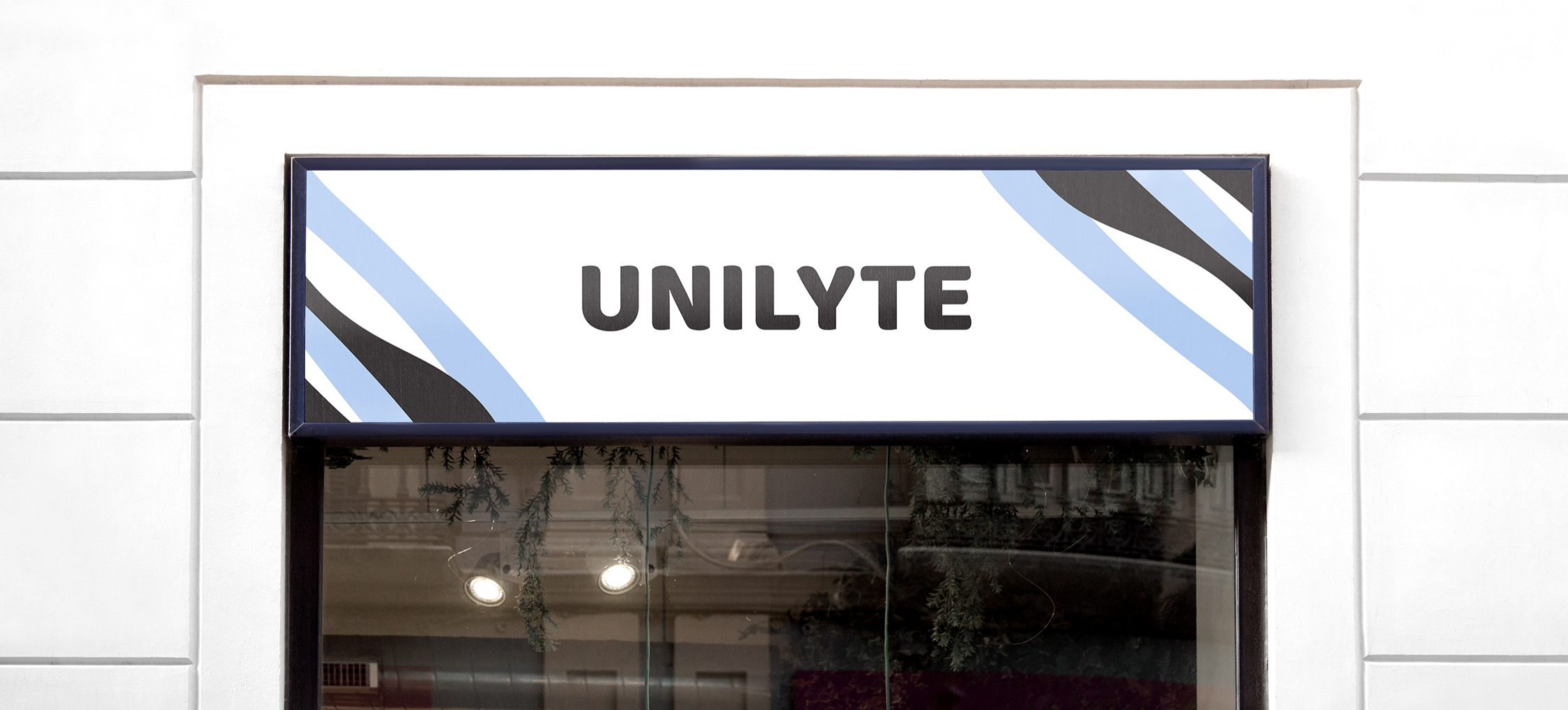
BRAND APPLICATION
S3 COFFEE BAR
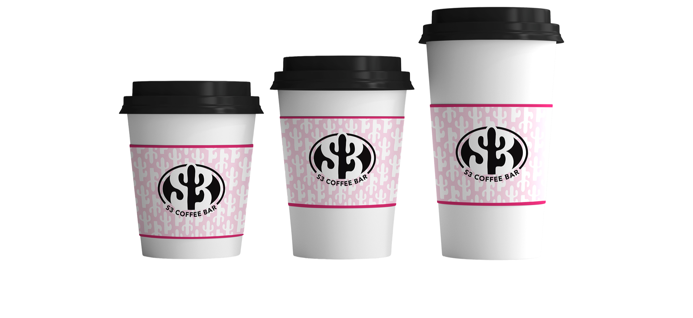
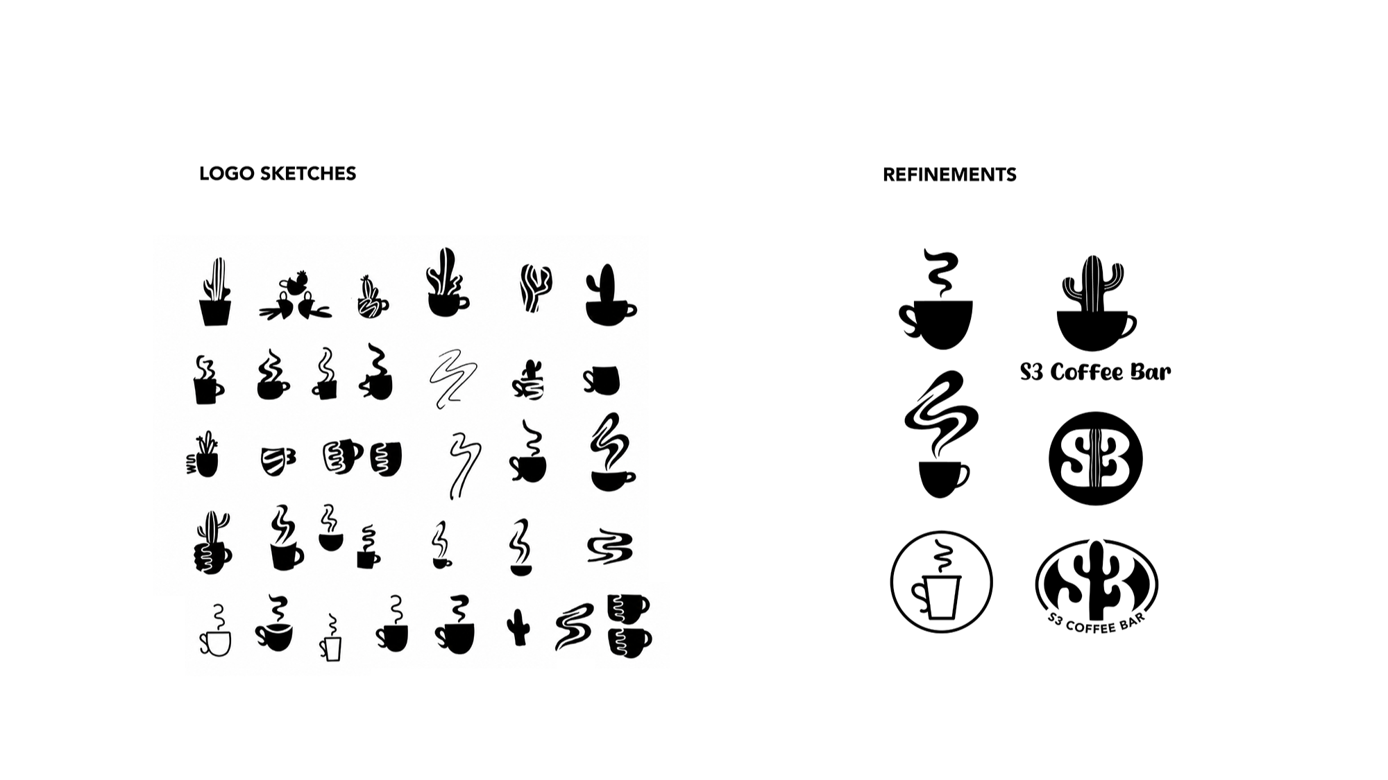
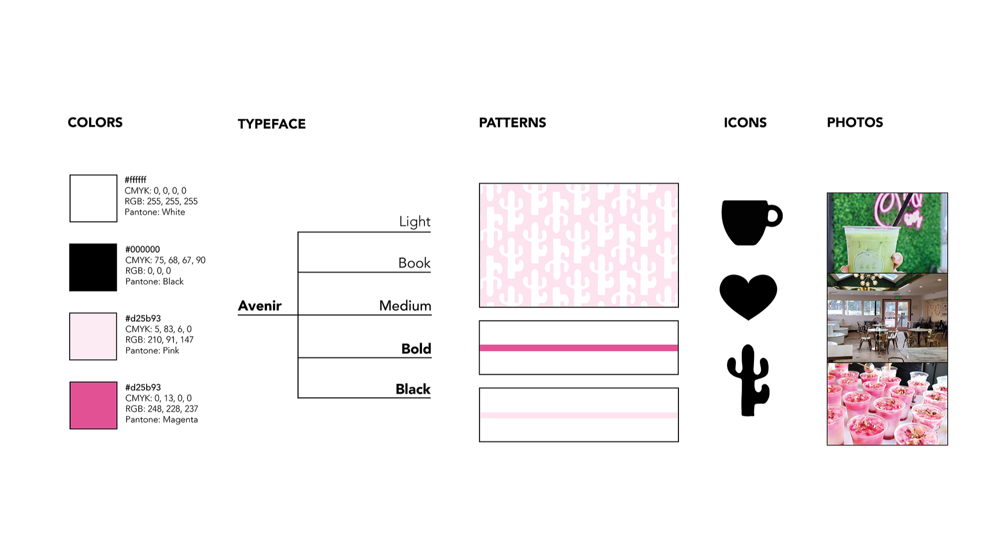
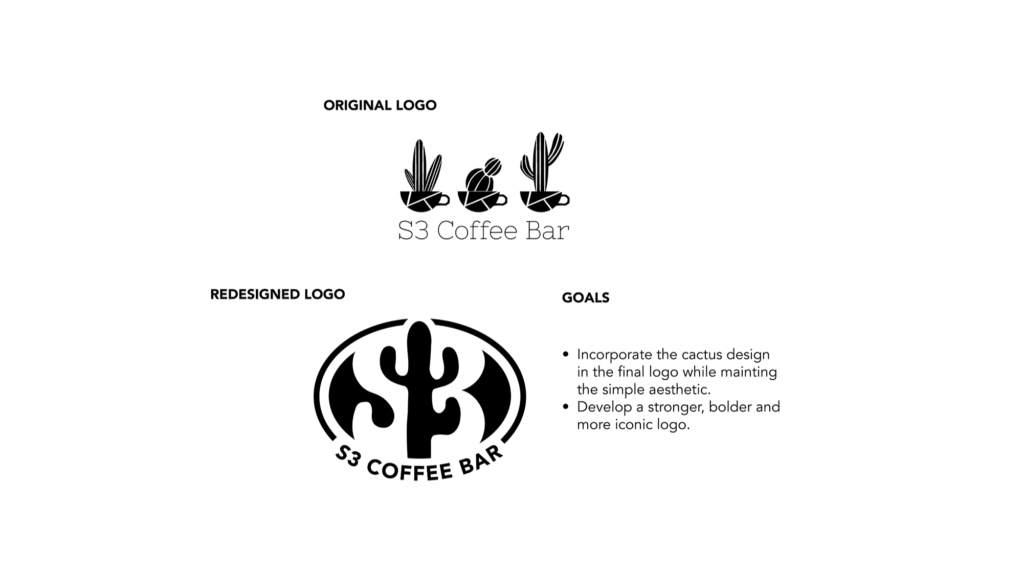
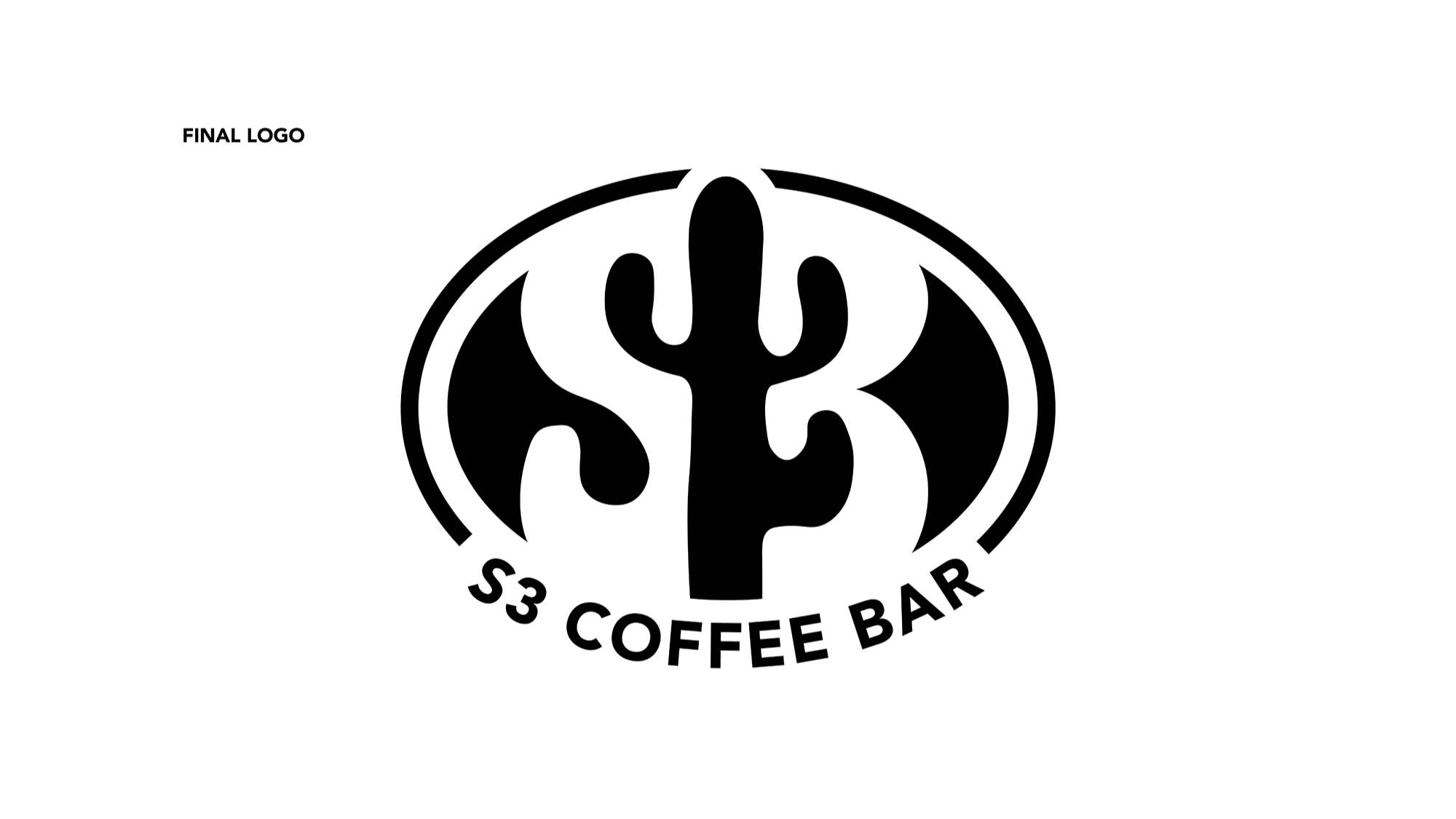
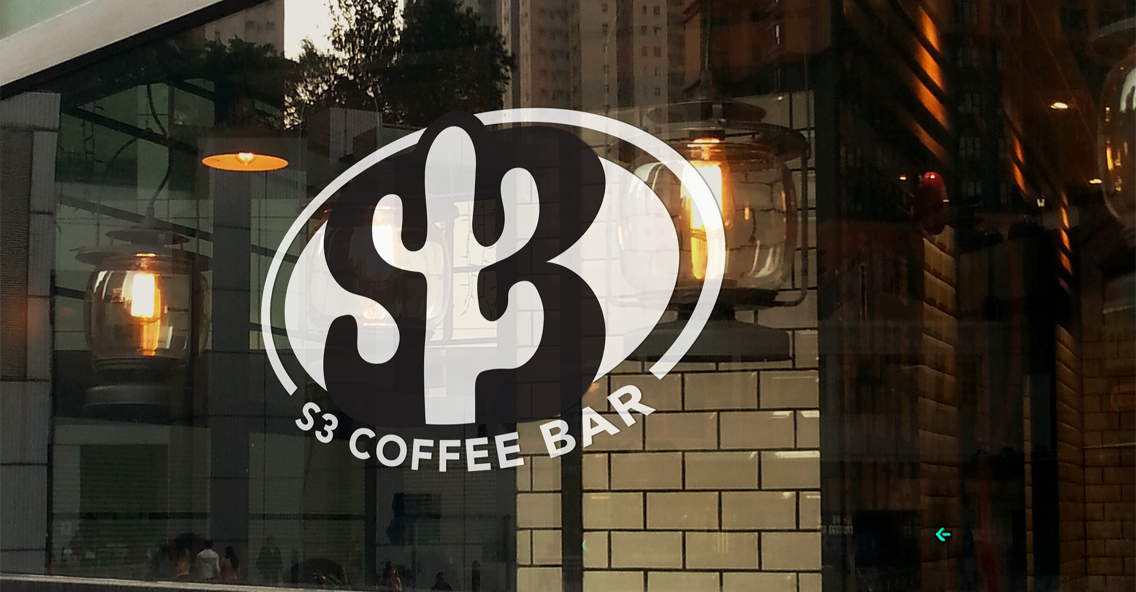
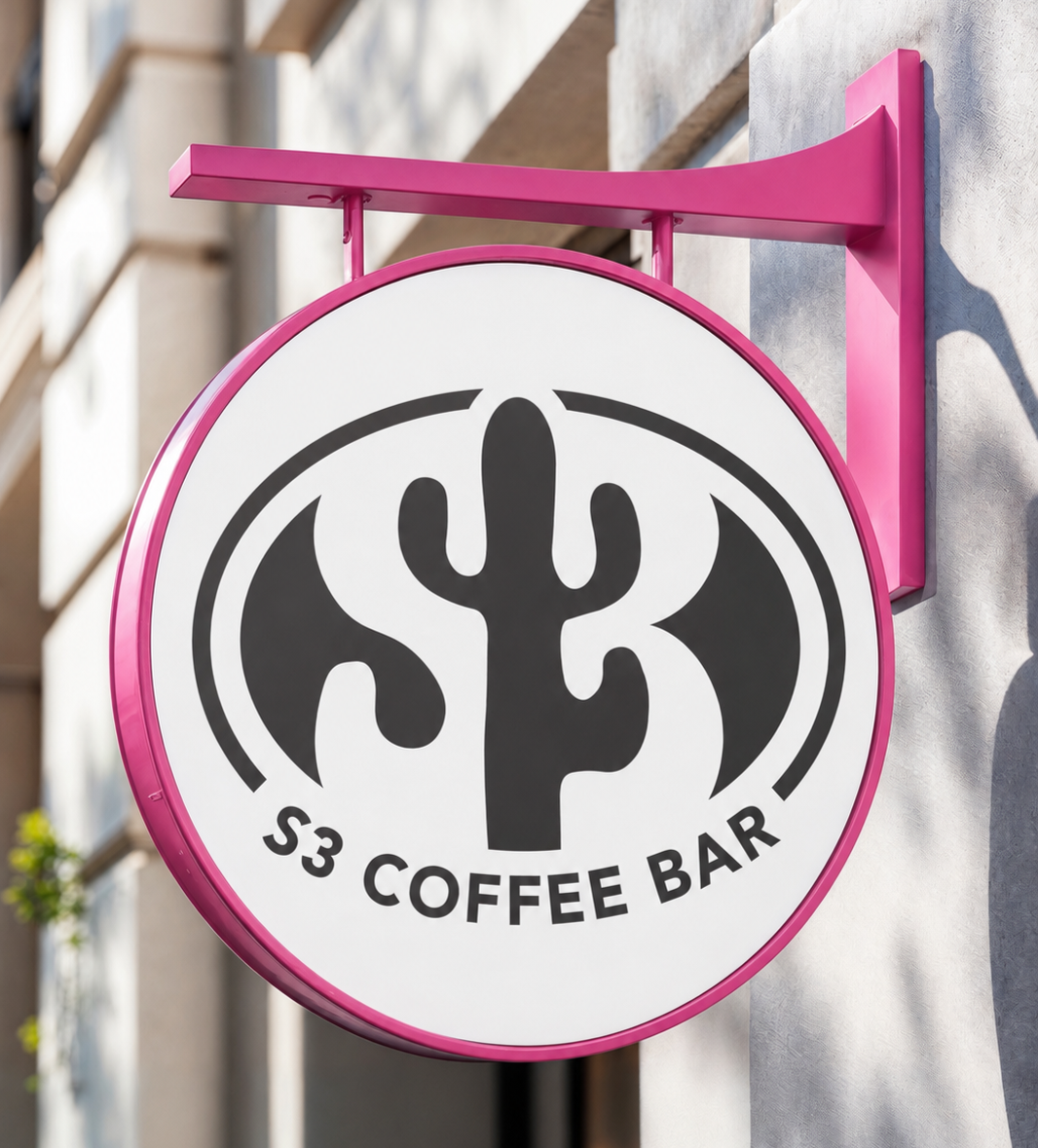
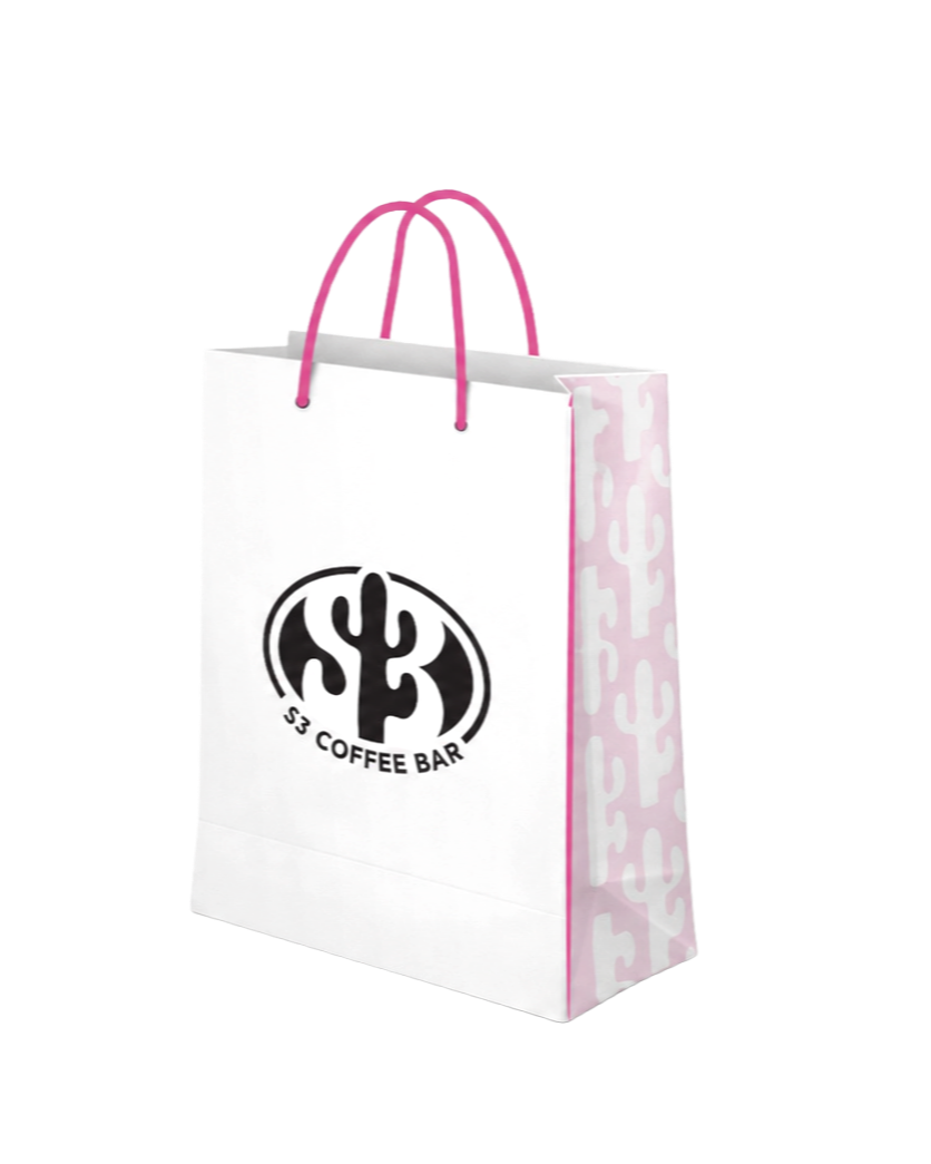
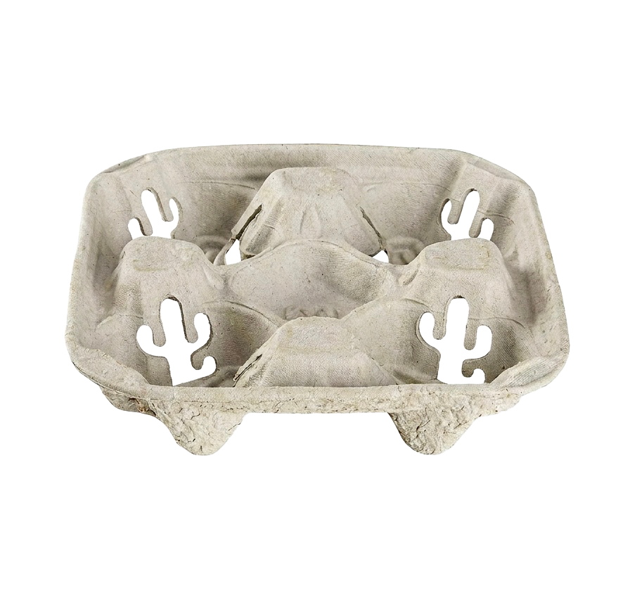
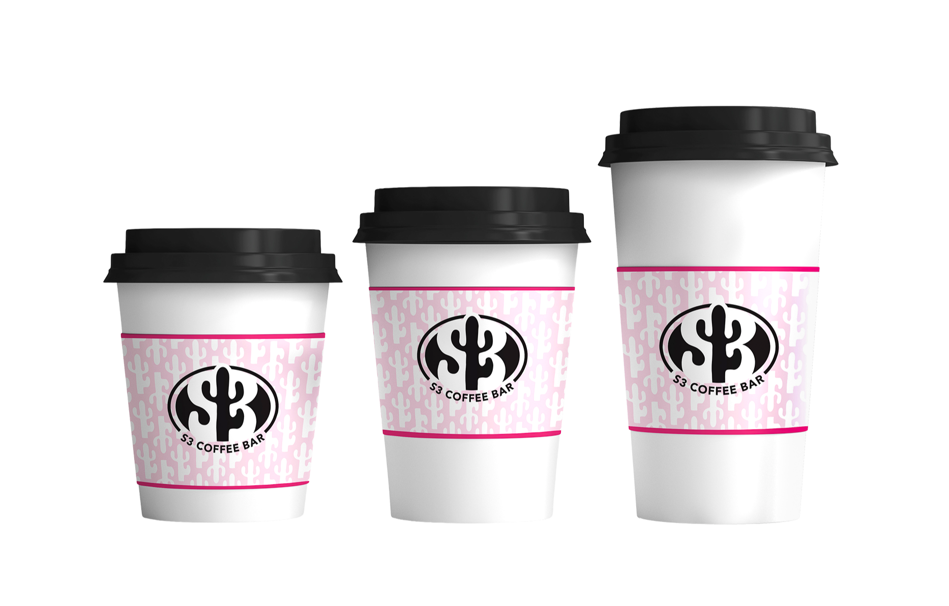
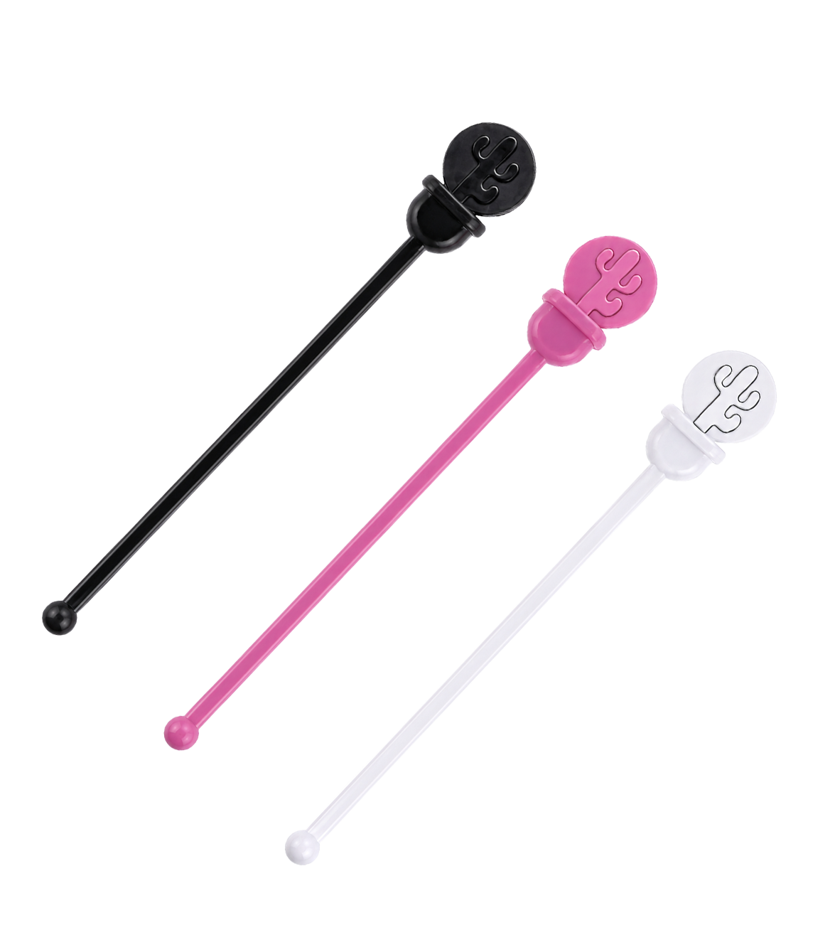
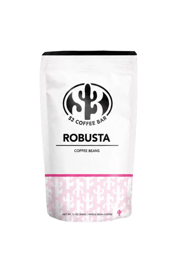
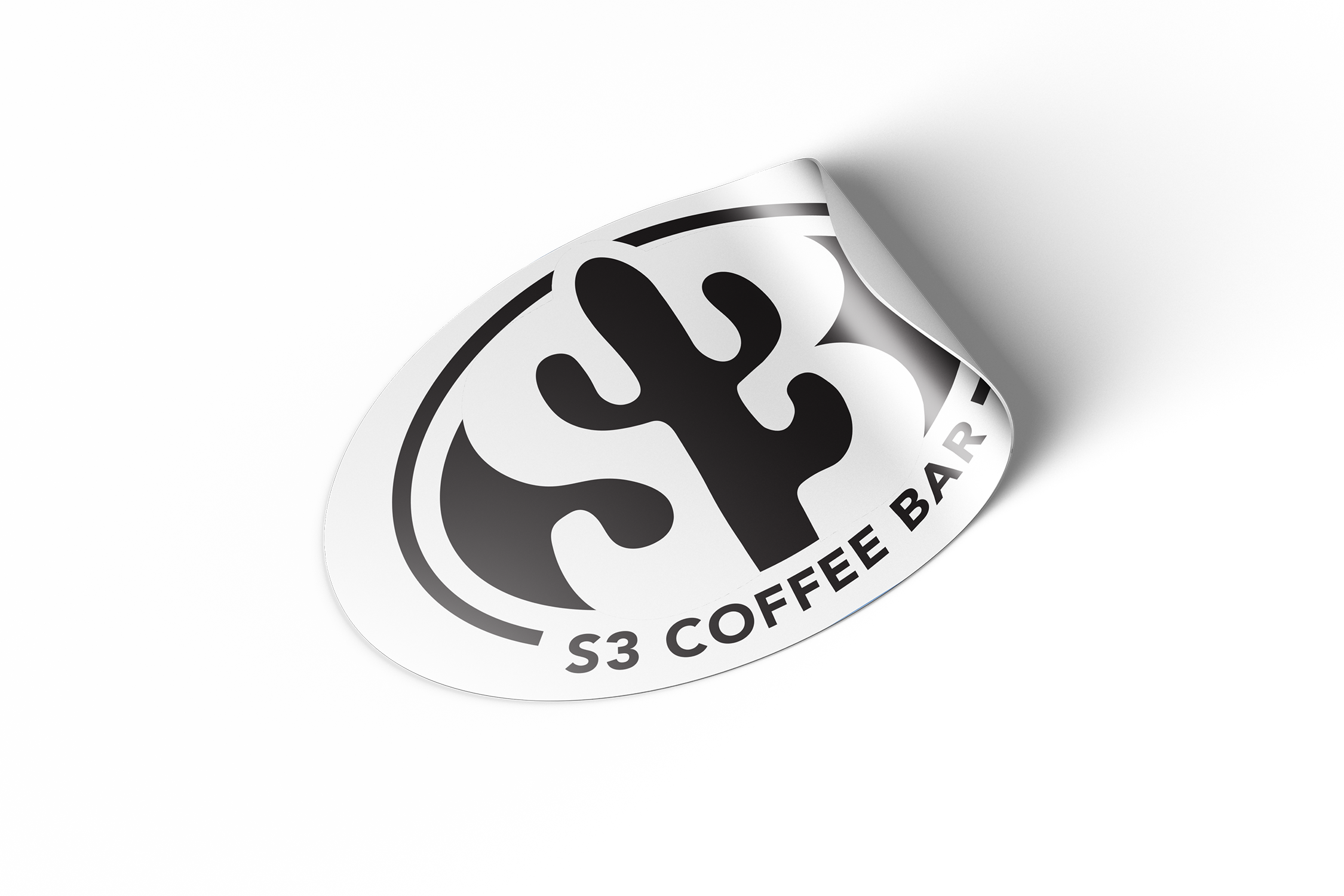
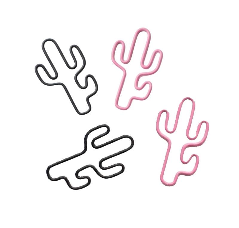
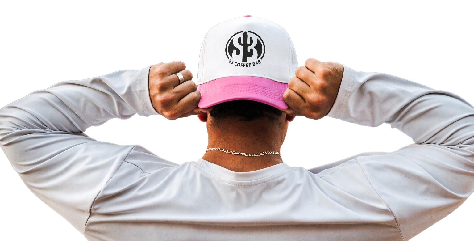
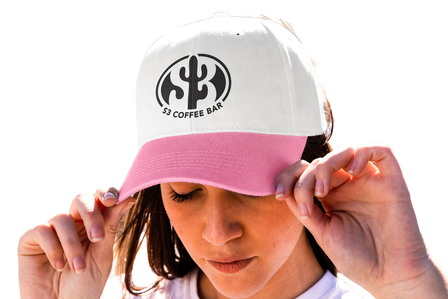
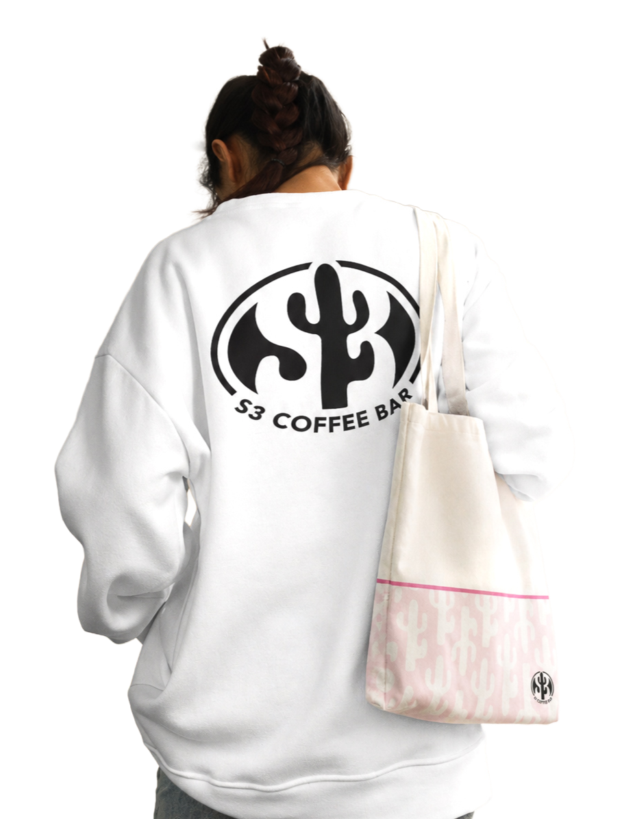
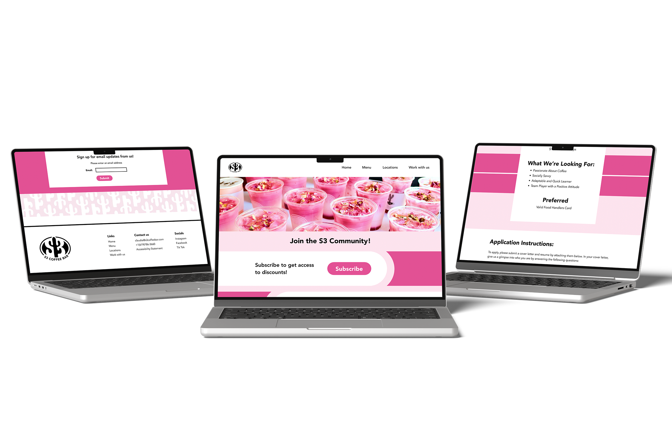
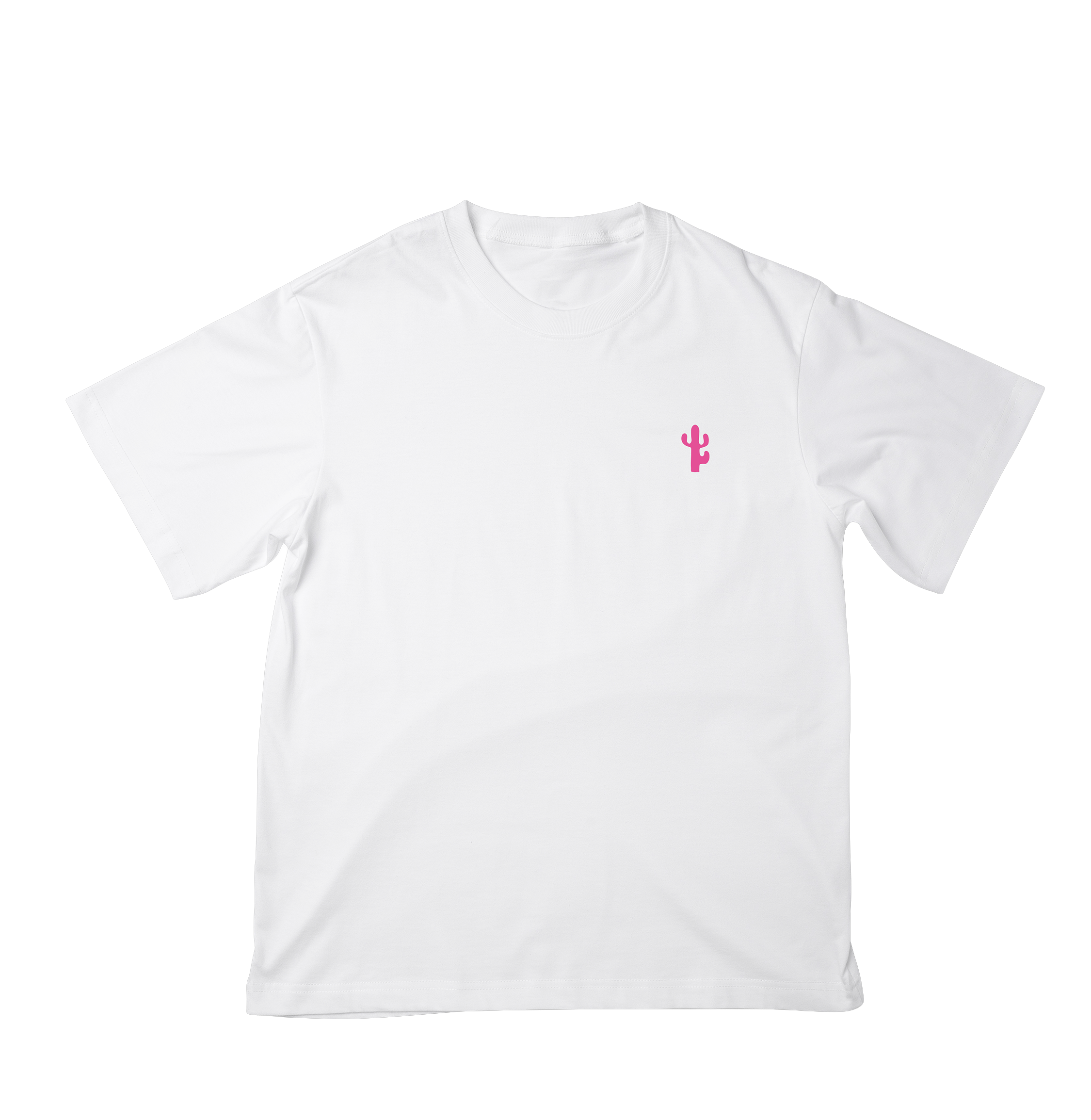
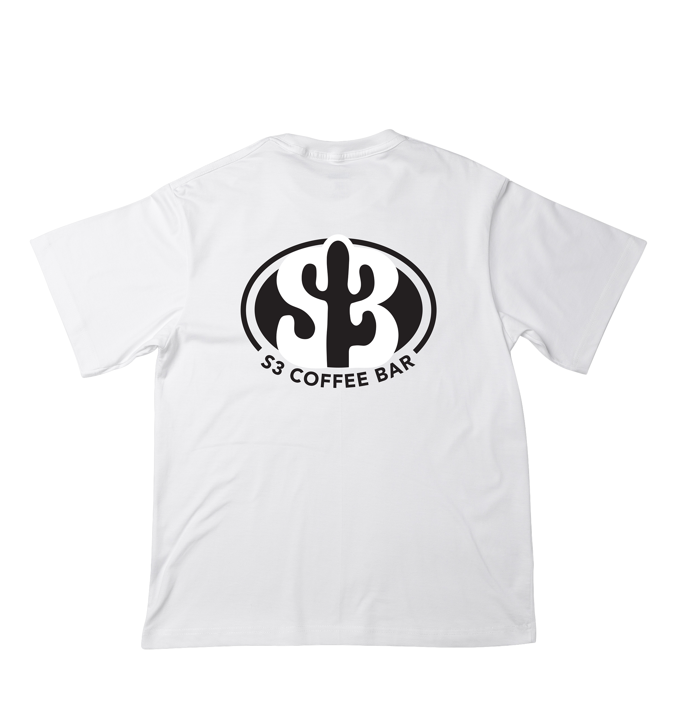
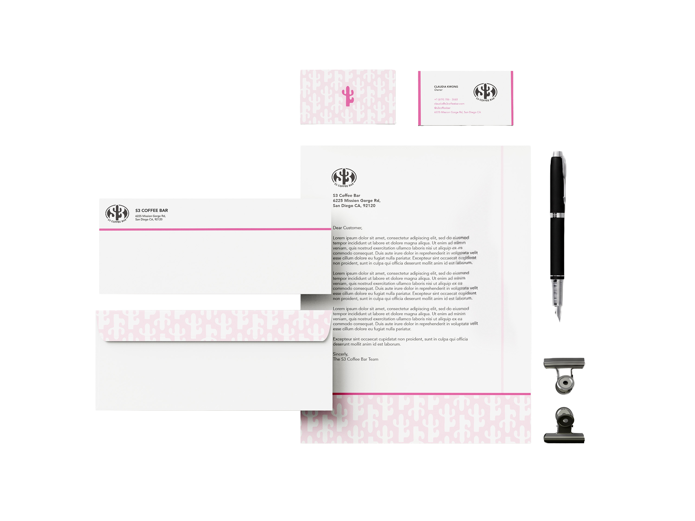
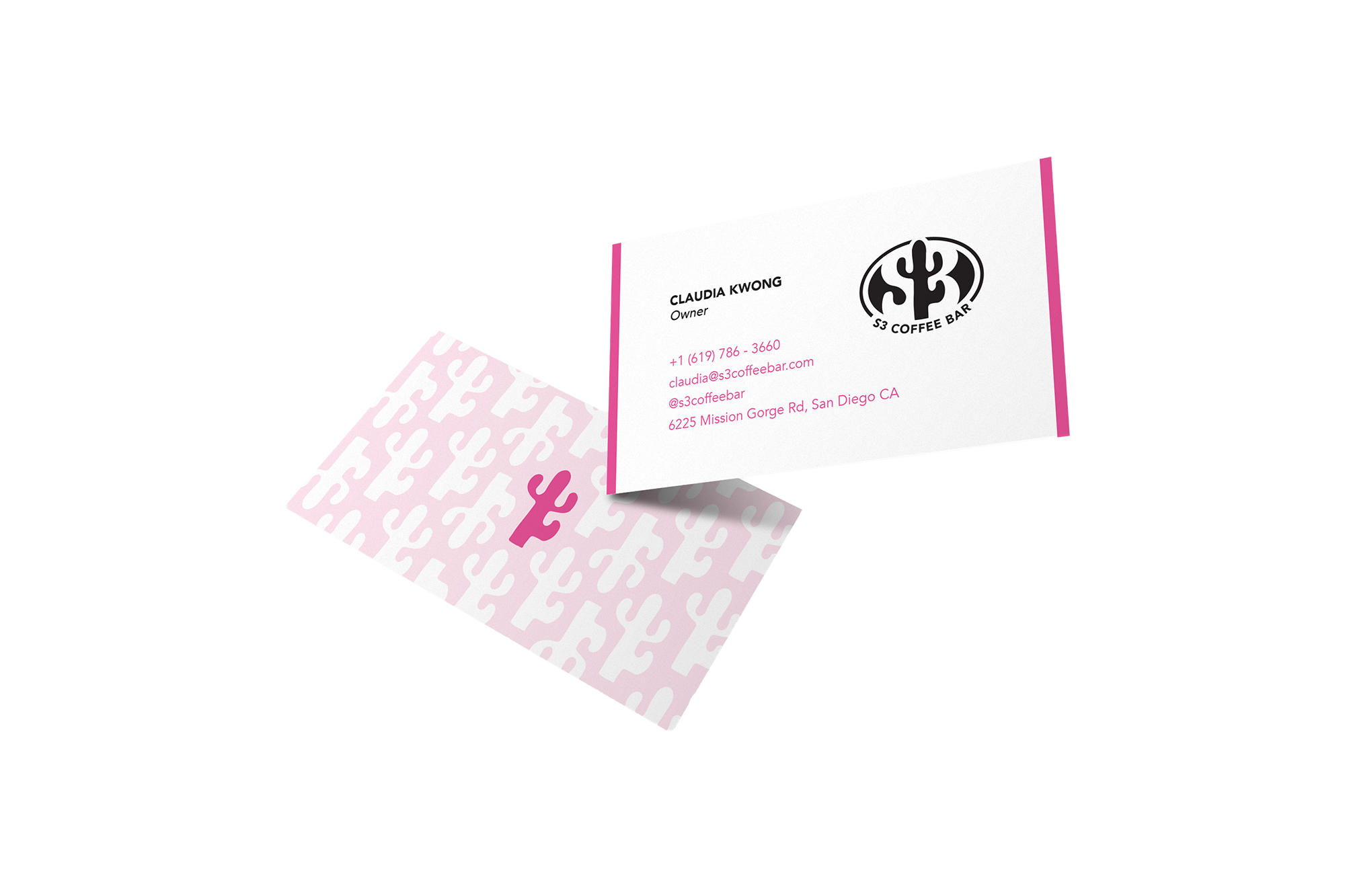
S3 Coffee Bar is a women-owned café started by 3 sisters in San Diego. It is built around quality coffee, community, creativity and an overall happy environment. This was a rebranding project where I focused on creating a clean yet playful visual identity that reflects the café’s uplifting atmosphere and organic approach. The original logo consists of three mugs with cacti in them. I wanted to keep the cactus symbol but redesign it by integrating the “S3” directly into the form of the cactus itself. I ended up developing a design that used the negative space to create the cactus form. This allowed the logo to feel more unique while connecting to the story of the brand. The shop itself has a lot of pink highlights so I wanted to incorporate pink in the design as well. Overall, the rebrand aims to help S3 stand out among other San Diego coffee shops while reinforcing its mission of bringing people together through good drinks, food and atmosphere.
BRAND DEVELOPMENT
BRAND APPLICATION
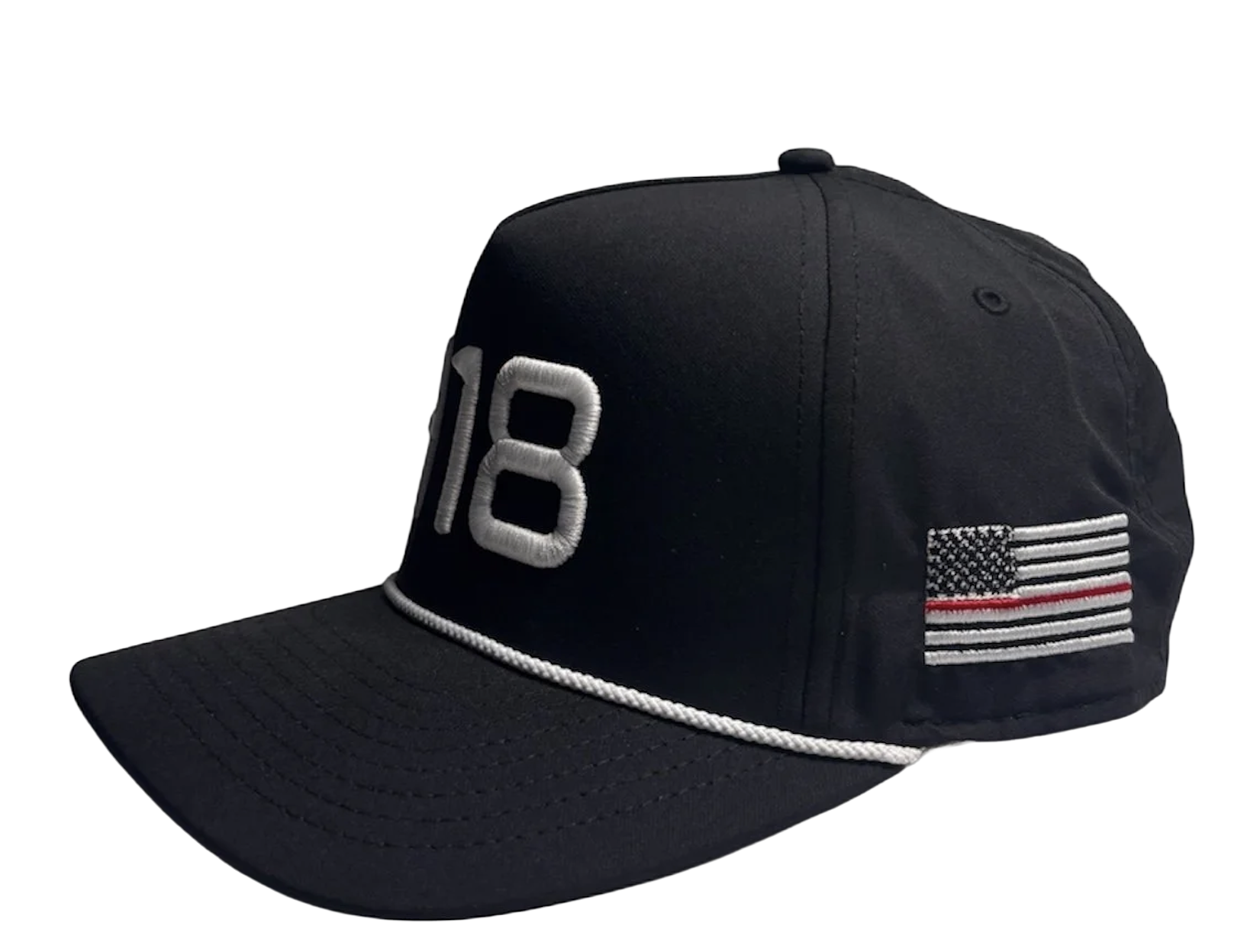
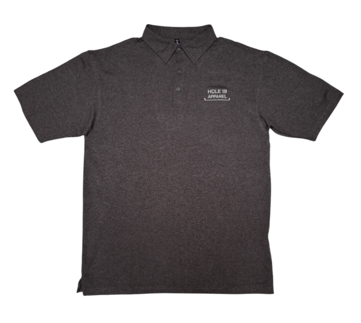
HOLE 18 APPAREL
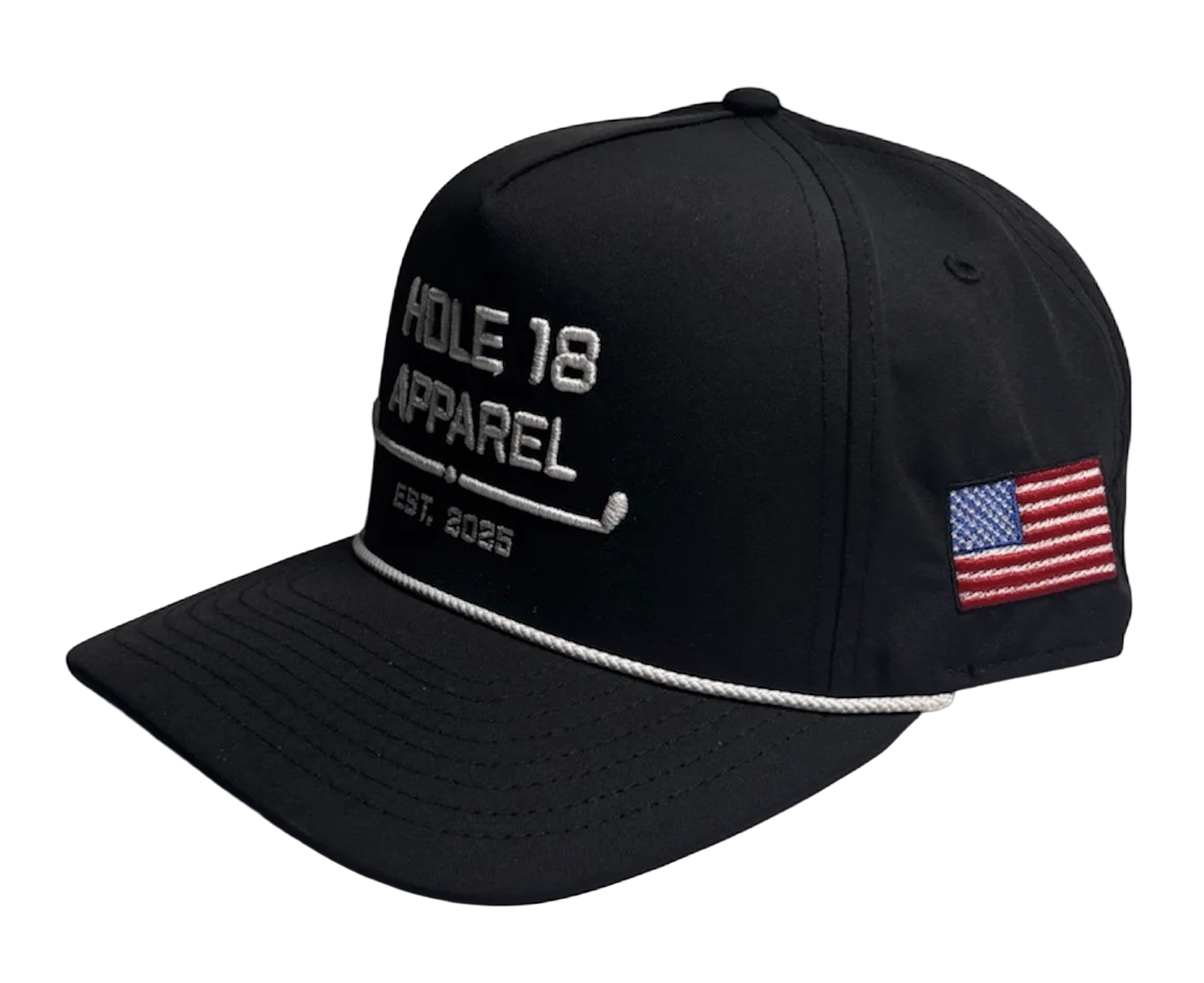
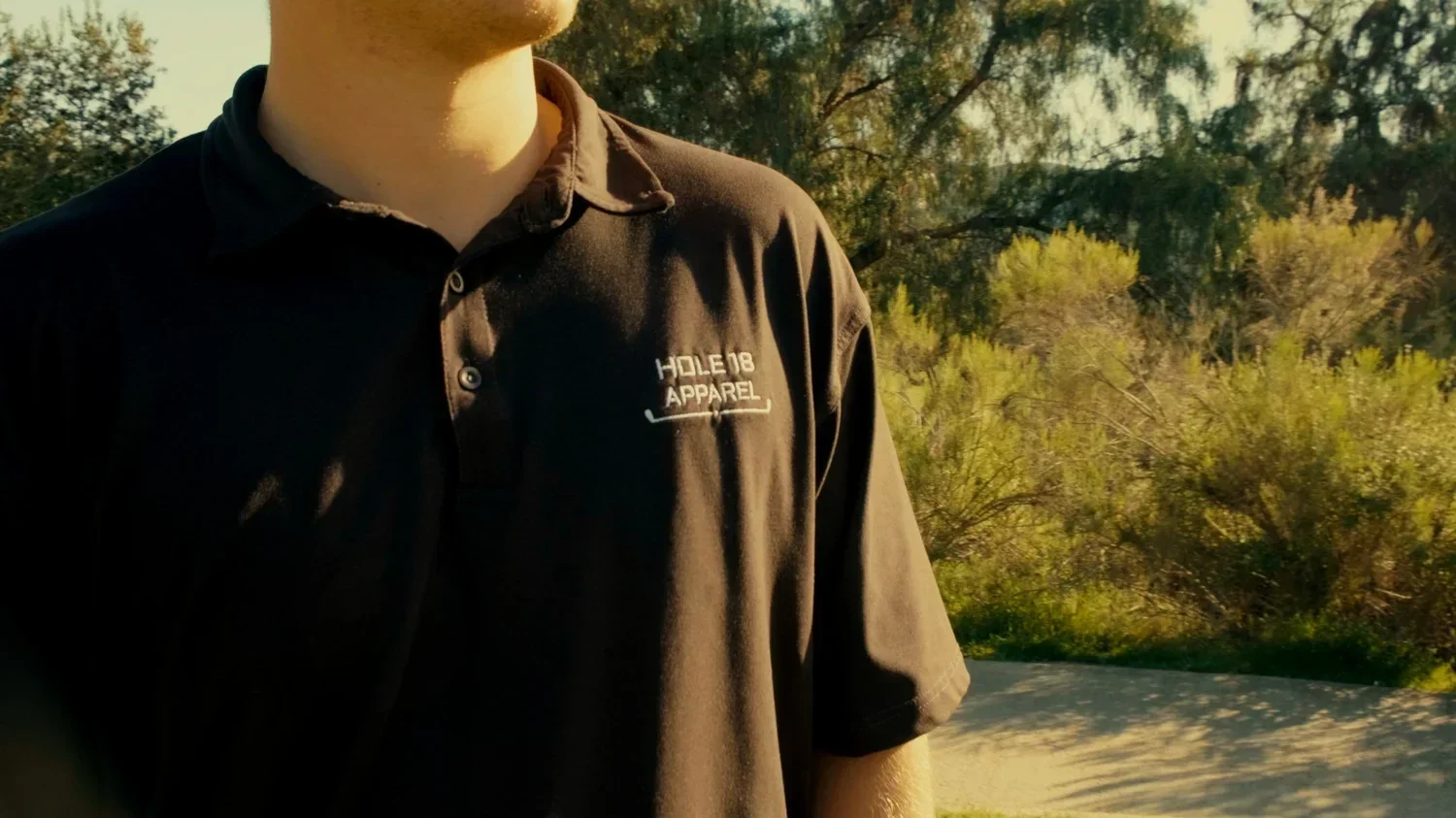
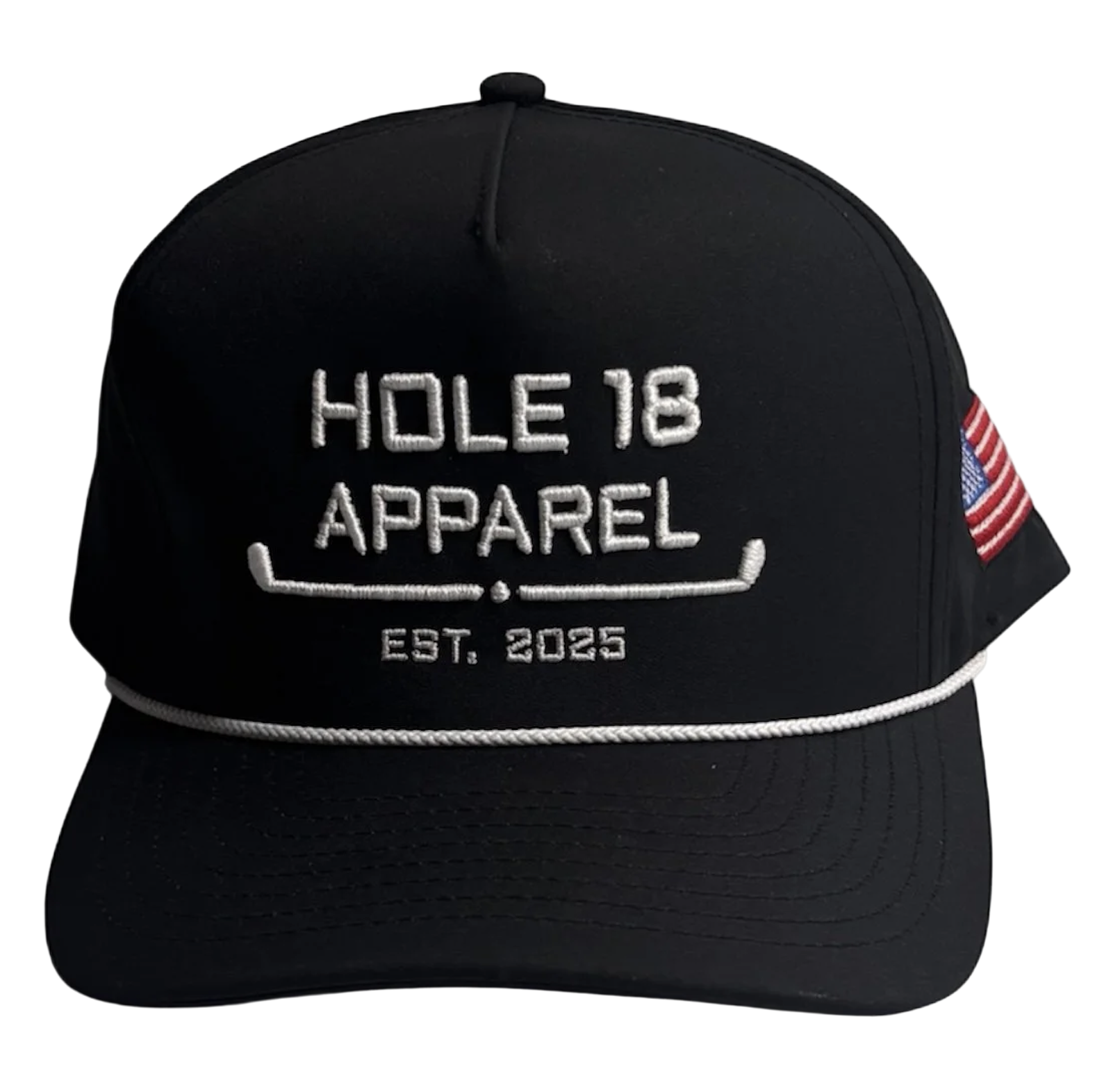
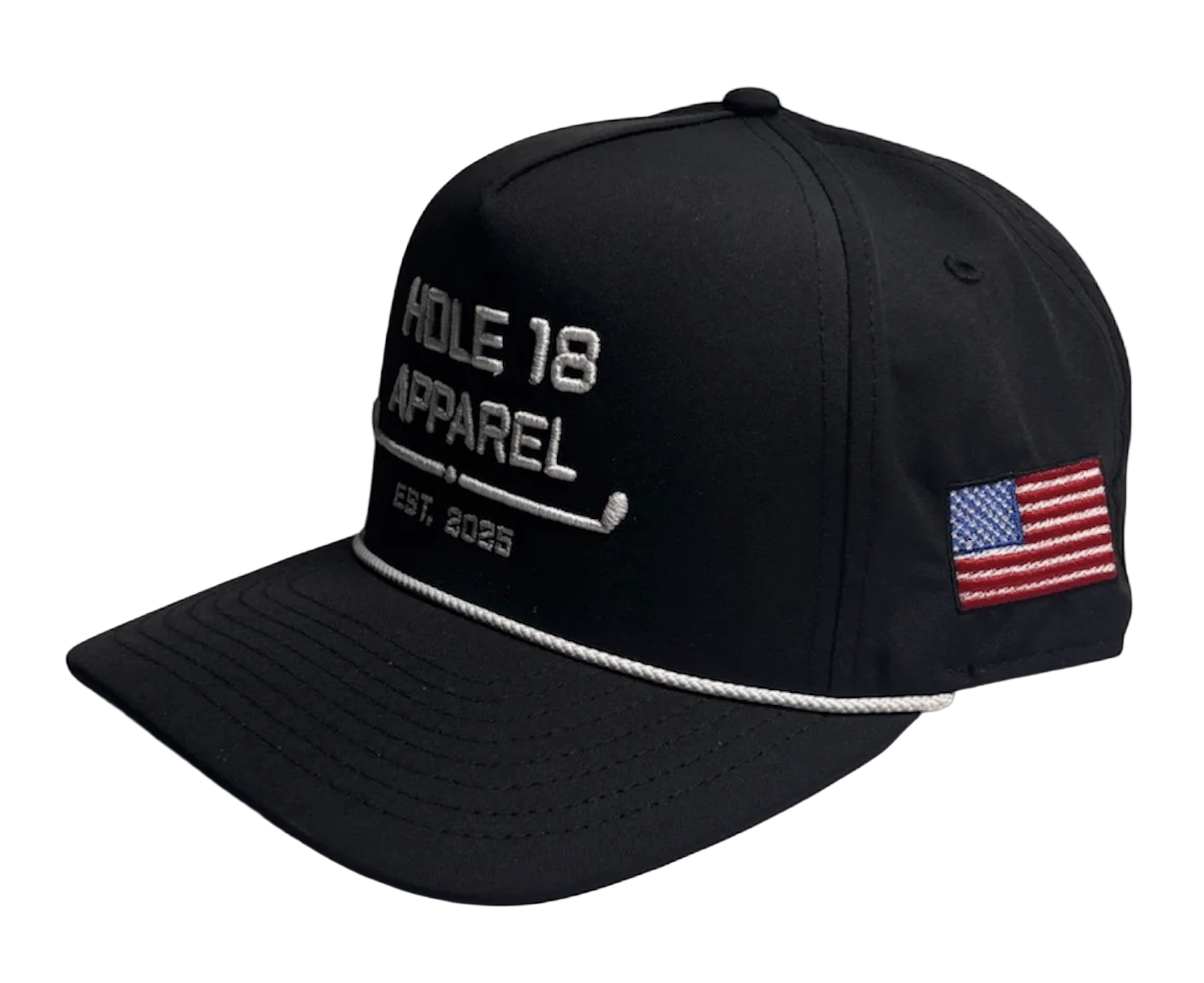
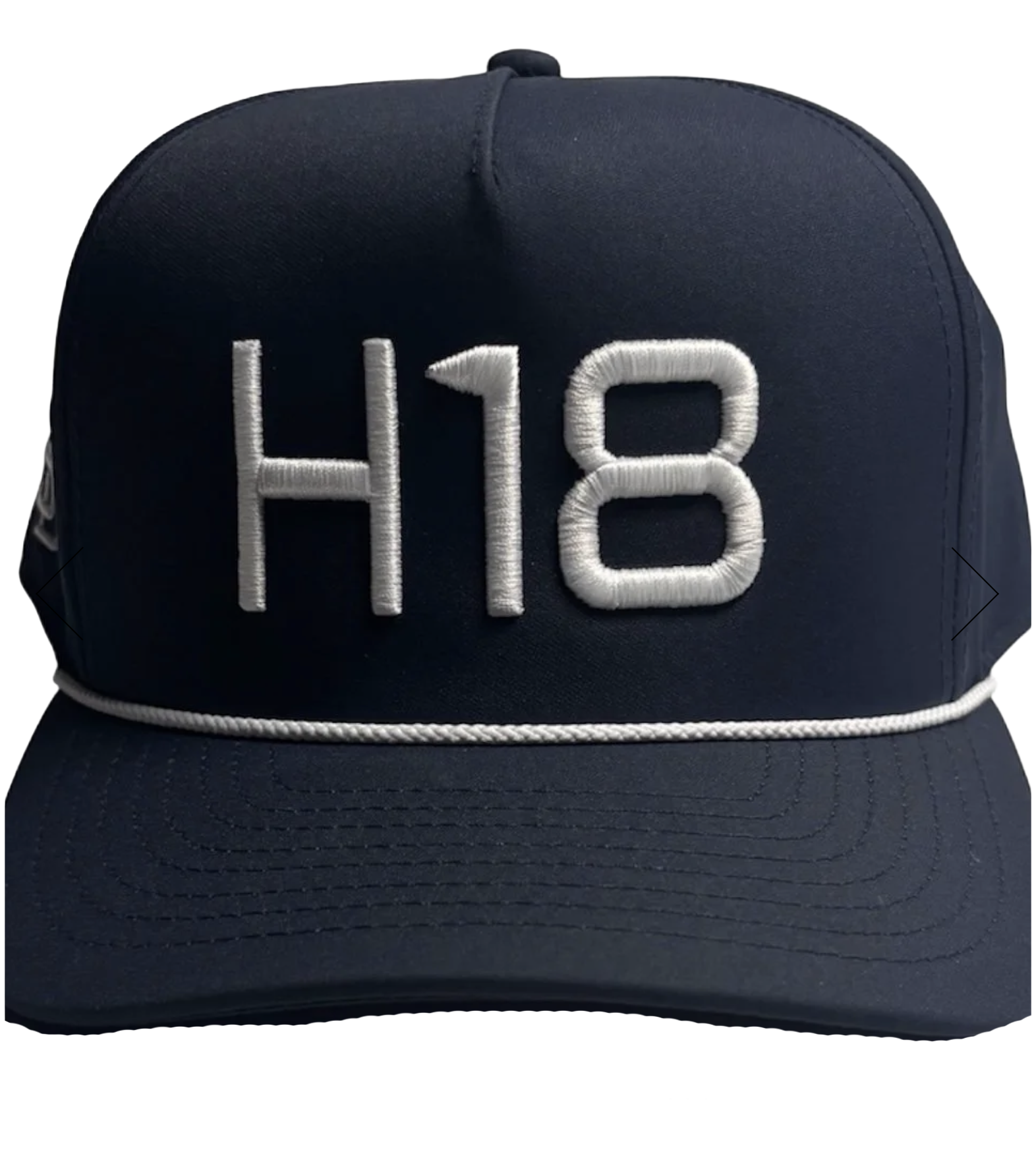
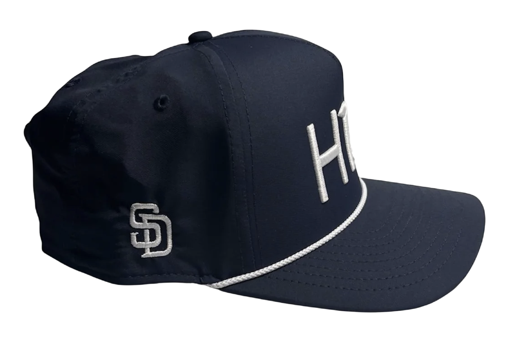
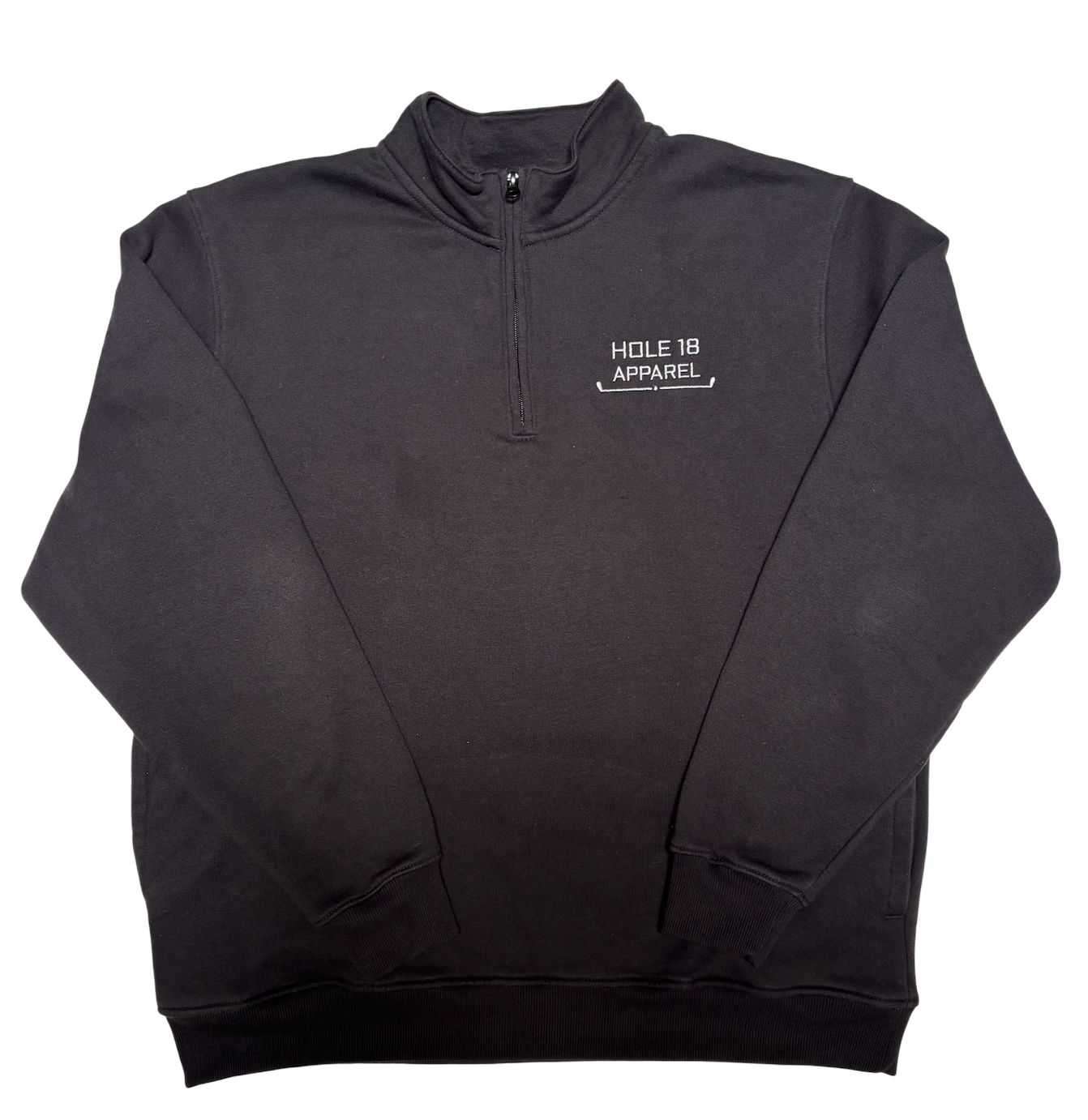
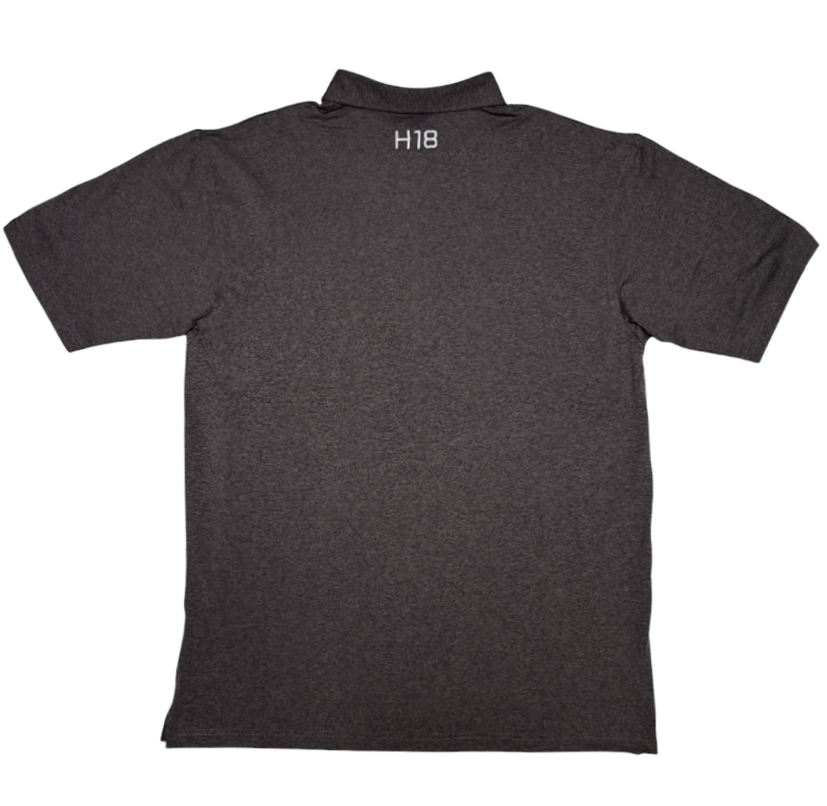
I designed the logo for Hole 18 Apparel, a golf-inspired lifestyle brand built around the values of comfort, simplicity, and sustainability. The brand represents the importance of giving your all until the very end, reminding golfers that regardless of how the first 17 holes have gone, there is always one more opportunity to finish strong. Hole 18 encourages perseverance, resilience and determination both on and off the course. I developed the logo to reflect this philosophy while also maintaining a clean and timeless logo that aligns with the brand's modern and stylish apparel.
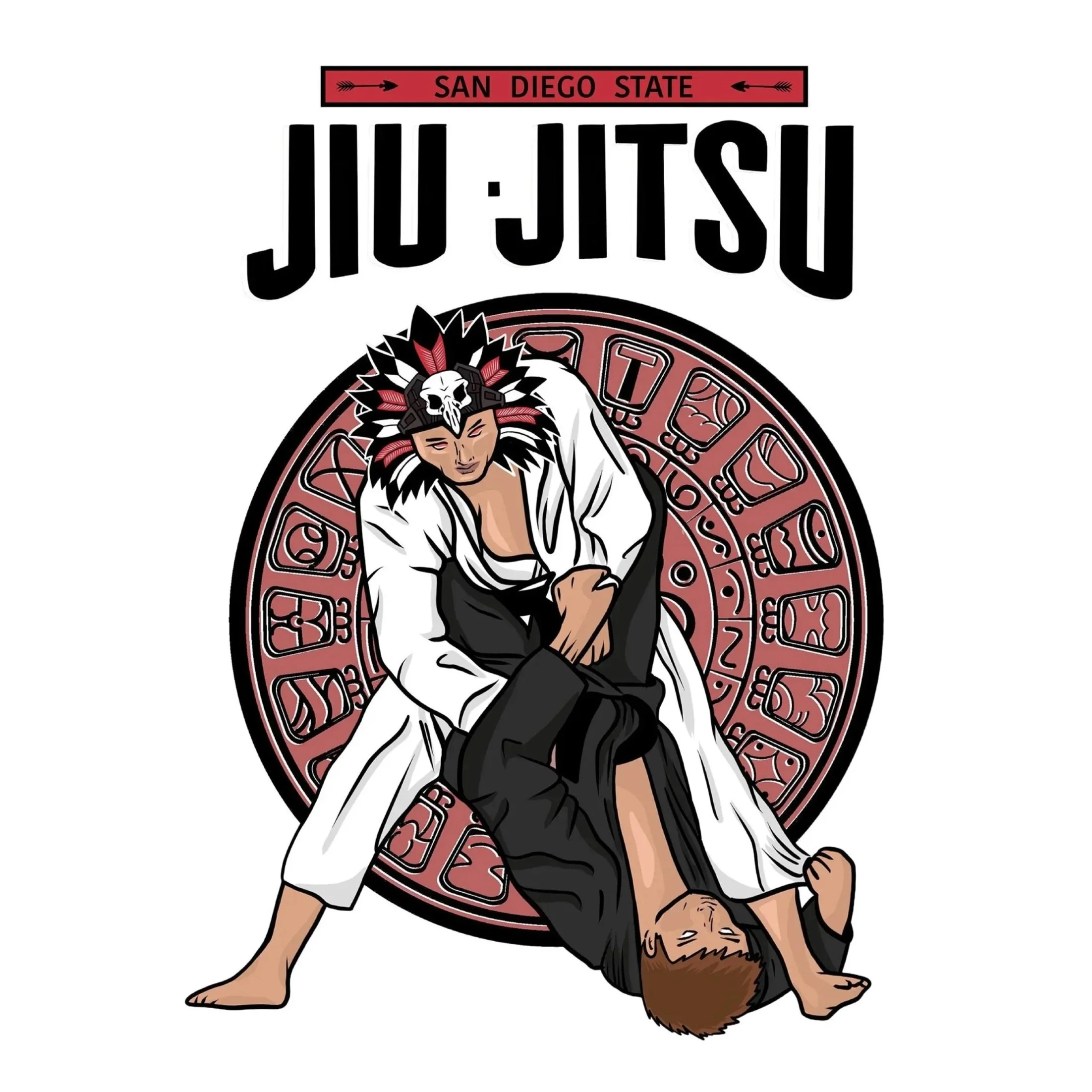
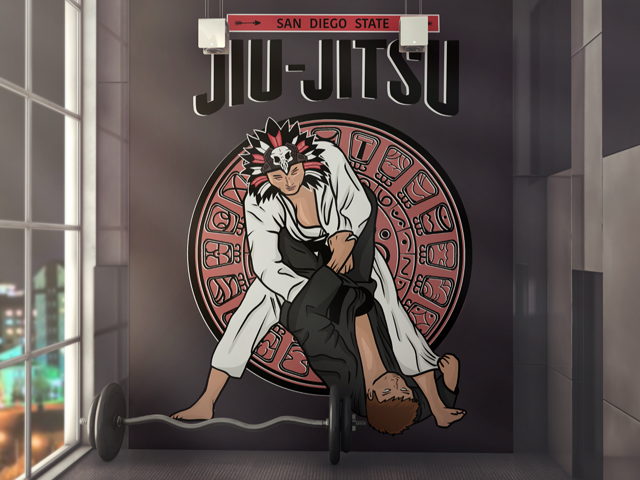
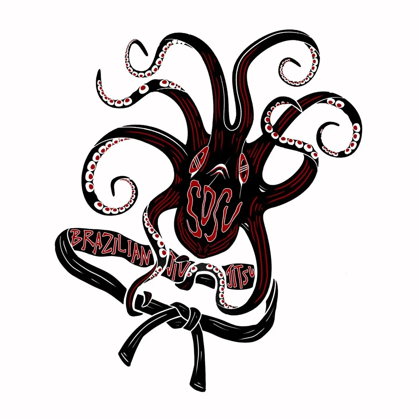
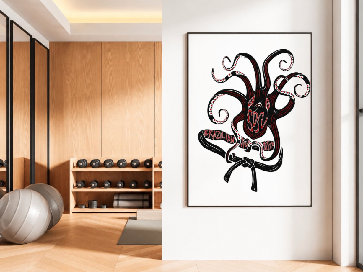
SDSU JIU JITsU
I created these graphics for the SDSU Jiu Jitsu Club, the official martial arts and physical education program offered at San Diego State University. My goal was to establish a cohesive visual identity and to match the discipline, intensity and tradition of Jiu Jitsu. I used bold typography, strong compositions and dynamic imagery that reflected the energy of the sport and the SDSU Aztec identity while maintaining a clean and professional aesthetic.